Download
1 / 73
730 likes | 749 Vues
Definition: The style, arrangement, and appearance of text on a page. David Carson. Type Effects for Photoshop and Illustrator. 80 Best Type Effects in Photoshop 50 Excellent Type Effect Tutorials in Illustrator.

E N D
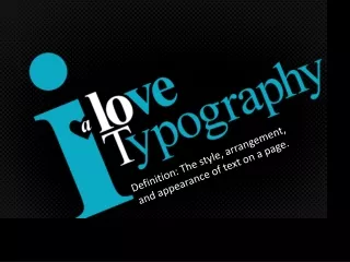
Definition: The style, arrangement, and appearance of text on a page.
Type Effects forPhotoshop and Illustrator 80 Best Type Effects in Photoshop50 Excellent Type Effect Tutorials in Illustrator
Even everyday type should be designed well. The typography you use reflects on youand your business. The more appealing, professional and organized information appears, the more likely people are to read it and be persuaded by your message.
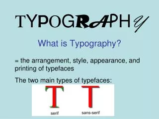
Display Type: Large type (e.g., used in headlines) • Body Copy: Small type found in the body.
Why can’t we use Photoshop for type layout? • Photoshop creates artwork using pixels, so type created in Photoshop is fuzzy around the edges. • We us InDesign or Illustrator for type unless it’s elaborate artwork like this:
Why can’t we use Photoshop for type layout? • Answer: Photoshop uses pixels, which makes type fuzzy. So, we use InDesign or Illustrator. • However, if you want to make artistic type effects, Photoshop can be used. • See examples on the next page of artistic type effects in both Photoshop and Illustrator.
How did Hillary’s logo change?What did it communicate before and after?
Principles Designers Know Words carry emotional impact. Letter forms carry emotional impact. The shape and design of a font impacts how we use the typeface. Social connotations are connected to letter forms and typography. Social contexts affect the way type is used and understood.
CONCORDANT TYPE: Type that is all the same font (can be boring). • CONTRASTING TYPE: Type that contrasts must contrast dramatically. • CONFLICTINT TYPE: Type that conflicts is too similar (not good).Which of the logos below is most CONFLICTING? • B. C. D. E. F.
Quiz Yourself • Conflicting type is type that is too _________A. differentB. similar
type hierarchy SubheadingA type hierarchy is a system for organizing type that establishes an order of importance that allows the reader to easily navigate content and find what they’re looking for. The most important type typically appears in the largest, heaviest weight; the subheadings are smaller yet bold; and the least important text (the body copy) is in the smallest and lightest type. Body copy also needs to be in a simple font (not script or decorative) so that it can be easily read. Bullets and EmphasisUse italics or bold for emphasis, not all capital letters. Use bullets or numbers to offset important points like those below:lUse bullets or numbers to offset important points.lBullets should be solid and bold.lDo not use asterix, complex wingdings or symbols.lUse small space between your bullet and text.
Cooper Black Goudy Stout
Cooper Black Goudy Stout