Download
1 / 2
20 likes | 89 Vues
Are you creating responsive HTML email design for your email marketing campaign? Follow the given tips and bring out the outstanding email design for your business. Read more here - https://bit.ly/2LIz84T

E N D
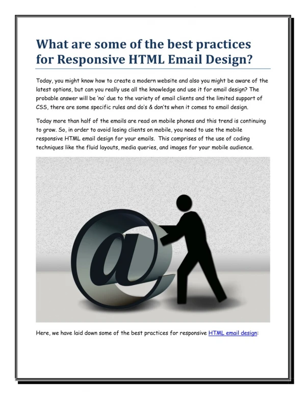
What are some of the best practices for Responsive HTML Email Design? Today, you might know how to create a modern website and also you might be aware of the latest options, but can you really use all the knowledge and use it for email design? The probable answer will be ‘no’ due to the variety of email clients and the limited support of CSS, there are some specific rules and do’s & don’ts when it comes to email design. Today more than half of the emails are read on mobile phones and this trend is continuing to grow. So, in order to avoid losing clients on mobile, you need to use the mobile responsive HTML email design for your emails. This comprises of the use of coding techniques like the fluid layouts, media queries, and images for your mobile audience. Here, we have laid down some of the best practices for responsive HTML email design:
Fonts Select the fonts that are clear and readable. For instance, if your font size is too small, people will tend to skip your email because nobody wants to strain their eyes reading tiny texts. At a minimum, use 13 or 14 pixels for the text and 20-22 for the tiles. This in return, will make your email much readable on a small screen. Layout It is better to stick to a single-column layout on a mobile device screen. This single layout makes your email compatible for the device and makes it easier to read, even when viewed with different email clients. A single column layout also simplifies your design and makes the important content highlighted. Content In many cases, you would not find enough space for all the content of your email newsletter in the mobile version; therefore, make sure to include the important parts of your message. Trimming down the content of your email enables the reader who is willing to stay focused on your message and will further translate into better conversion rates. Testing Testing your email is the last and the most important step before sending out the emails to your subscribers. You have to make sure that your designs render perfectly on all the mobile devices. However, it is always considerable to make the testing on real devices. Simply analyzing the templates created by professional HTML email designers can help you draft better and less-error prone emails. But, once you are familiar with the process of email design, you will have a much easier time designing from scratch.