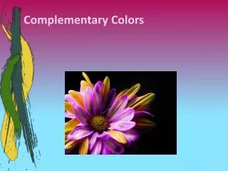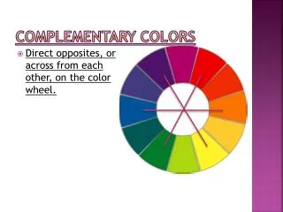
Complementary Colors
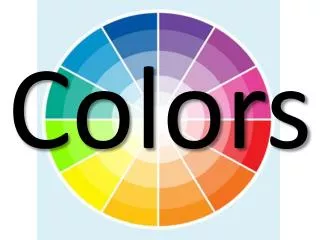
Complementary Colors. Complements sit across from one another on the traditional color wheel. Complementary color schemes were very common in Renaissance paintings—dark grays were created by layering neutrals on top each other. Jan Van Eyck—Madonna of the Chancellor Rolin.


Complementary Colors
E N D
Presentation Transcript
Complements sit across from one another on the traditional color wheel
Complementary color schemes were very common in Renaissance paintings—dark grays were created by layering neutrals on top each other Jan Van Eyck—Madonna of the Chancellor Rolin
Katie GrinnanBrainscapes Blue/orange contrast, neither color at full saturation
Complements are pairings of one Primary and one Secondary color • Blue + Orange (red + yellow) Red + Green (Yellow +Blue) Yellow+ Purple (Red +Blue) Thus, each complementary pairing is also a combination of all primary colors (a single primary, as well as two other primaries combined to create a secondary color).
Besides Black and White, complement pairings are color combinations creating the highest contrast
At full saturation, each complementary pairing has it’s own specifics • Yellow and purple are highest in value contrast • Blue and orange have the most warm/cool contrast • Red and green are equal in value
Complements placed next to one another maximize their vividness, and allow each other to ‘pop’
Mixed together, complements neutralize one another-literally. If you mix two complements, you will create neutrals. If not mixed completely, adding a complement to a color will reduce it’s saturation.
Mixing complements is a way to create Chromatic Neutrals---Neutrals mixed from colors rather than black and white. • Color schemes based on complements and the neutrals mixed from complements can be very harmonious—the complements pop, and the range of neutrals keeps everything unified.
Peter Doig, Painter in Mountain Landscape (Red-violet+yellow-green+neutrals)
Luc Tuymans , Ballroom Dancing, (Blue-violet+yellow-Orange+neutrals)