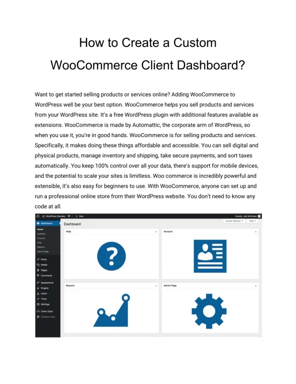
Download

1 / 20
200 likes | 298 Vues
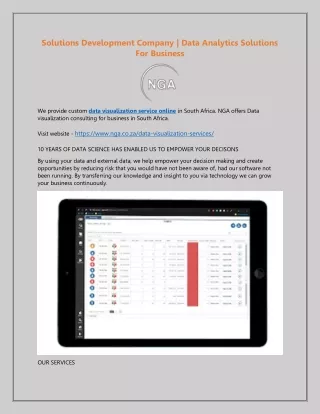
Monitor and analyze client service events with longitudinal and cross-sectional analyses. Visualize data using interactive charts for efficient identification of important cases. Explore time-to-resolve metrics and analyze time between events for improved insights.

E N D
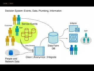
2 Dashboard for Statistical Visualization of Client Service Events The raw data:Creation – Received –First_Contact_SW – First_Contact_HW – Request – Pending – Closed TSC Events: Creation – Received – First_Contact_SW – First_Contact_HW – Request – Comp_Pending – Closed Types: HW Platforms, Products, Geo, Owner, …
Sorted data Case DateTime Event Type Time PrEv Case1 T1 Ev1 Type1 0 0 Case1 T2 Ev3 Type1 T2-T1 E1 Case1 T3 Ev7 Type1 T3-T2 E3 Case2 T4 Ev3 Type1 0 0 ……
Dashboard for Statistical Visualization of Client Service Events Consists of three key elements: • Run chart for longitudinal (in time) representation of data • Matrix bar chart for types of cases • Flower bed chart for time between events representation. The flower bed and matrix bar charts can be plotted for any specific interval of time: week, month, or year. All features of these three charts are clickable, switching is easy between charts, and drilling down can be done to detailed lists of individual cases. These interactive capabilities facilitate identification of the most business important cases.
6 Longitudinal Analysis: Run Chart TTR = Time-To-Resolve = DateTime(CaseClosed) – DateTime(CaseCreated)
7 Cross-Sectional Analysis –Time Between Events: The raw TSC data:Creation – Received –First_Contact_SW – First_Contact_HW – Request – Pending – Closed Events: Creation – Received – First_Contact_SW – First_Contact_HW – Request – Comp_Pending – Closed Types: HW Platforms, Products, Geo, Owner, …
8 Cross-Sectional Analysis –Time Between Events:
9 Cross-Sectional Analysis –Time Between Events:
10 Cross-Sectional Analysis –Time Between Events: MTBE MTBE MTBE • Traditional wayto represent 2 (pivot) tables: Freq and MTBE (Event x PrevEvent )
11 Cross-Sectional Analysis –Time Between Events: Variants of possible designs for 2 parameters (Fr and T) • Area of Circle (“house”) is proportional to frequency of the event. • Width of Petal (arrow, bar) is proportional to frequency of transitions between events. • Length of Petal is proportional to mean time between events. • Color of Petal is the same as color of “To” Circle (“house”)
12 Cross-Sectional Analysis –Time Between Events: Flower Bed Chart Petal direction points to next event, with matching petal-circle color. Circle size ~ frequency. Length of petal ~ time and width of petal ~ frequency. Data visualization – variants of design
7 7 3 3 1 3 3 1 1 1 13 Cross-Sectional Analysis – Tower Charts f(i) = Q( i / N) = ECDF-1(i / N) . 3D Towers Figure 5. Empirical CDF (left) and sorted sequence (right) of TBE = {1, 1, 3, 3, 7}. f(i) = Q( i / N) = ECDF-1(i / N) 3D Towers
14 Cross-Sectional Analysis –Time Between Events: Flower Bed Chart with Tower Petals
15 Cross-Sectional Analysis – Evolution of Elements
Cross-Sectional Analysis by Types of Cases: Traditional wayTo represent 2 (pivot) tables: Freq and TTR (HW Platform) x (Product)
Cross-Sectional Analysis by Types of Cases: Matrix Bar Chart Width of cuboid is proportional to time and height is proportional to square root of frequency.
Dashboard for Statistical Visualization of Client Service Events