
Enhancing Web Design: Key Principles for Effective User Experience
E N D
Presentation Transcript
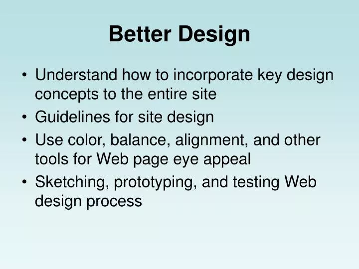
Better Design • Understand how to incorporate key design concepts to the entire site • Guidelines for site design • Use color, balance, alignment, and other tools for Web page eye appeal • Sketching, prototyping, and testing Web design process
Observe First • Before building any new web application, first look at other sites from your organization and at sites with similar purposes, review:- display of information- navigation- choosing and finding- communicating the organization’s identity- feedback and interaction
Most important location on a Web Page • Publishers have learned that people look at the upper right portion of the right-hand page first. • First point seen hasn’t been established for web pages yet, but –- top more likely than bottom- things below or right of scroll bar never seen- number of items should be 7 plus or minus 2, “hrair limit”- if you want something seen, put it near the top of the page with few competing items
Text Easier to Read if: • Black text on white background • 10-12 words per line • Standard 12 point system fontsTimes, Helvetica, Arial, Times Roman • Serif font for body, sans serif for titles- this is Arial, this is Times Roman • Use only two font sizes, one for titles and one for the body text
Text Easier to Read if:(continued) • Avoid words in all caps (only for warnings)DON’T CLICK HERE!!! • Make sure headings contrast with body text. (let’s users scan easily) • Separate paragraphs using a blank line or an indented first line, not both. • Leave plenty of white space around text • Build page around a single axis. We like things to line up.
Text Easier to Read if:(Continued) • Balance the page from top to bottom and right to left. • Memorize this:“The simpler, the better. Chaos and clutter are the opposites of order and organization.” A simple page with a few visual and text elements is easier to read than a page with a plethora of items competing for attention.
Designing for Eye Appeal • http://www.webwhirlers.com/colors/combining.asp • Primary colors – red, yellow, blue • Colors that are directly across the wheel are complementary. They work will together. • Adding black to a color is called a shade. • Adding white is called a tint.
Designing for Eye Appeal(continued) • Alignment – human eye likes things to line up, for example, the left edge of a picture and text column (single axis)- alignment should be the same from page to page • Frames facilitate- constant titles and menu items • Pay close attention to how scrolling will work on your pages
Web Site Design Steps • Sketch the pages, consider the display of information – text, images, video, tables, lists (pay attention to alignment) • Build navigation: menus, identification, and user control • Consider feedback and interaction issues • Decide how to include Corporate Identity • Decide on type of text • Color, contrast, and balance • Frames & alignment • Scrolling
After Design - Prototype • Use a WYSIWYG Web page editor or drawing package to create your online prototype • Test the prototype with the target audience • Ask the questions of prototype reviewers- Text readable? Useful images? Could you find information?- Is it clear where you are and where you going within the site?
After Design – Prototype(continued) - Are all menu choices evident? How would you find “X”? - Who sponsored the web site?- What seems missing from this page? What could be eliminated?- On a continuum from simple to cluttered where would this page fall?- What changes do you recommend?