
Uploaded by
nevan
3 SLIDES
123 VUES
30LIKES
Mastering Pie and Bar Graphs for Data Representation
DESCRIPTION
Learn how to create and interpret pie graphs to display data proportions and angles. Explore histograms to show grouped continuous data visually, with the area reflecting frequency. Bar graphs for discrete data, depicting frequency by bar height. Detailed exercises on page 254, Exercise E and F. 8
Download
1 / 3
Télécharger la présentation 
Mastering Pie and Bar Graphs for Data Representation
An Image/Link below is provided (as is) to download presentation
Download Policy: Content on the Website is provided to you AS IS for your information and personal use and may not be sold / licensed / shared on other websites without getting consent from its author.
Content is provided to you AS IS for your information and personal use only.
Download presentation by click this link.
While downloading, if for some reason you are not able to download a presentation, the publisher may have deleted the file from their server.
During download, if you can't get a presentation, the file might be deleted by the publisher.
E N D
Presentation Transcript
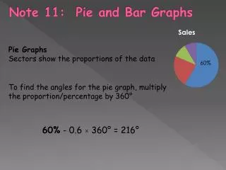
Note 11: Pie and Bar Graphs Pie Graphs Sectors show the proportions of the data To find the angles for the pie graph, multiply the proportion/percentage by 360° 60% - 0.6 × 360° = 216°
Histogram – display grouped continuous data – area represents the frequency frequency Bar Graphs – display discrete data Distance (cm) – counted data – draw bars (lines) with the same width – height represents frequency
Page 254 Exercise E and F


More Related