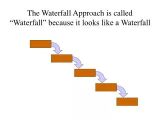
When to Use a Cascade (Waterfall) Chart
When to Use a Cascade (Waterfall) Chart. When to Use a Cascade Chart. Use a Cascade (waterfall) chart when you want to map changes in key variables (profit, contribution or sales) between periods and show why they changed.

When to Use a Cascade (Waterfall) Chart
E N D
Presentation Transcript
When to Use a Cascade Chart Use a Cascade (waterfall) chart when you want to map changes in key variables (profit, contribution or sales) between periods and show why they changed. Some examples of when you would use a Cascade Chart are to illustrate: • Cost Breakdown • Profit Breakdown • Profit Change • Multi-Year Profit Change • Growth Breakdown • Growth Breakdown—Vertical • Growth Over Time by Category • Comparing an Average and a Top Performer
Cost Breakdown You can use a Cascade chart to breakdown total expenses into its component parts. The above example could be the cost structure of an IT consulting firm.
Profit Breakdown You can perform a similar analysis to the cost breakdown for revenue or profit. This is an example of profit by division or practice area. You can show both positive and negative contributions to profit. This is not the case if you used a pie chart.
Profit Change One of the most common uses of a Cascade chart is to show profit change from year to year. Start with year 1 profit, show the key change elements, and end with year 2 profit. Source: The Facebook Waterfalls
Multi-Year Profit Change You can extend the Cascade to display multi-year profit changes. In this example, new products contribute significantly to growth.
Growth Breakdown Cascade charts can break down growth over time. It could be revenue, profit or in this case global GDP growth. This chart is a bit more complex, but it has a powerful message. 60% of global GDP growth between 2007 and 2025 will come from the 600 largest cities, even though these cities make up only 25% of the world’s population. Data columns added to the Cascade show number of cities and share of population. Source: McKinsey, Urban world: Mapping the economic power of cities
Growth Breakdown - Vertical You can also view Cascade charts vertically. In this case, it’s easier to see the relationship between GDP growth, and share of population. Source: McKinsey Global Institute
Growth Over Time by Category You can breakdown change over time. In this chart, we examine the growth in energy supply between 2010 and 2020. Two-thirds of the growth will come from fossil fuels with a shift to natural gas and an increased consumption of oil and coal in China driving the growth. Source: Bain & Company, Eight Great Trillion Dollar Growth Trends to 2020
Comparing an Average and a Top Performer You can illustrate how an average performer differs from a top performer. In this example, we compare the cost per degree delivered in an average competitive bachelors/masters program to a top quartile program. Source: McKinsey, Winning by Degrees
Choosing the Right Chart for the Job A successful business chart should help you as well as your audience make sense of what would otherwise be complex numbers and ideas. When designed poorly, charts just confuse. But choosing the right chart and utilizing good chart design will convey your message clearly and effectively. For more information on other charts available in Mekko Graphics and when the right way to use them please explore the following resources: Mekko Graphics charts not available in PowerPoint: Marimekko Chart Bar Mekko Chart Our Chart Finder and Sample Presentations can help you learn about other charts enhanced by Mekko Graphics