Customize your chart
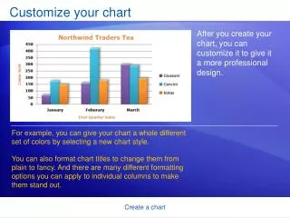
Customize your chart. After you create your chart, you can customize it to give it a more professional design. . For example, you can give your chart a whole different set of colors by selecting a new chart style.

Customize your chart
E N D
Presentation Transcript
Customize your chart After you create your chart, you can customize it to give it a more professional design. For example, you can give your chart a whole different set of colors by selecting a new chart style. You can also format chart titles to change them from plain to fancy. And there are many different formatting options you can apply to individual columns to make them stand out. Create a chart
Change the look of your chart When you first create your chart, it’s in a standard color. By using a chart style, you can apply different colors to a chart in just seconds. First, click in the chart. Then on the Design tab, in the Chart Styles group, click the More button to see all the choices. Then click the style you want. Create a chart
Change the look of your chart When you first create your chart, it’s in a standard color. By using a chart style, you can apply different colors to a chart in just seconds. Some of the styles change just the color of the columns. Others change the color and add an outline around the columns, while other styles add color to the plot area (the area bounded by the chart axes). And some styles add color to the chart area (the entire chart). Create a chart
Change the look of your chart If you don’t see what you want in the Chart Styles group, you can get other color choices by selecting a different theme. Click the Page Layout tab, and then click Colors in the Themes group. When you rest the pointer over a color scheme, the colors are shown in a temporary preview on the chart. Click the one you like to apply it to the chart. Create a chart
Change the look of your chart Important Unlike a chart style, the colors from a theme will be applied to other elements you might add to the worksheet. For example, a table or a cell style such as a heading will take on the colors of the theme applied to the chart. Create a chart
Format titles If you’d like to make the chart or axis titles stand out more, that’s also easy to do. On the Format tab, in the WordArt Styles group, there are many ways to work with the titles. The picture shows that one of the options in the group, a text fill, has been added to change the color. Create a chart
Format titles To use a text fill, first click in a title area to select it. Then click the arrow on Text Fill in the WordArt Styles group. Rest the pointer over any of the colors to see the changes in the title. When you see a color you like, select it. Text Fill also includes options to apply a gradient or a texture to a title. Create a chart
Format titles To make font changes, such as making the font larger or smaller—or to change the font face—click Home, and then go to the Font group. Or you can make the same formatting changes by using the Mini toolbar. The toolbar appears in a faded fashion after you select the title text. Point at the toolbar and it becomes solid, and then you can select a formatting option. Create a chart
Format individual columns There is still more that you can do with the format of the columns in your chart. In the picture, a shadow effect has been added to each of the columns (an offset diagonal shadow is behind each column). Create a chart
Format individual columns Here’s how to add a shadow effect to columns. • Click one of Giussani’s columns. That will select all three columns for Giussani (known as a series). • On the Format tab, in the Shape Styles group, click the arrow on Shape Effects. Create a chart
Format individual columns Here’s how to add a shadow effect to columns. • Point to Shadow, and then rest the pointer on the different shadow styles in the list. • You can see a preview of the shadows as you rest the pointer on each style. When you see one you like, select it. Create a chart
Format individual columns The Shape Styles group offers plenty of other great formatting options to choose from. For example, Shape Effects offers more than just shadows. You can add bevel effects and soft edges to columns, or even make columns glow. You can also click Shape Fill to add a gradient or a texture to the columns, or click Shape Outline to add an outline around the columns. Create a chart
Add your chart to a PowerPoint presentation When your chart looks just the way you want and it’s ready for a debut, you can easily add it to a Microsoft Office PowerPoint®presentation. Here’s how it works. • Copy the chart in Excel. • Open PowerPoint 2007. • On the slide you want the chart to be on, paste the chart. Create a chart
Add your chart to a PowerPoint presentation When your chart looks just the way you want and it’s ready for a debut, you can easily add it to a Microsoft Office PowerPoint®presentation. Here’s how it works. • In the chart’s lower-right corner, the Paste Options button appears. Click the button. Now you’re ready to present your chart. Create a chart