Download
1 / 6
60 likes | 170 Vues
This guide explains various methods of displaying information through visual aids, specifically pictographs, bar graphs, line graphs, and pie charts. With examples like ferry usage data illustrated with pictographs, the document details how to interpret the busiest days and vehicle counts. Additionally, it discusses bar charts using shoe size survey results to display frequency. Understanding these visual tools enhances data comprehension and effective communication.

E N D
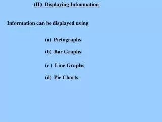
(II) Displaying Information Information can be displayed using (a) Pictographs (b) Bar Graphs (c ) Line Graphs (d) Pie Charts
Pictographs - made up from small pictures Ferry Use = 10 cars MON TUE WED THU FRI
Busiest day is Friday 40 No. cars on Monday is No. cars on Thursday is 25 No. more cars on Monday than on Thursday 15 Total for week 190
Pictographs - made up from small pictures Ferry Use = 4 cars MON TUE WED THU FRI
Pictographs - made up from small pictures Ferry Use = 6 cars MON TUE WED THU FRI
Bar Charts The results of a shoe size survey were Size 2 3 4 5 6 7 8 Frequency 1 3 2 1 5 3 1 These can be made into the following bar chart Class Shoe Size 4 frequency 2 2 3 4 5 6 7 8 size