Usability Evaluation
Criterionmgmt.com. Usability Evaluation. By Neil Olsen. Agenda. Website Overview Target Audience Competitive Analysis Willis-Consulting Schwarzkopf Recruiting Services Expert Analysis Data Collection Data Analysis Conclusion Recommendations. Website Overview.

Usability Evaluation
E N D
Presentation Transcript
Criterionmgmt.com Usability Evaluation By Neil Olsen
Agenda • Website Overview • Target Audience • Competitive Analysis • Willis-Consulting • Schwarzkopf Recruiting Services • Expert Analysis • Data Collection • Data Analysis • Conclusion • Recommendations
Website Overview • Purpose: To provide background information on Criterion Management and contact information. • Business Goals: To get financial advisors to contact Criterion Management and to build relationships. • Value Proposition: Criterion offers good customer service and experience negotiating salaries. • User Needs: To learn about the history of Criterion and its principles. • Purpose of Evaluation: To determine the level of usability for the website Criterionmgmt.com and to assess if it is achieving the goals of the business. • Expected outcomes: Criterion Management will redesign their website to make it more effective in meeting their business goals of recruitment and building relationships.
Target audience • Occupation: Financial Advisor (Retail business) • Income: Managing $30 million in assets with gross commissions of $300,000 or higher over last 12 months. • Education: Series 7 License • Computer Experience: Frequent internet user • Browsers: Internet Explorer, Mozilla Firefox, Google Chrome • Gender: Mostly male, but can vary • Age: 35-65, but can vary • Location: Nationwide in U.S.
Competitive analysis Aspects of Heuristic Evaluation : • Simplicity • Consistency • Focus • Simplification and Reduction • Contrast • Balance • Repetition • Gestalt Principles • Good Use of Page Real Estate http://www.criterionmgmt.com/
Willis-Consulting http://www.willis-consulting.com/
Willis-Consulting • The page is free of clutter • The text is consistent throughout all pages and there is consistency in the design between pages. • There is a clear and unambiguous structure to the page • A contact number is at the top right of the screen • The users focus is drawn by the use of graphics and titles • The color tone gives the user a sense of professionalism and the contrast is not overwhelming or dithered.
Willis-Consulting • There is a top running navigation bar with text and a clear home page. • The page is well balanced • There is repetition of elements within the page and effective use of the Gestalt principles • The page has a little too much blank space at the sides on a high end display (the image in this presentation was cropped at the sides).
SchwarzKopf Recruiting Services http://www.stockbrokerjobsite.com/index.html
SchwarzKopf Recruiting Services • The page is free of clutter • There is consistency in the page design across pages • There are 2 different fonts used and bolding to create a 3rd difference, so text consistency is an issue. • Titles are used to help guide the user to the important areas of the page, although the relevant information is on the right side and not the left. • The page is well balanced around a central point.
SchwarzKopf Recruiting Services • The color tone is pleasant and professional, and the contrast is not overwhelming or dithered. • However, the Contact button does not have the proper contrast from the background. • Repetition of elements is low but not necessary. • The Gestalt principles are well employed for the most part, except for the contact button. • The page has a little too much blank space at the sides on a high end display (the image in this presentation was cropped at the sides).
Expert Analysis http://www.criterionmgmt.com/
Expert Analysis • The page is free of clutter • There is consistency in the design of the website, however, the company address in red text and all other text is black, with links in red. • There is a title on each page, but there are no titles in the navigation bar and no Alt Text so this detracts focus from the content. • Also, the text is not broken up into chunks to make it salient to the user, which takes away from the users ability to focus on the important content. • Only the necessary elements are included on each page.
Expert Analysis • The color tone is not professional and is hard to look at the site. The contrast is a little to high causing the page to seem overwhelming. • There is repetition of elements and mostly the text just changes. • The Gestalt principles are employed on the contacts page and in the navigation bar. • The page has far too much blank space at the sides and across the bottom on a high end display (the image in this presentation was cropped at the sides and bottom).
Data Collection Tasks • Determine the purpose of the website. • Determine who the website is for. • Find the contact information for Scott Colton. • Determine what the opportunities are. • Find out why you should leave your current broker dealer for another one. • Determine what the fee is for using Criterion Management.
Data Analysis Ranking of Site Elements • Participants were asked to rank three elements using a Likert scale. • 1 being it was easy/good • 5 being it was hard/bad • A check indicates that a participant was able to complete the given task. Task Completion Chart
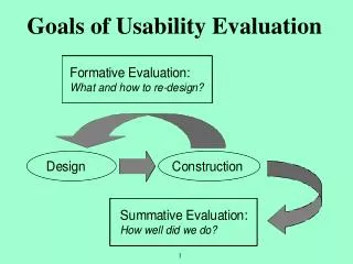
Conclusion • Fact: Criterion Management is a recruiting business • Fact: The business goals of any good recruiting website are for users to understand: • What do you do? • Why they should contact you as opposed to someone else? • What opportunities are available? • Problem: As it stands right now, Criterion Management’s website merely tells a story of who the principles are and how they got there. • Result: Based on this problem and the evaluation of “best practices” from other company’s websites in the same industry, a redesign is needed.
Recommendations General • Site contains the following pages: • Home page • About Us page • Contact Our Recruiters page • Opportunities Page • How the Process Works • FAQ page • Company name and phone number at the top of every page. • The different pages in the site should not exist within a flash based frame on a single page (the link to every page should not be criterionmgmt.com) • The content from the Introduction, Philosophy, and About Us pages should all be transferred to the About Us page. • Pictures of at least the principles of the company should accompany their bios. • The content should be updated as necessary for each of the pages.
Recommendations Home page • The Home button should take the user to the home page. • The home page should provide a statement of what Criterion Management does and who the website is for. • The company name and a contact phone number should be right at the top of the home page. • The contact information such as address and email address should also be on the home page. Near the bottom. • There should be no splash page
Recommendations Page Layout • Navigation menu is a fixed landmark on the top of every page and uses text instead of graphics • Include a search bar as a landmark. • The site should take up more space on the page. • The contrast of the website should be changed to a light and professional tone. Perhaps light blue and white or grey and white. • Text should be broken up with titles and should use brief explanations perhaps through the aid of bullet points or just more frequent titles. • Links should be blue and underlined as opposed to red. • Testimonial quotes can be used to break up information.
Recommendations Browser Integration • Allow user to hit back and forward buttons in the browser to navigate. • There should be an actual scroll bar and the content should not scroll within a single flash based frame. • If scrolling is needed, have a redundant menu at the page bottom. • Alt Text should be added to the graphics Ideal • Have a page dedicated to relevant news in the brokerage industry (could be difficult and/or costly). • Pictures and bios for each and every recruiter (may not project the tone the company wants). • Include testimonials from previous clients (would need to get client consent)
references • http://www.criterionmgmt.com/ • http://www.willis-consulting.com/ • http://www.stockbrokerjobsite.com/index.html