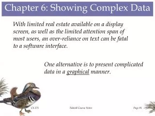
Chapter 6: Showing Complex Data
As real estate on display screens is limited and users have short attention spans, relying solely on text can hinder a software interface's effectiveness. This chapter discusses various strategies for visually presenting complex data, such as using graphical representations, dynamic queries, and data tips. Techniques like overview plus detail views, data brushing, and sortable tables facilitate better user experience by enabling efficient data exploration, filtering, and organization. By incorporating these design patterns, software can become more intuitive and user-friendly, enhancing data accessibility.

Chapter 6: Showing Complex Data
E N D
Presentation Transcript
Chapter 6: Showing Complex Data With limited real estate available on a display screen, as well as the limited attention span of most users, an over-reliance on text can be fatal to a software interface. One alternative is to present complicated data in a graphical manner. Tidwell Course Notes
Preattentive Variables Some visual features stand out so much that the user notices them before actually being aware of them. Which feature makes one button stand out more than the rest? Tidwell Course Notes
Data Exploration When the displayed data is complex, the user needs the means by which details can be examined more closely. Scrolling Zooming Opening & Closing Windows Tidwell Course Notes
Sorting The Data In some cases, there might be a “natural” way to sort displayed data, but, in general, the display should be flexible enough to accommodate the user’s sorting preferences. Windows Explorer allows the user to sort the contents of a directory by a variety of fields. Tidwell Course Notes
Searching The Data When the user is seeking particular data, the interface should facilitate the search, possibly even filtering the data to accommodate the user’s needs. POPFile filters incoming e-mail and classifies it by a variety of user-specified criteria. Tidwell Course Notes
Pattern #54: Overview Plus Detail Display a small view of the entire set of graphical data along with a large view of specific zoomed details. Example: Adobe Acrobat displays a miniature version of an entire document in a panel on the left side of its display, and the user may use the mouse to select the portion of the document to be shown in the main display pane. Tidwell Course Notes
Pattern #55: Datatips Use large tooltip-like rollover windows to display data that might be useful to specific users, but not to users in general. Example: When debugging a program in Microsoft Developer Studio, the programmer may use mouse operations to display the current value of any active variable, including structured variables containing several levels of values. Tidwell Course Notes
Pattern #56: Dynamic Queries When the overall data set is huge, provide the user with means to quickly filter out unwanted data and focus on desired information. Example: Dynamic HomeFinder provides users with the ability to dynamically refine a search for a new home based upon several criteria (distance from office or school, number of bedrooms, cost). Tidwell Course Notes
Pattern #57: Data Brushing If multiple sets of related data (or multiple views of the same data) are provided, have selections from one set (or view) result in corresponding selections from the others. Example: In this Excel-based application, the polygonal rotation may be produced by typing in a new value or by dragging the bar graph component. Tidwell Course Notes
Pattern #58: Local Zooming When displaying a large amount of densely packed data, provide mouse operations that display an enlarged section of the data wherever the mouse is. Example: yEd, a Java-based graph editor provides a magnifying glass capability that allows users to see extensive details about very localized areas within the graph. Tidwell Course Notes
Pattern #59: Row Striping Coloring alternate rows of a table with two distinct but similar shades can assist users in distinguishing long, multi-column rows. Example: In this Student Grades example, row striping was used to facilitate reading the instructor’s and administrator’s data tables. Tidwell Course Notes
Pattern #60: Sortable Table When presenting the user with information in a table, provide mechanisms for sorting the rows by the table’s various columns. Example: Microsoft Excel provides users with the ability to sort spreadsheet data by means of the different columns. Tidwell Course Notes
Pattern #61: Jump To Item When the user wants to use the keyboard to select an item from a lengthy ordered list, jump right to the desired item as it’s typed in. Example: Microsoft Visual Studio’s help search screen allows the user to type text and scroll to the first indexed item with the desired text. Tidwell Course Notes
Pattern #62: New-Item Row When the user is creating a table of information, insert a new row at the bottom of the table as a placeholder for the next item to be added. Example: In Microsoft Visual Studio, when creating a menu with the Designer, a placeholder for a new menu item is automatically generated at the bottom of the menu being created. Tidwell Course Notes
Pattern #63: Cascading Lists When displaying a hierarchy of items, display each level of the hierarchy in a list next to the list of the parent node in the previous hierarchical level. Example: Vendio’s on-line auction listing application uses eBay’s merchandise categorization hierarchy to allow users to provide specifications about what they’re selling. Tidwell Course Notes
Pattern #64: Tree Table When displaying a multi-column table in which one column’s data is hierarchical in nature, use an indented outline format. Example: The iTunes radio display lists a set of music genres and allows the user to see details about individual radio streams in each genre. Tidwell Course Notes
Pattern #65: Multi-Y Graph When multiple graphs share the same x-axis, place them atop each other rather than superimposing them. Example: This Microsoft Visio chart contrasts CS 275 program grades and exam grades over the same time interval. Tidwell Course Notes
Pattern #66: Small Multiples By simultaneously displaying a large number of small images that are related to each other, their differences and similarities may be accentuated. Example: Media Lab Europe developed the Last Clock, which uses concentric rings to show snapshots of its surroundings from the past few seconds, the past few minutes, and the past few hours. Tidwell Course Notes
Pattern #67: Treemap When displaying hierarchical information on a large page, an overview of the hierarchy can be provided via spatial subdivisions proportional to the significance of its various branches. Example: While most treemaps are rectangular, Kai Wetzel has developed a circular treemap system for displaying disk usage, color-coded to indicate the age of the files. Tidwell Course Notes