Download
1 / 4
40 likes | 318 Vues
Picture of presenting author. Title of your poster presentation Subtitle (size = DIN A0 = 84.1 x 118.9 cm) Marie Firstauthor 1 , François Correspondingauthor 2 and Michel Lastauthor 1

E N D
Picture of presenting author Title of your poster presentationSubtitle (size = DIN A0 = 84.1 x 118.9 cm) Marie Firstauthor1, François Correspondingauthor2and Michel Lastauthor1 Affiliation1:the names and addresses of the associated institution go hereAffiliation 2: the names and addresses of the associated institution go here Name of presenting author
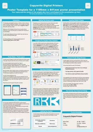
Picture of presenting author Title of your poster presentationSubtitle (size = DIN A0 = 84.1 x 118.9 cm) Marie Firstauthor1, François Correspondingauthor2and Michel Lastauthor1 Affiliation1:the names and addresses of the associated institution go hereAffiliation 2: the names and addresses of the associated institution go here Name of presenting author Suggestions pour la réalisation d’un poster :Contenu du poster : - Un titre, des auteurs et affiliations- Indiquer en gras le nom du « corresponding author » ou de la personne présentant le poster- Des illustrations de taille proche du A4 (quatre en moyenne). - Quelques illustrations plus petites qui font office de « vignettes » - Du texte : une vingtaine de lignes de texte environ- Eventuellement : une introduction ou un court résumé du poster (3 -5 phrases max)- Une conclusion concise et précise (les conclusions sont très lues par le spectateur)- Certains posters peuvent aussi être construits entièrement sous la forme d’un schémaTexte : - Utilisation de police type « Arial, Calibri, Helvetica » recommandée. Eviter les police de type « Times New Roman »- Eviter l’utilisation de majuscules et de l’italique pour UNE PHRASE ENTIERE CAR C’EST ASSEZ DIFFICILE A LIRE- Pour les titres, choisir une taille comprise entre 60 et 72 points environ- Pour le corps du texte, choisir une taille comprise entre 36 à 40 points environ- Pour les légendes, essayer de ne pas réduire la taille du texte à moins 24 points. - Limiter la largeur des colonnes à 10 - 12 mots, au-delà la lecture est plus difficile Organisation du poster :- Si possible, organiser le parcours du regard du spectateur (qui, pour le spectateur occidental regarde d’abord spontanément en haut à gauche).- Simplifier les phrases qui sont préférablement courtes et directes, voire nominales (notamment pour les titres). Pour information, c’est en général le début de la phrase qui est retenu par les lecteurs du poster. - Soigner les légendes : elles sont lues, en moyenne, par deux fois plus de gens que le corps du texte ! Numérotation possible des figures- Aérer la présentation : les blancs (30%) facilitent la lecture !- Utiliser puces et lettrines : elles accélèrent le repérage. Couleurs et illustrations :- Ne pasabuserdes couleurs qui rendent le texte difficile à lire- Attention, les images sur le fond entier du poster ont souvent un effet « alourdissant » et ont tendance à décourager le spectateur! Préférez un fond blanc (c’est aussi moins d’encre !)- Pour information, l’ordre de préférence de lecture des illustrations se fait de manière suivant : photo > dessin > schéma > tableau Guidelines for poster production:Poster’s contents: - A title, authors and affiliations (use the bold face to indicate the name of the corresponding author)- Illustrations of sizes close to A4 (about 4) - Icons and thumbnails to help structure the reading - Text: about 20-30 lines from top to bottom- It is possible to add an introduction (max 3-5 sentences), or a short summary - A conclusion : short and concise (very important for the reader)- Some posters can also be built as a single diagramText: - Use « Arial, Calibri, Helvetica » fonts and try to avoid the « Times New Roman » font- Try to avoid UPPER CASE (difficult to read)- For titles, choose text size between 60 to 72 pts- For the text body, choose text size between 32 to 40 pts - For captions, try to not use sizes smaller than 24 pts. - Limit colomns width to 10 - 12 wordsPoster structure:- If possible, set up the poster to create a reading path (from the top left hand corner to the bottom right hand corner) - Make simple and short sentences. FYI: The sentence’ beginning is the most read ! - Give a special care to captions : they are read about two times more than the text body! It is also possible to give numbers to figures - Lighten the poster : about 30 % blanks facilitates the reading- Use bullets and lists: They speed up the reading Colors and illustrations:- Don’t usetoo manycolors, it’s difficult to read !- Be careful : background images often have a « loading » effect that may discourage the reader! Try white background (it also saves ink!)- FYI, the reader’s order of preference for illustrations is: picture > drawing > diagram > table
Picture of presenting author Tempus leo ut varius sit amet, pharetra vel leo. Nam ac erat id nisi sagittis mattis ac at justo. Nulla consequat tempus leo ut varius. Aliquam justo risus, blandit a semper a, luctus nec ipsum. Suspendisse et felis rhoncus dolor ultricies lobortis vitae eget quam. Lorem ipsum dolor sit amet : Lorem ; ipsum ; dolor ; sit ; amet. This is a fake text (‘Lorem Ipsum’) Donec imperdiet leo at lorem tempor tristique. Fusce felis lorem, sodales sit amet vulputate ac, tempus non elit. Morbi vulputate, turpis sit amet vulputate consectetur, mauris risus egestas tellus, eget ornare ipsum lectus ornare metus. Sed velit massa, rutrum et semper Caption 3: An avalanche by A. Prudhor (left) and surface hoar by F. Jarry (right) Nam ac erat id nisi sagittis Sit amet, pharetra vel leo. Nam ac erat id nisi sagittis mattis ac at justo. Nulla consequat tempus leo ut varius. Aliquam justo risus, blandit a semper a, luctus nec ipsum. Suspendisse et felis rhoncus dolor ultricies lobortis vitae eget quam.z Caption 1: Diagram of Texte and Texte Pharetra vel leo Sit amet, pharetra vel leo. Nam ac erat id nisi sagittis mattis ac at justo. Nulla consequat tempus leo ut varius. Aliquam justo risus, blandit a semper a, luctus nec ipsum. Suspendisse et felis rhoncus dolor ultricies lobortis vitae eget quam. Donec a tortor nisl, id condimentum nibh. Aliquam laoreet elit rutrum sapien pellentesque eget malesuada dui feugiat. Cras ultrices tortor eu justo bibendum convallis. • Global snow properties and their spatial variability • Blowing and drifting snow • Avalanche risk forecasting • Guiding in avalanche terrain • Modern forms of communicating avalanche danger • Avalanche education • Avalanche dynamics and hazard mapping • Avalanche protection • Instrumentation, monitoring and remote sensing • Crisis management, avalanche accidents and rescue • Managing snow • Impact of climate change • Snow hydrology and ecology Phasellus dignissim sem ut massa condimentum. Aenean fringilla mollis metus, non mattis orc. Vestibulum laoreet enim et nibh eleifend. Integer nec nulla pulvinar erat venenatis ornare ac nec diam. Cras sagittis turpis id mauris sollicitudin tristique. Praesent nec velit eget est suscipit molestie in at massa. Caption 4 : Location of Alpes Congrès Caption 2 : Grenoble How to structure your poster: an example AnneTheScientist1; Jean TheEngineer2 et Marc ThePro2 Affiliation1:the names and addresses of the associated institution go hereAffiliation 2: the names and addresses of the associated institution go here Name of presenting author Introduction Maecenas dignissim erat et felis porttitor euismod. Cras cursus neque vitae risus pulvinar in adipiscing mi convallis. Class aptent taciti sociosqu ad litora torquent per conubia nostra, per inceptos himenaeos. Quisque rutrum cursus auctor. Integer non augue risus, quis ultricies nunc. Proin felis purus, mattis at euismod in, volutpat sed est. Conclusion Maecenas dignissim erat et felis porttitor euismod. Cras cursus neque vitae risus pulvinar in adipiscing mi convallis. • Duis porta nibh rutrum eros ultricies vulputate • Etiam quis augue eget ipsum venenatis mattis eget vel dui • Duis laoreet urna quis turpis vulputate quis sollicitudin lorem vehicula. Proin felis purus, mattis at euismod in, volutpat sed est. • Class aptent taciti sociosqu ad litora torquent per conubia nostra • Quisque rutrum cursus auctor. References and acknowledgements: • Class aptent taciti sociosqu ad litora torquent per conubia nostra • Quisque rutrum cursus auctor. • Integer non augue risus, quis ultricies nunc. • Class aptent taciti sociosqu ad litora torquent per conubia nostra