Moder n
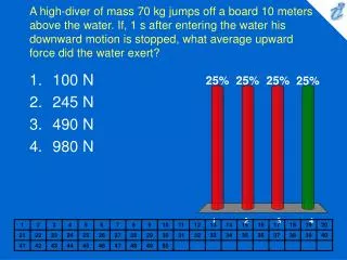
Moder n. Color. Christian Herrera Nicole Galvin. Theory. Albert M unsell & Color Properties. http:// munsell.com / wp -content/uploads/2013/05/ Munsell_Blog_AlbertMunsell.jpg.

Moder n
E N D
Presentation Transcript
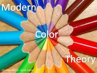
Modern Color Christian Herrera Nicole Galvin Theory
Albert Munsell & Color Properties http://munsell.com/wp-content/uploads/2013/05/Munsell_Blog_AlbertMunsell.jpg
http://www.google.com/url?sa=i&source=images&cd=&docid=d1tW1h0m9W_IxM&tbnid=F8WSkD0T8ZNI1M:&ved=0CAgQjRw&url=http%3A%2F%2Fwww.huevaluechroma.com%2F&ei=adoHU6cPybzIAbf_gbAN&psig=AFQjCNHfh96HlATPt4VQqp2MP9jktzNMnQ&ust=1393109993132034http://www.google.com/url?sa=i&source=images&cd=&docid=d1tW1h0m9W_IxM&tbnid=F8WSkD0T8ZNI1M:&ved=0CAgQjRw&url=http%3A%2F%2Fwww.huevaluechroma.com%2F&ei=adoHU6cPybzIAbf_gbAN&psig=AFQjCNHfh96HlATPt4VQqp2MP9jktzNMnQ&ust=1393109993132034
“Desire to fit a chosen contour, such as the pyramid, cone, cylinder or cube, coupled with a lack of proper test, has led to many distorted statements of color relations, & it becomes evident, when physical measurement of pigment values & chromas is studied, that no regular contour will serve.” – Albert H. Munsell, A Pigment Color System & Notation
Hue – measured around horizontal circlesChroma – measured radially outward from the vertical axisValue – measured vertically http://www.google.com/url?sa=i&source=images&cd=&docid=EFhcq47XKqfpgM&tbnid=r9HEy-2N4K1nOM:&ved=0CAgQjRw&url=http%3A%2F%2Fvickiwelsh.typepad.com%2Ffield_trips_in_fiber%2F2012%2F03%2Fcolor-theory-4-the-color-theorists.html&ei=ZtoHU_zbK8fyyAHOhYGICA&psig=AFQjCNFCD4uz8-IEb7zubW9DdZtQN-kmPw&ust=1393109990775297 http://en.wikipedia.org/wiki/File:Munsell_1929_color_solid_transparent.png
HUE http://www.google.com/url?sa=i&source=images&cd=&docid=P7rPwswQk7Wu3M&tbnid=v3q1Bo6j1HZRqM:&ved=0CAgQjRw&url=http%3A%2F%2Fwww.handprint.com%2FHP%2FWCL%2Fcolor18a.html&ei=Z9oHU_yXOubbyQHv3oDoAw&psig=AFQjCNEX6tMpvqCoEPdar8HEEg9G0ck5cw&ust=1393109992049764 http://en.wikipedia.org/wiki/File:Munsell_1929_color_solid_transparent.png
Example of Munsell’s System A Light Yellow Hue with a Dark Color Mixed In = 5Y 8/12 Pure yellow (5Y) of light hue (8) with a hint of the complimentary color purple (identified by its value in the mix as 12)
Johannes Itten Color Contrasts http://achtnullvier.com/sites/default/files/glossar/johannes_Itten.jpg?1320933188
Contrasts of Hue The interaction of two or more different colors http://myweb.wssu.edu/betzs/primary25a.jpg
Light-Dark Contrast Contrast between light values & dark values
Cold Warm
Simultaneous Contrast
of Contrast Saturation
Josef Albers Color Interaction http://abstractartist.org/wp-content/uploads/2011/04/josef-albers-portrait.jpg
http://25.media.tumblr.com/tumblr_m14ujsPK8W1ro4yjro1_500.jpghttp://25.media.tumblr.com/tumblr_m14ujsPK8W1ro4yjro1_500.jpg http://3.bp.blogspot.com/-OnKhbZhcslc/Ug_QVMCGkZI/AAAAAAAACbk/uhchk39nJE8/s1600/albers.png
AFTER IMAGE
Equiluminance http://visualizeit.files.wordpress.com/2008/10/siggraph.png
Partitive Color Mixing https://fbcdn-sphotos-c-a.akamaihd.net/hphotos-ak-ash3/t1/1506813_10151907761701487_2089181029_n.jpg
Simultaneous Contrast One Color Appears as Two http://1.bp.blogspot.com/-j3Lf4wu0B7I/UDAdOtQ-_TI/AAAAAAAARFw/1rtadC1fb8g/s1600/mental8-6b.png
SimultaneousContrast Two Colors Appear as One http://www.uxmatters.com/mt/archives/2006/01/images/color-theory-images/SuccessiveContrast2-1.gif
ColorMixingModels http://www.practicalecommerce.com/files/images/0004/1533/rgb_cmyk.png Subtractive RYB color
Color Receptors RED GREEN BLUE RGB http://thehumaneyeandthecamera.blogspot.com/p/difference-between-rods-and-cones.html
SecondaryLightColors •Green+ Blue = Cyan • Blue+ Red = Magenta • Red+Green= Yellow • (CMY) • Red + Green + Blue = White http://dba.med.sc.edu/price/irf/Adobe_tg/models/images/rgb_model.gif
RGB Color Experience http://api.ning.com/files/yltp4bQ88zstEUnSSyz1SuRrCsGJHfI55QCww*6io1Xj5Bdu45-xun2cxhQ3cosTO0ryEQRGdw17tfp7nWRrgQ__/TV.jpg
SUBTRACTIVE MIXING Reflected Colors
CMYSubtractive Mixing PrintersPrimary Colors http://dba.med.sc.edu/price/irf/Adobe_tg/models/images/cmy_model.gif
http://www.math.harvard.edu/computing/latex/color_files/rgbcmyk.gifhttp://www.math.harvard.edu/computing/latex/color_files/rgbcmyk.gif
RYB Subtractive Mixing http://rip94550.files.wordpress.com/2009/03/picture-32f.png?w=780
The Mix Primary Color system in art classes. Red + Yellow = Orange Yellow + Blue = Green Blue + Red = Violet http://upload.wikimedia.org/wikipedia/commons/5/55/Color_star-en.svg
RYB = Duller Color In RYB subtractive mixing, R + Y + B = Black. The secondary colors in RYB subtractive mixing are duller than both the CMY Subtractive triad and Additive’s RGB triad secondary colors. CMY (Subtractive) RYB (Subtractive) RGB (Additive) https://lh3.googleusercontent.com/-rhucl_2K1jY/TWqXTwYRdjI/AAAAAAAAHZ4/tmz6L6uGmT0/s1600/farbsub.jpg
Color Harmony http://hallgroat.com/wp-content/uploads/2013/06/MONOCHROMATIC-COLOR-HARMONY.jpg
Complementary Colors at opposite ends of the color wheel. Creates a visual vibration. Ex. Green and Red. http://www.tigercolor.com/Images/Swatch_rect.gif
Split Complimentary Color scheme that uses two adjacent colors and their compliment. There is a visual contrast as the Complimentary scheme but its easier on the eyes. Ex. Green, purple, and orange, http://www.tigercolor.com/Images/Swatch_rect.gif
Double Complimentary Double complimentary uses four colors, these are two pairs of complimentary colors. Complimentary colors intensify each other; this would make some colors combinations easier to look at than others. Ex. Red, Orange. Green, and Blue. http://www.tigercolor.com/Images/Swatch_rect.gif
Analogous An analogous color scheme uses colors which are next to each other on the color wheel. This color scheme is usually the most pleasing to the human eyes, since the colors carry similar wavelengths. Ex. Cool colors, Light-Blue, green, and light-green http://www.tigercolor.com/Images/Swatch_rect.gif
Triadic A combination of three colors on the color wheel which are evenly spaced on the color wheel. This scheme tends to be pretty vibrant regardless of combination of colors. Ex. Purple, Orange, and green. http://www.tigercolor.com/Images/Swatch_rect.gif
Square This scheme consists of four color evenly spaced of the color wheel. Ex. Red, blue, green, and yellow. http://www.tigercolor.com/Images/Swatch_rect.gif
Monochromatic This is color scheme where you use a single hue to make tints or shades of a color to explore saturation and lightness. Ex. Red to pink. http://upload.wikimedia.org/wikipedia/commons/thumb/1/1a/CPT-Websites-monochrome.svg/201px-CPT-Websites-monochrome.svg.png.
Bibliography Albers, Josef, and Nicholas Fox Weber. Josef Albers: A Retrospective. New York: Solomon R. Guggenheim Foundation, 1988. Print. "Color." Roeger. N.p., n.d. Web. 22 Feb. 2014. <http://www.roeger.tv/color/>. Fraser, Tom, and Adam Banks. Designers Color Manual. San Francisco: Chronicle, 2004. Digital file. "Itten, Johannes (1888-1967)." The Thames & Hudson Dictionary of Design Since 1900. London: Thames & Hudson, 2004. Nielson, Karla J., and David A. Taylor. Interiors an Introduction. 3rd ed. New York: McGraw-Hill, 2002. Print. Rosenthal, T. G., and Josef Albers. Josef Albers: Formulation : Articulation. New ed. New York: Thames & Hudson, 2006. Print. Siebenbrodt, Michael, and Elisabeth Reissinger. Bauhaus Weimar: Designs for the Future. Ostfildern-Ruit: HatjeCantz, 2000. Print. Stone, Terry Lee, Sean Adams, and Noreen Morioka. Color Design Workbook: A Real-world Guide to Using Color in Graphic Design. Gloucester: Rockport, 2006. Print. *Images cited on slides*