What is Desktop Publishing?
DTP – the basics and the rules. What is Desktop Publishing?

What is Desktop Publishing?
E N D
Presentation Transcript
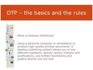
DTP – the basics and the rules What is Desktop Publishing? Using a personal computer or workstation to produce high-quality printed documents. A desktop publishing system allows you to use different typefaces, specify various margins and justifications, and embed illustrations and graphs directly into the text.
Which would rather you read? Exhibit A Exhibit B
White Space • Columns are one method that you can use to open up a document and create white space. (Adjusting the kerning, leading and margins are other ways to do this.) • White space helps to organize elements by setting them off from others. White space refers to the overall "colour" of a document. • The colour of a document a can also influence a reader to read it. Too little white space implies long boring dry reading.
How do columns define the design of a document? Newspapers tend to use four or five columns, while magazines tend to use three. Books normally use one or two columns. The number of columns you use gives the reader a message as to what type of material can be expected.
Which do you Prefer? Exhibit A Exhibit B
headlines are centred, text is flush left • Indents are "typewriter" wide • image is centred in the column • All of these unaligned objects create a messy page. • If the text is flush left, make the headlines line up! • On a type writer, the standard indent is five spaces. On a computer it is more like two. • Align your images with the text
Design Rules for DTP • Graphics - Images are used to attract the readers eye, and persuade them to read the publication. Therefore, photographs or graphics should accompany the text they support. • Graphics also help to break up long "gray" passages of text, to make it more palatable for the reader.
Revealed • Have you ever read an article in the newspaper where the image has nothing to do with the text? It is disconcerting, even downright annoying when the reader has to search for the meaning of the picture in the article that accompanies it.
Tips for Image Use: Make them • Relevant Use pictures to clarify key concepts and attract attention to them. • Consistent Unify your publication with your choice or treatment of pictures. You can give your pictures a consistent look in several ways. • can use a small palette of colours or a single accent colour, • a common graphic style • the same camera angle or point of view • consistent lighting. • the same filter effects to each image (Use Adobe Elements) • the same human models in a progressing story line. • Human Most people like to look at other people. Portraits of people will draw readers' attention, especially if the images are relevant and tell a story and perhaps do what you are suggesting.
Captions Captions help to explain pictures or images in a publication. Captions accompanying an image also draw the reader in and encourage them to read the publication.
Headline & Subheads • Headline - a brief, enticing summary of the article. Headlines help the reader to decide whether or not to read the document. Headlines should be short and concise so that the reader can get their meaning quickly. Headlines can be differentiated from the body text in two ways. They can be set in a contrasting typeface, or they can use the same type face in a larger size. • Subheads follow the headline, but are not part of the body copy. They provide more information that might entice the reader to the article. Pick out the headline and the sub head from the text below.
Botched Newspaper Headlines Headlines should be short and concise so that the reader can get their meaning quickly. • bold messages entice readers to purchase copies. • work within restrictions of time and space. • compact large-size print into narrow column widths. • brief messages must clearly state the theme of each story. • be attractive to the eye and catch the reader's attention. • a fraction of the time needed to come up with it.
Newspaper Ambiguity Ambiguity, having more than one meaning, may be a result of syntax or of semantics. Examples from Newspapers • Iraqi Head Seeks Arms • Prostitutes Appeal to Pope • Panda Mating Fails; Veterinarian Takes Over • Teacher Strikes Idle Kids • Miners Refuse to Work after Death • Juvenile Court to Try Shooting Defendant • Red Tape Holds Up New Bridges • Man Struck By Lightning Faces Battery Charge • Astronaut Takes Blame for Gas in Spacecraft • Kids Make Nutritious Snacks • Chef Throws His Heart into Helping Feed Needy • Hospitals are Sued by 7 Foot Doctors
Other Tips • Minimize the number of type faces. Follow the "Rule of 3" never more than 2 or 3 type faces on a single page. Try to choose type faces that reflect the nature of the publication. • Be consistent in placing and spacing! Line things up vertically and horizontally as much as possible. Align elements on your page as much as possible. Not having consistent spacing and alignment is the sure sign of an amateur layout artist. • Justification - Finally, in most instances in most publications, layout artists will "fully justify" their copy. Full justification means that the words are aligned both on the left side and on the right side as well. This eliminates the "jagged edge" which detracts visually from the layout of a piece.
Pull Quotes • Pull Quote - A pull quote is a short phrase, or quote taken from the article that appears in a larger font size. The use of a larger bolder element against smaller text creates interest for the reader. These also serve to break up long gray passages of text that are visually uninteresting. Look at this paragraph of text. Where does your eye go first?
Consistency: How Achieved Applying a specific font scheme and colour scheme for all of your company's publications gives them a uniform and consistent look. • Using a font scheme makes it very easy to change your publication if doesn't look the way you want. If you started with one, you can always change it, and it will make sure that every character, every heading, and every title stays within that scheme. • A colour scheme is basically the same idea it designates a certain colour for the various parts of your publication — text, headings, bullets, And just as with font schemes, you can create your own colour scheme. • The master page contains the design elements that you want to repeat on multiple pages. When you need to change the look of your publication (or just add an element), instead of having to do that on each and every page, you can update the master page. Master pages can contain a variety of design and layout elements, such as headers and footers, page dimensions, pictures, margins, and just about anything you can put on a page. • You can also create more than one master page. If you have a catalog that has the same elements on the front and back covers but want the pages inside to look different from the covers, you can create two masters — one for the covers and one for the inside pages.
Questions to ask. • Are readers persuaded to read the document. • Is it attention grabbing. • Is it attractive. • How crowded or busy is the page? • Is there too much or too little white space? • Is the colour scheme effective? • Is the text scheme effective? • Are the different elements of the layout suitably balanced? • Do the different elements line up where they are supposed to?

