Download
1 / 37
380 likes | 578 Vues
LESSON. 16. UNIT. 3 . Colour and the colour wheel (primary, secondary and tertiary colours). Characteristics of Colours. Hue, value, and intensity. SUMMERY OF LECTURE 15 Elements and principals of Design

E N D
LESSON. 16. UNIT. 3. Colour and the colour wheel (primary, secondary and tertiary colours). Characteristics of Colours. Hue, value, and intensity.
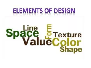
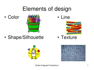
SUMMERY OF LECTURE 15 • Elements and principals of Design • Elements of Art and their importance. Line, shape, form, space, texture, Value and colour. • Lines and what they do in Art. • Types of lines. Vertical, horizontal, diagonal, zigzag and curved. • line variation, length, width and texture
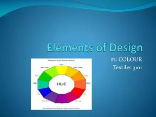
Basic Color Theory Color theory encompasses a multitude of definitions, concepts and design applications - enough to fill several encyclopedias. However, there are three basic categories of color theory that are logical and useful : The color wheel, color harmony, and the context of how colors are used. Color theories create a logical structure for color. For example, if we have an assortment of fruits and vegetables, we can organize them by color and place them on a circle that shows the colors in relation to each other.
The Color Wheel A color circle, based on red, yellow and blue, is traditional in the field of art. Sir Isaac Newton developed the first circular diagram of colors in 1666. Since then, scientists and artists have studied and designed numerous variations of this concept. Differences of opinion about the validity of one format over another continue to provoke debate. In reality, any color circle or color wheel which presents a logically arranged sequence of pure hues has merit.
There are also definitions (or categories) of colors based on the color wheel. We begin with a 3-part color wheel.
Primary Colors: Red, yellow and blueIn traditional color theory (used in paint and pigments), primary colors are the 3 pigment colors that can not be mixed or formed by any combination of other colors. All other colors are derived from these 3 hues. Secondary Colors: Green, orange and purpleThese are the colors formed by mixing the primary colors.Tertiary Colors: Yellow-orange, red-orange, red-purple, blue-purple, blue-green & yellow-greenThese are the colors formed by mixing a primary and a secondary color. That's why the hue is a two word name, such as blue-green, red-violet, and yellow-orange.
Color Harmony Harmony can be defined as a pleasing arrangement of parts, whether it be music, poetry, color, or even an ice cream sundae.In visual experiences, harmony is something that is pleasing to the eye. It engages the viewer and it creates an inner sense of order, a balance in the visual experience. When something is not harmonious, it's either boring or chaotic.
At one extreme is a visual experience that is so bland that the viewer is not engaged. The human brain will reject under-stimulating information. At the other extreme is a visual experience that is so overdone, so chaotic that the viewer can't stand to look at it. The human brain rejects what it can not organize, what it can not understand. The visual task requires that we present a logical structure. Color harmony delivers visual interest and a sense of order. In summary, extreme unity leads to under-stimulation, extreme complexity leads to over-stimulation. Harmony is a dynamic equilibrium.
Some Formulas for Color Harmony There are many theories for harmony. The following illustrations and descriptions present some basic formulas. A color scheme based on analogous colors Analogous colors are any three colors which are side by side on a 12 part color wheel, such as yellow-green, yellow, and yellow-orange. Usually one of the three colors predominates.
2. A color scheme based on complementary colors. Complementary colors are any two colors which are directly opposite each other, such as red and green and red-purple and yellow-green. In the illustration above, there are several variations of yellow-green in the leaves and several variations of red-purple in the orchid. These opposing colors create maximum contrast and maximum stability.
3. A color scheme based on nature. Nature provides a perfect departure point for color harmony. In the illustration above, red yellow and green create a harmonious design, regardless of whether this combination fits into a technical formula for color harmony.
More detailed explanation of COLOR WHEEL INTERMEDIATE/ TERITARY COLORS: A mixture of a primary and a secondary color. The primary color is always listed first followed by the secondary color. Examples include: Yellow-‐orange, yellow-‐green, blue-‐ green, blue-‐violet, red-‐violet, red-‐oran
COLOR WHEEL WARM COLORS: Warm colors are the yellows and reds of the color spectrum, associated with fire, heat, sun, and warmer temperatures; also called hot colors They are vivid in nature. They are bold and energetic. Warm colors are those that tend to advance in space;
therefore, caution needs to be taken so you do not overwhelm your content with eye catching hues. If an element in your design needs to pop out, consider using warm colors to do
COLOR SCHEMES examples ANALOGOUS: Colors next to each other on the color wheel Ex. Orange and Red Or COMPLIMENTARY: Colors across from each other on the color wheel. (opposites) When mixed in equal amounts gets a neutral gray. Ex. Red and G
COLOR SCHEMES MONOCHROMATIC: 1 Color with white and black added to it. “Mono” meaning one “Chromatic” meaning presence of color POLYCHROMATIC: All colors and variations. “Poly” meaning more than 1 “Chromatic” meaning presence of colour.
COLOR SCHEMES ACHROMATIC: Means “without color” A colorless scheme consisting of blacks, whites, and grays. May also be referred as neutral color
Characteristics of Colours. Hue, value, and intensity. Hue Tint Shade Tone Saturation Lightness Chroma Intensity / Luma Brightness / Luminance Grayscale In this section we have a look at the terminology of color properties and their meaning in different contexts. Color properties allow us to distinguish and define colors. The more we know about color properties, the better w e can adjust colors to our needs.
Hue Hue defines pure color in terms of "green", "red" or "magenta". Hue also defines mixtures of two pure colors like "red-yellow" (~ "orange"), or "yellow-green" (limitations to this statement will be addressed later). Hue is usually one property of three when used to determine a certain color.
Hue is a more technical definition of our color perception which can be used to communicate color ideas. Hue ranges from 0° to 359° when measured in degrees. Hues are basic colors we learn to connect with words as children. Hues can refer to the set of "pure" colors within a color space.
Tint Tint is a color term commonly used by painters. A tint is a mixing result of an original color to which has been added white. If you tinted a color, you've been adding white to the original color. A tint is lighter than the original color.
When used as a dimension of a color space, tint can be the amount of white added to an original color. In such a color space a pure color would be non-tinted. Other usage / meanings of tint: * A soft touch or shimmer of a different hue! * Hair color which doesn't fully cover natural hair color. It adds a touch of color which is supposed to wash out within five to eight weeks. * Car Window Tint: means of changing the color/transparency of car windows.
Shade Shade is a color term commonly used by painters. A shade is a mixing result of an original color to which has been added black. If you shaded a color, you've been adding black to the original color. A shade is darker than the original color. When used as a dimension of a color space, shade can be the amount of black added to an original color. In such a color space a pure color would be non-shaded.
Tone Tone is a color term commonly used by painters. There is a broader and a narrower definition of tone. The broader definition defines tone as a result of mixing a pure color with any neutral/grayscale color including the two extremes white and black. By this definition all tints and shades are also considered to be tones.
The narrower definition defines tone as a result of mixing a pure color with any grayscale color excluding white and black. By this definition a certain amount of white and black must have been added to the original color. Furthermore the following is true: If you changed the tonal value of a color, you've been adding gray (any ratio of mixture) to the original color
A tone is softer than the original color. Tone is not used as a dimension of a color space. Instead, the tonal difference consists of the amounts of white and/or black used to determine a certain color. Exception: Tone as a result of mixing an original color with a hue-scale color (e.g. brownscale / sepia).
Saturation Saturation is a color term commonly used by (digital / analog) imaging experts. Saturation is usually one property of three when used to determine a certain color and measured as percentage value. Saturation defines a range from pure color (100%) to gray (0%) at a constant lightness level. A pure color is fully saturated.
From a perceptional point of view saturation influences the grade of purity or vividness of a color/image. A desaturated image is said to be dull, less colorful or washed out but can also make the impression of being softer. We will clear up the term saturation from a color mixing point of view in the color spaces section.
Lightness Lightness is a color term commonly used by (digital / analog) imaging experts. Lightness is usually one property of three when used to determine a certain color and measured as percentage value. Lightness defines a range from dark (0%) to fully illuminated (100%). Any original hue has the average lightness level of 50%. A painter might say lightness is the range from fully shaded to fully tinted You can lighten or darken a color by changing its lightness value..
Chromatic Signal / Chromaticity / Chroma This family of color terms is commonly used by (digital / analog) imaging and video experts. In the previous section we learned that color perception is a result of achromatic and chromatic signals. We can therefore define a chromatic signal as the component of color perception that is not achromatic, i.e. any deviation from neutral-color perception (dark, grayscale, illuminated).
The chromatic intensity or chromaticity is the intensity of the chromatic signal contributing to color perception. Chromaticity is similar to saturation since color / an image with a low chromaticity value is not very colorful. Chroma is a component of a color model. There's a blue-yellow and a red-green chroma component.
Intensity / Luminosity / Luma In general, intensity is a synonym for magnitude, degree or strength. It can therefore be used in conjunction with any color property. Nevertheless, it carries special meaning in certain contexts. For painters the meaning of intensity is equivalent to the meaning of saturation. For physicists intensity refers to different aspects of radiation. When speaking of light, the intensity can mean the number of photons a light source emits.
The following sources provide a deeper insight: - Luminosity - Intensity - Luminosity Function - LumenLuma (%) is the intensity of the achromatic signal contributing to our color perception.
Brightness / (relative) Luminance Brightness is an attribute of our perception which is mainly influenced by a color's lightness. This is probably why brightness and lightness are often mixed up. Brightness is not a color property, if used "correctly". For one color of specific hue the perception of brightness is also more intense, if we increase saturation. A higher level of saturation makes a color look brighter.
In relation to other colors the brightness intensity of a color is also influenced by its hue. We can then speak of (relative) luminance to refer to brightness. It's very important to know more about luminance.
Grayscale A grayscale is a series of neutral colors, ranging from black to white, or the other way around. Each step's color value is usually shifted by constant amounts. A grayscale color can be determined by a value of a one-dimensional color space: On a white surface (e.g. paper) the grayscale color's value equals to the relative intensity of black (ink) applied to the medium.On a black surface (e.g. monitor) the grayscale color's value equals to the relative intensity of white (light) applied to the medium.
Summery of today's Lecture. 16 Unit.3. LESSON. 16. UNIT. 3. Colour and the colour wheel (primary, secondary and tertiary colours). Characteristics of Colours. Hue, value, and intensity.