Understanding Amgen's Economic Effect Through Effective Color Usage
60 likes | 173 Vues
This analysis explores the varying economic impacts of Amgen, utilizing color theory to enhance data representation. The use of monochromatic, analogous, and complementary colors is examined to identify their effectiveness in conveying information. While pie charts may not be the ideal choice for all data sets, alternative visual strategies are suggested to improve clarity and connection for viewers. By color-coding economic data, we can assist stakeholders in better understanding Amgen's influence on the economy.

Understanding Amgen's Economic Effect Through Effective Color Usage
E N D
Presentation Transcript
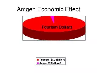
Amgen Economic EffectColors (not Monochromatic, Analogous, or complimentary)Information (not appropriate for pie chart. Difficult to relate the information to itself-What would help?)
Amgen Economic EffectColor-Monochromatic (Same color, but different hues)Information-Same presentation of information
Amgen Economic EffectColor-Analogous (Next to each other on color wheel)Information-On Graph and % added
Amgen Economic ImpactColor- Complimentary (opposite on color wheel)Information- Same