Download
1 / 4
40 likes | 79 Vues
Although technical SEO is a topic that only a few of us make use of it is an integral part of life. The Search Console messages have started appearing and sites are gradually switching over to the mobile-first indexing methodology. Any SEO technical checklist must contain parameters such as issues, mistakes, tips and recommendations. https://bit.ly/2NaArdx

E N D
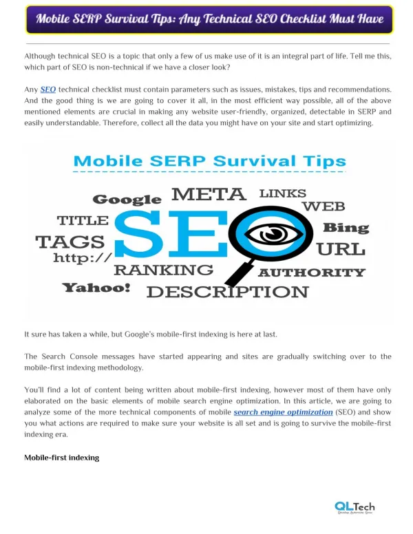
Although technical SEO is a topic that only a few of us make use of it is an integral part of life. Tell me this, which part of SEO is non-technical if we have a closer look? Any SEO technical checklist must contain parameters such as issues, mistakes, tips and recommendations. And the good thing is we are going to cover it all, in the most efficient way possible, all of the above mentioned elements are crucial in making any website user-friendly, organized, detectable in SERP and easily understandable. Therefore, collect all the data you might have on your site and start optimizing. It sure has taken a while, but Google’s mobile-first indexing is here at last. The Search Console messages have started appearing and sites are gradually switching over to the mobile-first indexing methodology. You’ll find a lot of content being written about mobile-first indexing, however most of them have only elaborated on the basic elements of mobile search engine optimization. In this article, we are going to analyze some of the more technical components of mobile search engine optimization (SEO) and show you what actions are required to make sure your website is all set and is going to survive the mobile-first indexing era. Mobile-first indexing
What does Google intend to do with “mobile-first indexing? Regardless of most of the SEOs might be believing, Google has not developed a separate index for mobile search. Whether any site applies the mobile-first indexing approach or not, Google will still serve the search results from the common index of the Internet. Now you might be asking then what the difference is. Well intrinsically, only there is one factor that has really changed: Instead of crawling websites with a desktop user-agent, Google will be crawling the websites with a mobile user-agent. Delivering mobile-optimized experiences With this mobile user-agent, what Googlebot sees is greatly dependent on how your website is configured to handle mobile usage. Delivering mobile-optimized experiences tends to take place in one of the three ways: 1. Responsive design: With this method, nothing really changes. Your website’s uniform resource locators (URLs) remain as they are, and the Hyper Text Markup Language (HTML) code implemented is identical as well. This type of website’s design will adapt to the size of the screen it is being viewed on, delivering a mobile experience catering to the device’s specific screen resolution. Google recommends responsive design as its preferred design pattern, as it requires the least effort from their end; there is no extra code to index and no additional URLs for crawling. 2. Dynamic Service: A lot of times websites detect the user-agent when a page is being loaded and provide a different HTML code on the same URL with respect to the type of device that’s being used. This is called dynamic serving. It is the same URL, different HTML code, one for desktop users and another one for the mobile users. 3. Unique mobile URL: In this approach, a website will provide different code to mobile users as well and will also use different URLs for its mobile site. Often a website serves its mobile content from a separate subdomain, like m.website.com, www.website.com/mobile/. a or from different subfolder like Each of these mobile design methodologies have their own strengths and weaknesses. But for SEO purposes, having a responsive design tend to present the least hassle, whereas in dynamic serving and separate mobile URLs can cause many problems for the technical SEO of your website. But by just having a fully responsive site doesn’t mean your work is complete. Even if your responsive site gets a green mark on Google’s Mobile-Friendly Test, this doesn’t mean you don’t have anything to fear from mobile-first indexing.
There are still some elements of technical SEO and general optimization you need to know in order to fix your site. If your site uses the dynamic serving or separate mobile URLs, there might be quite a lot of work cut out for you in ensuring that your website continues to perform consistently. Consistent On-page SEO Firstly, you will need to make sure your on-page SEO is up to the mark on your mobile site. In a responsive design, this is not an issue, as mobile and desktop pages are basically the same. However, if your site is using dynamic serving or separate mobile URLs, it’s crucial to double-check your on-page SEO, here are few must have for on page: ● Whether you have optimized title tags and meta-descriptions? ● Does your page have a strong headline? ● Is your content the matching with your desktop version? Once your website is switched to mobile-first indexing, Google will check mobile site for indexing and ranking. If your mobile site is not on the same level in on-page SEO as your desktop site, you can expect your site ranking going down. Importance of Structured data Along with basic on-page SEO elements, you will also need to keep structured data in mind as well. Your website might have structured data embedded in your desktop pages that can result in rich snippets in Google’s search results. If this structured data isn’t there on your mobile site, you could be losing those rich snippets and the click-through rates. You must ensure that any structured data markup that’s there on your desktop site is also present on your mobile site. Use Google’s structured data testing tool to verify the markup, and keep a special look out for structured data report in Google Search Console for potential errors and warnings. Must have Pagination A lot of times, for a smooth mobile user experience, websites might not paginate content the same way for mobile users as it does for desktop. Instead of links to deeper pages, your mobile site may be using infinite scrolling or does not bother with pagination at all and just display limited content. In this case, you must fix this before the website is to be switched to mobile-first indexing. Lacking of pagination or the wrong implementation, means that the Googlebot won’t index beyond the first page of paginated content. And what the Googlebot can’t see, it cannot crawl and this could eminently lead to your site dropping out of the Google’s index entirely.
So make sure your pagination is done properly on mobile site, with completely crawlable pagination URLs. On top of that, your website might be using pagination Meta tags to indicate paginated content. With rel=prev and rel=next, you can signpost that, like lists of products or an article spread out over multiple pages. When using dynamic serving or separate mobile URLs, you need to ensure your pagination Meta tags are present on mobile as well as on desktop. Company Name Address Facebook Twitter Google+ Instagram Quora Website :QL Tech : QL Tech - 45 St Georges Terrace, Ground Floor, Perth, 6000 :https://www.facebook.com/QLTechAU/ :https://twitter.com/qltechaustralia :https://plus.google.com/+QLTechPerth :https://www.instagram.com/qltechau/ :https://www.quora.com/profile/QL-Tech-Australia : https://www.qltech.com.au/