Download
1 / 4
40 likes | 51 Vues
Handle the color saturation in book printing process is an important part.<br>If we cannot monitor the color saturation, it will lead to color difference in book printing directly.

E N D
How to handle color saturation of book printing in China Handle the color saturation in book printing process is an important part. If we cannot monitor the color saturation, it will lead to color difference in book printing directly. Control color saturation from two dimensions: 1.Depth the basic primary colors 2.Deep basic color keeps gradation
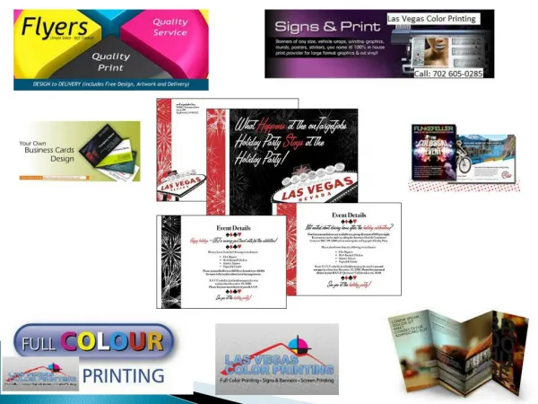
Color saturation is a very important part of the printing process. If the color saturation is not controlled, it will directly cause the color difference of the book. The so-called chromatic aberration means that in book printing process, the colors of the printed product and the sample are often inconsistent, or the color mixing failure after the pattern is superimposed, which affects the quality of the product, and the whole batch of products is scrapped. Color difference, also called deviation, is one of the typical quality defects in the printing process Therefore, it finally will affect the finished product, especially in the printing of magazines, product catalogs, children's books, photo books, etc., because these books most need is the brightly colored illustrations to express the work and express author’s emotions. In a serious situation, the entire batch of products will be scrapped and redone. So, how to handle color saturation and avoid color difference in printing? Let’s see!
1.Depth the basic primary colors. 1)Make all kinds of solid color blocks, such as red, green, blue and other colors of the header words and logos, and the depth of the basic colors that do not require layers. General, book printing was required strong and bright colors for the words and logos by customers. In theory, it is to give full play to the maximum solid density of the offset printing ink to achieve the maximum saturation. 2)The blue sky, ocean, green leaves, lawn and other colors in landscape photography images, because in people’s minds has formed a fixed concept. Therefore, in principle, the color amount of C version should be darker on the basis of the required color amount of the hue when color processing, and green leaves, lawns and other greens are also in Y version, making the green saturated and vivid. For the basic colors of red, green, and blue that require gradation, according to the color cast and gray characteristics of general offset printing inks, the optimal saturation configuration is: Red=M95%+Y85% Green=Y95%+C85% Blue=C95%+M80%
2. Deep basic color keeps gradation 1) The dot gradation range of the deep basic color is 65% to 90%. Since the dots above 80% increase more, the levels are easy to merge. Therefore, the basic color of the level is needed for this area. The level should be maintained under the premise that the density of the field is sufficient, and the saturation of the field density cannot be emphasized, resulting in the level of the basic color. The depth of the basic color that needs to be layered, the focus is to moderately reduce the color volume of more than 80% of the area, so that it is separated from the solid color block, so that the book printing in China can not only print the solid density, but also maintain the gradation. 2)The hierarchical texture in the deep basic colors is mainly represented by the main color plate, such as warm colors such as red and orange: it is represented by the Y and M color plates; the cool colors such as green and cyan are represented by the C color plate. Therefore, the layered texture of the main color version must be emphasized, and the characteristics of the layered texture of the real object must be vividly displayed. 3)The basic color of the mid-tone area is sufficient. In the mid-tone area, the dot tone value ranges from 35% to 65%, which is the main part of most objects and the key area for color processing. To adjust the basic color of this area to the best saturation, the key is to deepen it by about 5% on the basis of the required color volume of the hue. For example, safflower, the light and mid-tone M color requires a color volume of 40%. It can be deepened to 45% to make the red more saturated and vivid.