Download
1 / 41
410 likes | 429 Vues
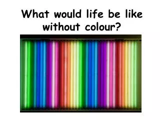
Learn how color can enhance user experience, improve task performance, and convey emotions effectively in design. Dive into the dimensions of color and guidelines for optimal visual communication.

E N D
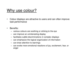
Why use colour? • Colour displays are attractive to users and can often improve task performance • Benefits: • various colours are soothing or striking to the eye • can improve an uninteresting display • facilitates subtle discriminations in complex displays • can emphasize the logical organization of information • can draw attention to warnings • can evoke more emotional reactions of joy, excitement, fear, or anger
DANGER! • Inappropriateuseofcolourcanbedisasteroustotheapplication
Red Green Yellow Blue Orange Black
Red Green Yellow Blue Orange Black
Colour Dimensions • Hue, Intensity and Saturation • hue is the spectral wavelength composition of a colour that produces it’s perception of being blue, orange, green, etc. • blue short-wavelength, green medium-wavelength, red long-wavelength • average human can discriminate approximately 150 hues • intensity is the relative amount of lightness or darkness of the colour in a range from black to white (also known as value) • saturation is the purity of the colour in a scale from gray to the most vivid variant of the perceived colour (also known as chroma)
Colour Dimensions • RGB (Red, Green, Blue) • CIE (International Commission on Illumination) • responsible for maintaining color standards, based on the concept of a standard observer. This standard observer is in turn based on a model of the human rods and cones. However, the model does not take adaptation or contrast into account which is why the CIE system has little to do with the appearance of colors.
Colour terminology • Brightness • subjective reaction to levels of light • affected by luminance • Luminance • luminance is the amount of light emitted by an object • dependent on the amount of light falling on the object’s surface and its reflective properties • Contrast • a function of the luminance of the object and the luminance of its background
Hue, Shade, and Tint • hue is what we call colour in its purist form • shade of a colour is what that colour would look like if the light were shaded from it, or black added to it, • tint is what we get when a colour is diluted with white.
Colour Guidelines • Physiological guidelines: (1) avoid simultaneous display of highly saturated, spectrally extreme colours (2) avoid pure blue for text, thin lines and small shapes (3) avoid adjacent colours, differing only in the amount of blue (4) older viewers need higher brightness levels to distinguish colours (5) colors change appearance as ambient light level changes (6) magnitude of a detectable change in colour varies across the spectrum (7) difficulty in focusing results from edges created by colour alone (8) avoid red and green in the periphery of large-scale displays (9) opponent colours go well together (red/green or yellow/blue) (10) For colour-deficient observers, avoid single colour distinctions.
Colour Guidelines • Perceptual guidelines: (11) not all colours are equally discernible (12) luminance does not equal brightness (13) different hues have inherently different saturation levels (14) lightness and brightness are distinguishable on a printed hard copy, but not on a colour display (15) not all colours are equally readable or legible (16) hues change with intensity and background colour (17) avoid the need for colour discrimination in small areas
Colour Guidelines • Cognitive guidelines: (18) do not overuse colour (19) be aware of nonlinear colour manipulation in video and hard copy (20) group related elements by using a common background colour (21) similar colours connote similar meanings (22) brightness and saturation draw attention (23) link the degree of colour change to event magnitude (24) order colours by their spectral position (25) warm and cold colours should indicate action levels
Colour Guidelines • Color Graphics -- Blessing or Ballyhoo (Excerpt) • G. Murch • Physiological guidelines: #1 avoid simultaneous display of highly saturated, spectrally extreme colours • reds, oranges, yellows, and greens can be viewed together without refocusing • cyan and blues cannot easily be viewed simultaneously with red • avoid extreme colour pairs such as red and blue or yellow and purple • de-saturating spectrally extreme colours will reduce the need for refocusing
Physiological Guidelines #2 avoid pure blue for text, thin lines and small shapes • our visual system has trouble with detailed, sharp, short-wavelength stimuli • however, makes a good background colour and is perceived easily in the periphery Good Background Colour
Physiological Guidelines #3 avoid adjacent colours, differing only in the amount of blue • edges will appear indistinct
Physiological Guidelines #4 older viewers need higher brightness levels to distinguish colours #5 colours change appearance as ambient light level changes • displays change colour under different types of light (fluorescent, incandescent, or daylight) • appearance also changes as light level is increased or decreased • change occurs because of an increased or decreased contrast and due to the shift in the sensitivity of the eye
Physiological Guidelines #6 magnitude of a detectable change in colour varies across the spectrum • small changes in extreme reds and purples are difficult to detect. • Our visual system does not perceive changes in green very well.
Physiological Guidelines #7 difficulty in focusing results from edges created by colour alone • multi-coloured images should be differentiated on the basis of brightness as well as colour
Physiological Guidelines #8 avoid red and green in the periphery of large-scale displays • due to the insensitivity of the retinal periphery to red and green, these colours in saturated form should be avoided, especially for small symbols and shapes • yellow and blue are good peripheral colours
Physiological Guidelines #9 opponent colours go well together • good: red/green or yellow/blue • bad: red/yellow or green/blue
Physiological Guidelines #10 for colour deficient observers, avoid single colour distinctions • colour blindness is a lack of perceptual sensitivity to certain colours • colour blindness comes as a result of a lack of one or more of the types of colour receptors • most colour perception defects are for red or green or both • about 10% of males have a colour perception defect, but this is rare in females • red-green colour blindness is a result of a lack of red receptors • yellow-blue is the second most common form, but it's extremely rare.
Perceptual Guidelines #11 not all colours are equally discernible • perceptually we need a large change in wavelength to perceive colour difference in some portions of the spectrum and a small one in other portions
Perceptual Guidelines #12 luminance does not equal brightness • two equal-luminance but different hue colours will probably appear to have different brightness • deviations are most extreme for colours towards the end of the spectrum (red, magenta, blue)
Perceptual Guidelines #13 different hues have inherently different saturation levels • for example, yellow always appears less saturated
Perceptual Guidelines #14 lightness and brightness are distinguishable on a printed hard copy, but not on a colour display • the nature of a colour display does not allow lightness and brightness to be varied independently
Perceptual Guidelines #15 not all colours are equally readable or legible • extreme care should be taken with text colour relative to background colours • there is a loss in hue with reduced size • there is inadequate contrast when the background and text colours are similar • general rule: • darker, spectrally extreme colours such as red, blue, magenta, brown, etc. make good background colours • brighter, spectrally-centered, and de-saturated hues produce more legible text
Perceptual Guidelines #16 hues change with intensity and background colour • when grouping elements by colour, make sure that backgrounds or nearby colours do not change the hue of an element • limit the number of colours and make sure they are widely separated in the spectrum
Perceptual Guidelines #17 avoid the need for colour discrimination in small areas • hue information is lost in small areas • human visual system produces sharper images with achromatic colours • for fine detail it is best to use black and white and grey • use chromatic colours for larger panels or for attracting attention
Cognitive Guidelines #18 do not overuse colour • benefits of colour as an attention getter, information grouper, and value assigner are lost if too many colours are used • limit displays to about six clearly distinguishable colours 5 different colours 9 different colours
Cognitive Guidelines #19 be aware of non-linear colour manipulation in video and hard-copy • algorithms do not exist for translating the physical colours of an imaging device into a perceptually structured colour set • The primary colours of illuminated light combine additively, while the primary colours of pigment combine subtractively.
Cognitive Guidelines #20 group related elements by using a common background colour • a successive set of images can be shown to be related by using the same background colour
Cognitive Guidelines #21 similar colours suggest similar meanings • can convey the message through the degree in similarity of hue • The colour range from blue to green is generally seen as more similar than the range from red to green.
Cognitive Guidelines #22 brightness and saturation draw attention
Cognitive Guidelines #23 link the degree of colour change to event magnitude
Cognitive Guidelines #24 order colours by their spectral position • red, orange, yellow, green, blue, indigo, violet
Cognitive Guidelines #25 warm and cold colours should indicate action levels • warm (long-wavelength) signifies an action or the requirement of a response • cool signifies status or background information
Colour attracts your attention 85689726984689762689764358922659865986554897689269898 02462996874026557627986389045679232769285460986772098 90834579802790759047098279085790847729087590827908754 98709856749068975786259845690243790472190790709811450 85689726984689762689764458922659865986554897689269898 85689726984689762689764358922659865986554897689269898 02462996874026557627986389045679232769285460986772098 90834579802790759047098279085790847729087590827908754 98709856749068975786259845690243790472190790709811450 85689726984689762689764458922659865986554897689269898
HCI Guidelines for Colour • Use colour conservatively • Limit the number of colours • recognize the power of colour as a coding technique • ensure that colour coding supports the task • have colour coding appear with minimal user effort • place colour coding under user control • design for monochrome first • consider the needs of colour-deficient users • use colour to help in formatting • be consistent in colour coding • be alert to common expectations about colour codes
HCI Guidelines for Colour • Be alert to problems with colour pairings • use colour changes to indicate status changes • use colour in graphic displays for greater information density