Chart
Today you will: Interpret or solve real world problems using data from charts , (dot) line plots, stem-and-leaf plots, double-bar graphs, line graphs, (box plot) box-and-whisker plots, scatter plots, frequency tables or double line graphs . . Chart. Line Plot Dot Plot.

Chart
E N D
Presentation Transcript
Today you will:Interpret or solve real world problems using data from charts, (dot)line plots, stem-and-leaf plots, double-bar graphs, line graphs, (box plot)box-and-whisker plots, scatter plots, frequency tables or double line graphs.
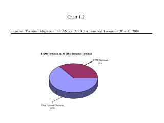
Box & Whisker Plot Movie Ratings
Frequency Table 1 What percent of total injuries were football related? What percent of total injuries were either skating/hockey or track and field? 3.
Frequency Table 2 How many people attended the reunion that were teenagers or younger? What percent of the total number of attendees were 70 or older? 3.
Chart 1 Which car has the fastest acceleration? Which car has the slowest acceleration? What would be a good estimate of how long it would take Car A to go from 0 to 45 mph? Acceleration is the rate at which a car’s speed increases. The faster a car reaches a certain speed, the faster it’s acceleration.
Chart 2 Between which two years was the percent of increase in population the greatest? What was the percent of increase from 1950 to 2000? How many more people lived in the US in 2000 than 1990?
Stem and Leaf Plot 1 Which has a higher median speed, the predator or non-predator? What are the slowest and fastest speeds recorded for each? What is mode speed recorded for each?
Stem and Leaf Plot 2 What is the median of the data? What is the mode of the data? What percent of students spent less than an hour on the internet? Ms. Jones took a poll about the daily amount of time spent on the internet. The number of minutes spent on the internet is recorded below for the students polled.
Line or Double Line Graph 1 Between what years did both countries have their greatest increase? Between what years did the US have a decrease but China had an increase? Between what years did both countries have a similar increase?
Line or Double Line Graph 2 If Shane weighs 140 lbs and does each activity for 10 minutes, approximately how many calories would he burn? According to this graph, no matter the person’s weight, which activity burns the most calories in 10 minutes? A person burning approximately 90 calories in 10 minutes while swimming would weight about how much?
Double Bar Graph 1 What sales trend can be observed in the graph? What percent of total sales were hamburgers during week 1? What percentage of total sales were hamburgers during week 4?
Double Bar Graph 2 How many people attended the family reunion according to the graph? How many more people had the last name of Roberts than Brown? What percentage of the females had the last name O’Hara?
Pie Graph 1 A youth group raised a total of $1983 for a local homeless shelter. The youth director made the circle graph below but forgot to include a legend. If the bake sale raised $318, which sector belongs to the bake sale? If the car wash earned the most money, how much did it earn? If the candy bar sale raised nearly one quarter of the money, which sector represents the candy bar sale?
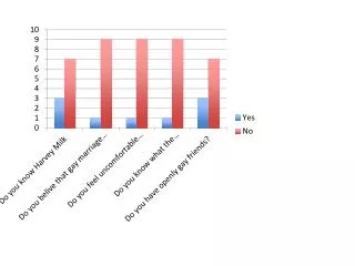
Pie Graph 2 How many people considered their mom as the true female superhero? What percentage of people felt that Oprah Winfrey was a true female superhero ? How many more adults selected Oprah Winfrey than Hilary Clinton?
Line Plot 1 What is the mode of the data? What is the median of the data? What percent of the data falls above 11?
Box & Whisker Plot 1 About what percent of Alaska’s population is under 30? About what is the median age in Florida? 3.
Box & Whisker Plot 2 What was the highest number of homeruns hit by McGwire? Who had the higher median of homeruns? 3.
Scatter Plot 1 Does the data show a strong or weak correlation? Why? Does the data show a positive or negative correlation? Why?
Scatter Plot 2 Does the data show a strong or weak correlation? Why? Does the data show a positive or negative correlation? Why? 3.