V A L U E in drawing
260 likes | 286 Vues
Learn about value in drawing, from defining form with light and shadow to using gradations for three-dimensionality. Discover tips to master value, shift from outlines to tones, and experiment with chiaroscuro.

V A L U E in drawing
E N D
Presentation Transcript
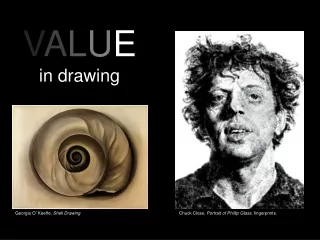
VALUEin drawing Georgia O’Keeffe, Shell Drawing Chuck Close, Portrait of Phillip Glass, fingerprints.
What is value? Cup your palms. Light and shadow define form. Shadows, highlights and mid-tones allow us to see objects in their three dimensionality. In drawing, we use gradations of tone from light to dark to create the illusion of form and to describe the direction and flow of light. Value refers to the relative lightness or darkness of a perceived surface. Looking into your cupped palms, where are the darkest darks? The lightest lights? Can you find a mid-tone?
WARNING! The enemy of value is a harsh outline. A strong, unbroken outline will flatten a sphere into a circle. • Beginners usually rely too much on harsh outlines. Outlines just define the visible edge of a shape; they don’t tell us about the effect of light • To shift away from outlining and shift toward using value: • Try beginning with soft and/or wide media such as charcoal, conte crayon or pastel chalk. • * Use the softest pressure you can when first sketching out a shape. • * Seek compositions in which the form is not completely isolated on the paper, but emerges from the sides or completely fills the paper (thus doing away with edges).
There are no lines here. Volume as pure tone can provide a sharp distinction of figure and ground. George Seurat, charcoal
Usually it Is best for the student to first explore their ability to make a wide range of tonalities with a particular medium (ink, charcoal or soft pencil.) For your first experiment use pressure and density of stroke to establish a light tone, mid-tone and dark tone. Now you are ready to try a drawing using three values.
Student drawing with three values. When working with a small number of values it is useful to divide the form into value shapes. You can usually see these shapes of value in objects if you squint. It helps to use a single light source.
Value shapes can be soft rather than hard edged. Chalk or charcoal can give you soft fields of value like these achieved by Marvin Cherney
Chiaroscurois an Italian term dating from the Renaissance that literally means “light dark.” It is commonly used to describe a drawing technique in which dramatic light establishes a broad range of tones that gradually transition from light to dark. Chiaroscuro shows the roundness of forms and is considered the most sculptural style of drawing. Leonardo da Vinci: Study of the drapery for the Madonna With Saint Anne, High Renaissance.
LightArtists have experimented with a wide variety of lighting, from candles to full sun. Leonardo da Vinci wrote that the perfect way to illuminate the head of a young woman was to seat her in a courtyard with high walls painted black and direct sunlight diffused by a muslin canopy. We don’t know if Leonardo ever followed his own advice and created such an environment, but his drawings suggest such an idealized setting. Light sources can be observed, created or even imagined.Students should experiment with a variety oflight situations, but do keep in mind that a very bright light flattens forms. You should alsoavoid ambient light (light that appears to comefrom all directions). Ambient light, such as thatfrom fluorescent bulbs, washes out forms. Leonardo da Vinci, Head of a Young Woman, charcoal and chalk, High Renaissance
To introduce students to chiaroscuro drawing teachers often direct a single soft light source onto simple white shapes such as spheres, cones or square boxes. In such a controlled environment, the area of the object directly in the path of the light source (perpendicular to the light source) will be the lightest tone. We call this area the highlight. The areas blocked from the light source are usually the darkest. Blocked light = shadow. The areas parallel to the light source are usually mid-tones. Because objects usually exist in relation to grounds or other objects, reflection also affects value.
Claudio Bravo Craneo de elefante In more complex forms, texture and irregular surfaces create a range of shadows, highlights and mid-tones.
Several factors affect the amount of light reflected off a surface. The first is the amount and quality of illumination on a surface. Another factor is the texture of a surface. A smooth surface will have brighter and more clearly defined highlights than a rough surface. A toilet lid will have a strong highlight. A dead deer’s fur will have a more diffused highlight. Antonio Lopez Garcia Andrew Wyeth
Chiaroscuro emphasizes form with little respect to color. A red dress looks the same as a white dress in a chiaroscuro drawing. In the 19th and 20th centuries artists became increasing interested in using value to depict color. Artists recorded impressions of both form and color in sketches that depicted transitory moments. Looking at this pencil sketch by Yasuo Kuniyoshi (1930) we can tell that the subject’s dress and hat are darker than her skin. The handling of value Is also much looser suggesting not sculptural permanence but a fleeting moment. In the more lengthy 1875 study by Edgar Degas to the right we clearly get a sense of the tonal palette of the sitter’s clothes and hair.
A dark, saturated color will reflect less light than a pale surface. This inherent tonality of an object, separate from the amount of light or the effects of texture, is called: local value. Squint at this photograph of a green pepper, a tomato and an onion. The green pepper, except for the highlights and shadows, will register as a dark mid-tone. A tomato may fall right in the middle of the value scale and the onion will be among the lightest mid-tones. Each vegetable has a distinct local value.
Nine Part Value Scale With Mid-Tone Core A wide range of values may be required for nuanced drawings that take into account the local value of color or that attempt the dramatic effects of chiaroscuro. Below is a nine part value scale. The middle tone has been extended across the range of tones. Note how much lighter the middle tone appears when set against the darkest value. The same mid-tone will appear significantly darker against the lightest value. Every value is relative, defined by its relation to other values. Try making your own nine part value scale with a mid-tone stripe.
Charles Sheeler, Feline Felicity, 1934, black crayon on paper. Sheeler’s drawing uses a wide range of values to depict the interplay of sun and shadow on a striped cat.
Tonal Key After you have the ability to make a wide range of values, you may want to experiment with using a portion of the value scale. A high or light tonal key ranges from white to middle gray A middle tonal key selects from within the middle range of the value scale. A low or dark tonal key takes from the dark half of the value scale Accents of strong darks or lights can be added to limited tonal drawings to express extreme highlights or shadows.
A silverpoint drawing in a high (light) tonal key that ranges from white to middle gray, John Wilde, Design For Parade V, 2002.
A low (dark) tonal key drawing with strong lights as contrast. Gustave Courbet, Self Portrait, charcoal on paper.
Use high contrast of light and dark to push a form forward. Use closely grouped values (low contrast) to encourage a form to recede. Claudio Bravo’s drawing divides the skull almost in half, with the right side depicted in a high (light) tonal scale and the left in a mid to low (dark) tonal scale. Areas of low contrast between light and dark tend to recede, therefore the back of both sides of the skull which show closely grouped tones recedes while the front of the skull where the two tonal keys meet and contrast extends forward.
Now it’s safe to come back to line. Optical Grays With pastel, charcoal or ink wash the artist can make solid gray tones. Other media, such as pen and ink, pencil, silverpoint and markers can be used to create optical grays. Optical grays are the result of hatched or crosshatched lines that the eye involuntary blends to produce a tone. Try making a crosshatch and linear value scale.
Gaspard Dughet (1615-1675), red chalk drawing showing the use of hatched lines to create a range of value
Gestural Crosshatching Cross hatched lines need not be straight or evenly applied. Curving, massed crosshatched lines like these by Henry Moore can create an illusion of texture and rounded forms. Henry Moore, The Artist’s Hands,c.1974, carbon line, charcoal, colored crayon, chinagraph, and ball point pen. Henry Moore, Women Winding Wool, 1949, watercolor, crayon and brush
Curvilinear value lines. Nicola Hicks, Love Me Like A Rock, 1989, chalk and charcoal Direct observation of value can lead to more Imaginative and metaphoric drawings that have a convincing sense of light and mass.
Value as solid tone is often combined with gestural marks and hatched lines. Your final project will combine tonal and linear value and use at least two media. You may complete this assignment on ArtRage or with your hands and tools. Conclusion Robert Arneson, The French Connection, 1991, conte on paper