Download
1 / 46
530 likes | 916 Vues
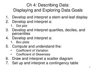
Business Statistics: A Decision-Making Approach 7 th Edition. Chapter 2 Graphs, Charts, and Tables – Describing Your Data. Chapter Goals. After completing this chapter, you should be able to: Construct a frequency distribution both manually and with a computer

E N D
Business Statistics: A Decision-Making Approach 7th Edition Chapter 2Graphs, Charts, and Tables – Describing Your Data
Chapter Goals After completing this chapter, you should be able to: • Construct a frequency distribution both manually and with a computer • Construct and interpret a histogram • Create and interpret bar charts, pie charts, and stem-and-leaf diagrams • Present and interpret data in line charts and scatter diagrams
Chapter Focus • First time trying practices using Excel • Practices are simple….not strongly fun • Try to be familiar with Excel • Describe data using frequency distribution and relative frequency distribution. • Discrete • Continuous • Present data using a chart • Universal and popular way: Histogram
Detail View Data Quantitative Data Qualitative Data Tabular Methods Graphic Methods Tabular Methods Graphic Methods 1) Dot Plot 2) Histogram 3) Ogive 4) Stem & Leaf Display 5) Scatter Diagram Charts: 1) Column 2) Pie 1) Frequency Distr. 2) Relative/Percent Frequency Distr. 3) Cumulative Frequency Distr. 4) Cumulative Relative/Percent Frequency Distr. 5) Crosstabulation • 1) Frequency Distr. 2) Relative/Percent Frequency Distr. • 3) Crosstabulation
Frequency Distribution (FD) • It is a tabulation of the values.. • Each entry in the table contains the frequency or count of the occurrences of values within a particular group or interval, • and in this way the table summarizes the distribution of values in the sample.
Why Use FD? • A frequency distribution is a way to summarize data • The distribution condenses the raw data into a more useful form... • and allows for a quick visual interpretation of the data
Frequency Distribution: Discrete Data • Discrete data: possible values are countable Example: An advertiser asks 200 customers how many days per week they read the daily newspaper.
Relative Frequency Relative Frequency: What proportion (%) is in each category? 22% of the people in the sample report that they read the newspaper 0 days per week
Practice • Develop FD using Discreet Data • Download the “SportShoes” Excel data file from the class website • Make sure to download and SAVE the data file. • See the note (ppt).
Frequency Distribution: Continuous Data • Continuous Data:uncountable…..may take on any value in some interval Example: A manufacturer of insulation randomly selects 20 winter days and records the daily high temperature • (Temperature is a continuous variablebecause it could be measured to any degree of precision desired – 98.58697 F) 24, 35, 17, 21, 24, 37, 26, 46, 58, 30, 32, 13, 12, 38, 41, 43, 44, 27, 53, 27
Grouping Data by Classes Sort raw data from low to high (easy using Excel): 12, 13, 17, 21, 24, 24, 26, 27, 27, 30, 32, 35, 37, 38, 41, 43, 44, 46, 53, 58 • Find range: 58 (Max) – 12 (Min) = 46 (use for class width) • Determine number of classes: • Rule of thumb: between 5 and 20 • Calculation of class: follow 2^k>= n (n=20) • Two to the power of four and five (in Excel: 2^4=16and 2^5=32). Then, take 5. • Thus, there should be 5 classes.
Grouping Data by Classes • Compute class width: 10 (46/5 = 9.2 then round off 10) • Determine intervals:10, 20, 30, 40, 50 • (Sometimes class midpoints are reported: 15, 25, 35, 45, 55 – if calculation result is 13.5) • Construct frequency distribution • count number of values in each class Largest Value - Smallest Value W = Number of Classes
Frequency Distribution Data from low to high: 12, 13, 17, 21, 24, 24, 26, 27, 27, 30, 32, 35, 37, 38, 41, 43, 44, 46, 53, 58 Frequency Distribution ClassFrequency Relative Frequency 0 or 12 is also OK 10 but under 19.99 3 .15 20 but under 29.99 6 .30 30 but under 39.99 5 .25 40 but under 49.99 4 .20 50 but under 59.99 2 .10 Total 20 1.00
Histogram based on FD Data in ordered array: 12, 13, 17, 21, 24, 24, 26, 27, 27, 30, 32, 35, 37, 38, 41, 43, 44, 46, 53, 58 No gaps between bars, since continuous data 0 10 20 30 40 50 60 Class Endpoints Class Midpoints
Histogram • The classesorintervals are shown on the horizontal axis • frequency is measured on the vertical axis • Bars of the appropriate heights can be used to represent the number of observations within each class • Such a graph is called a histogram
How Many Class Intervals? • Many (Narrow class intervals) • may yield a very jagged distribution with gaps from empty classes • Can give a poor indication of how frequency varies across classes • Few (Wide class intervals) • may compress variation too much and yield a blocky distribution • can obscure important patterns of variation. (X axis labels are upper class endpoints)
General Guidelines • Number of Data Points Number of Classes under 50 5 - 7 50 – 100 6 - 10 100 – 250 7 - 12 over 250 10 - 20
Practice • Develop FD using continuous data • Download the “Capital Credit Union” Excel file from the class website • See the note (ppt).
Joint Frequency Distribution • What does the credit card balance distribution look like from male versus female cardholder? • Conventional way: Develop F.D. and Hist. for each gender separately • Better way: joint the two variables (M/F) using joint frequency distribution…much easier to compare two different variables • See the next slide
Practice • Develop JFD and relative JFD using “Capital Credit Union” Excel file and then develop other types (i.e., charts, diagram) using “Bach, Lombard, & Wilson” Excel files • See the note (ppt).
Ogives • An Ogive is a graph of the cumulative relative frequencies from a relative frequency distribution • Ogivesare sometime shown in the same graph as a relative frequency histogram
Ogives (continued) 12, 13, 17, 21, 24, 24, 26, 27, 27, 30, 32, 35, 37, 38, 41, 43, 44, 46, 53, 58 Add a cumulative relative frequency column: Frequency Distribution Cumulative Relative Frequency Relative Frequency ClassFrequency 10 but under 20 3 .15 .15 20 but under 30 6 .30 .45 30 but under 40 5 .25 .70 40 but under 50 4 .20 .90 50 but under 60 2 .10 1.00 Total 20 1.00
Ogive Example / Ogive 100 80 60 40 20 0 Cumulative Frequency (%) 0 10 20 30 40 50 60 Class Endpoints Class Midpoints
Ogives in Excel Excel will show the Ogive graphically if the “Cumulative Percentage” option is selected in the Histogram dialog box
Other GraphicalPresentation Tools ** Try the rest of them by yourself ** Qualitative(Categorical) Data Quantitative(Numerical)Data Bar Chart Pie Charts Stem and Leaf Diagram
Bar and Pie Charts • Bar charts and Pie charts are often used for qualitative (category) data • Height of bar or size of pie slice shows the frequency or percentage for each category
Bar Chart Example 1 (Note that bar charts can also be displayed with vertical bars)
Pie Chart Example Current Investment Portfolio Investment Amount Percentage Type(in thousands $) Stocks 46.5 42.27 Bonds 32.0 29.09 CD 15.5 14.09 Savings 16.0 14.55 Total110 100 Savings 15% Stocks 42% CD 14% Bonds 29% Percentages are rounded to the nearest percent (Variables are Qualitative)
Tabulating and Graphing Multivariate Categorical Data • Investment in thousands of dollars Investment Investor A Investor BInvestor CTotal Category Stocks 46.5 55 27.5 129 Bonds 32.0 44 19.0 95 CD 15.5 20 13.5 49 Savings 16.0 28 7.0 51 Total 110.0 147 67.0 324
Tabulating and Graphing Multivariate Categorical Data (continued) • Side by side charts
Side-by-Side Chart Example • Sales by quarter for three sales territories:
Stem and Leaf Diagram • A simple way to see distribution details from qualitative data METHOD • Separate the sorted data series into leading digits (the stem) and the trailing digits (theleaves) • List all stems in a column from low to high • For each stem, list all associated leaves
Example: Data sorted from low to high: 12, 13, 17, 21, 24, 24, 26, 27, 27, 30, 32, 35, 37, 38, 41, 43, 44, 46, 53, 58 • Here, use the 10’s digit for the stem unit: Stem Leaf 1 2 3 5 • 12 is shown as • 35 is shown as
Example: Data in ordered array: 12, 13, 17, 21, 24, 24, 26, 27, 28, 30, 32, 35, 37, 38, 41, 43, 44, 46, 53, 58 • Completed Stem-and-leaf diagram:
Using other stem units • Using the 100’s digit as the stem: • Round off the 10’s digit to form the leaves • 613 would become 6 1 • 776 would become 7 8 • . . . • 1224 becomes 12 2 Stem Leaf
Line Charts and Scatter Diagrams • Line charts show values of one variable vs. time • Time is traditionally shown on the horizontal axis • Scatter Diagrams show points for bivariate data • one variable is measured on the vertical axis and the other variable is measured on the horizontal axis
Types of Relationships • Linear Relationships
Types of Relationships (continued) • Curvilinear Relationships
Types of Relationships (continued) • No Relationship
Chapter Summary • Data in raw form are usually not easy to use for decision making -- Some type of organization is needed: Table Graph • Techniques reviewed in this chapter: • Frequency Distributions, Histograms, and Ogives • Bar Charts and Pie Charts • Stem and Leaf Diagrams • Line Charts and Scatter Diagrams