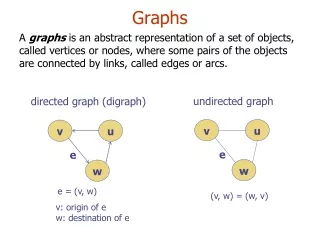
Graphs
Graphs. Types of Graphs. Visual Representations. Scientists frequently utilize graphs and charts to serve as visual representations of their data. There are 3 types of graphs commonly used amongst the scientific community. Circle (more commonly known as pie) Bar Line. Circle.

Graphs
E N D
Presentation Transcript
Graphs Types of Graphs
Visual Representations • Scientists frequently utilize graphs and charts to serve as visual representations of their data. • There are 3 types of graphs commonly used amongst the scientific community. • Circle (more commonly known as pie) • Bar • Line
Circle • A circle graph shows the parts of a whole. • Properties of Circle Graphs: • They are circular shaped graphs with the entire circle representing the whole. • The circle is then split into parts, or sectors. • Each sector represents a part of the whole. • Each sector is proportional in size to the amount each sector represents, therefore it is easy to make generalizations and comparisons.
Reading a Circle graph… • When reading this circle graph we look for the following pieces of information: the graph title, individual sectors and their relative sizes, and the sector labels (one for each sector). Let's take a closer look at each of these.
Graph Title--A graph title gives an overview of the information displayed in the graph. The title is given at the top of the graph. • Sectors--Each sector represents one part of the whole. The size of each sector represents its fraction of the whole. • Sector Labels--The label of each sector indicates the category of information it refers to, and may also give numeric data (often a percentage) so we know the size of each sector.
Bar • A bar graph is a visual display used to compare the amounts or frequency of occurrence of different characteristics of data. This type of display allows us to: • compare groups of data, and • to make generalizations about the data quickly.
Reading a Bar Graph… • When reading a bar graph there are several things we must pay attention to: the graph title, two axes, including axes labels and scale, and the bars. Since bar graphs are used to graph frequencies or amounts of data in discrete groups, we will need to determine which axis is the grouped data axis, as well as what the specific groups are, and which is the frequency axis.
Graph Title--The graph title gives an overview of the information being presented in the graph. The title is given at the top of the graph. • Axes and their labels--Each graph has two axes. The axes labels tell us what information is presented on each axis. One axis represents data groups, the other represents the amounts or frequency of data groups. • Grouped Data Axis--The grouped data axis is always at the base of the bars. This axis displays the type of data being graphed.
Frequency Data Axis--The frequency axis has a scale that is a measure of the frequency or amounts of the different data groups. • Axes Scale-- Scale is the range of values being presented along the frequency axis. • Bars--The bars are rectangular blocks that can have their base at either vertical axis or horizontal axis (as in this example). Each bar represents the data for one of the data groups.