
Two Quantitative Variables
E N D
Presentation Transcript
Two Quantitative Variables Chapter 10
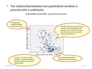
Section 10.1: Scatterplots and Correlation I was interested in knowing the relationship between the time it takes a student to take a test and the resulting score. So I collected some data …
Scatterplot Put explanatory variable on the horizontal axis. Put response variable on the vertical axis.
Describing Scatterplots • When we describe data in a scatterplot, we describe the • Direction (positive or negative) • Form (linear or not) • Strength (strong-moderate-weak, we will let correlation help us decide) • Unusual Observations • How would you describe the time and test scatterplot?
Correlation • Correlation measures the strength and direction of a linearassociation between two quantitativevariables. • Correlation is a number between -1 and 1. • With positive correlation one variable increases, on average, as the other increases. • With negative correlation one variable decreases, on average, as the other increases. • The closer it is to either -1 or 1 the closer the points fit to a line. • The correlation for the test data is -0.56.
Back to the test data I was not completely honest. There were three more test scores. The last three people to finish the test had scores of 93, 93, and 97. What does this do to the correlation?
Influential Observations • The correlation changed from -0.56 (a fairly moderate negative correlation) to -0.12 (a fairly weak negative correlation). • Points that are far to the left or right and not in the overall direction of the scatterplot can greatly change the correlation. (influential observations)
Correlation • Correlation measures the strength and direction of a linear association between two quantitative variables. • -1 < r < 1 • Correlation makes no distinction between explanatory and response variables. • Correlation has no unit. • Correlation is not a resistant measure.
Practice Get the CatJumping data from the class website under exercises for chapter 10. This came from researchers that were looking at factors (like mass) associated with jumping performance of cats. • The mass is in grams and the takeoff velocity is in cm/sec • Put in Corr/Regression Applet, graph, and find correlation coefficient. • Predict what will happen when the point: • (5600,410.8) is removed. • (7930, 286.3) is removed. • Take a quick look at the correlation guessing game applet
Learning Objectives for Section 10.1 • Summarize the characteristics of a scatterplot by describing its direction, form, strength and whether there are any unusual observations. • Recognize that the correlation coefficient is appropriate only for summarizing the strength and direction of a scatterplot that has linear form. • Recognize that a scatterplot is the appropriate graph for displaying the relationship between two quantitative variables and create a scatterplot from raw data. • Recognize that a correlation coefficient of 0 means there is no linear association between the two variables and that a correlation coefficient of -1 or 1 means that the scatterplot is exactly a straight line. • Understand that the correlation coefficient is influenced by extreme observations.
Inference for Correlation (Simulation) Section 10.2
Inference for Correlation with Simulation • Developing a null distribution to test correlation is quite similar to the methods we have used before with comparing means and proportion. • One big difference now is that we don’t have two or three categories with the explanatory variable. The explanatory variable is now quantitative. • We test to see if there is a linear association between people’s heart rate and body temperature.
Temperature and Heart Rate Hypotheses • Null: There is no association between heart rate and body temperature. (ρ = 0) • Alternative: There is a positive linear association between heart rate and body temperature. (ρ > 0) ρ = rho is the population correlation
Temperature and Heart Rate Collect the Data
Temperature and Heart Rate r = 0.378 Explore the Data
Temperature and Heart Rate • If there was no association between heart rate and body temperature, what is the probability we would get a correlation as high as 0.378 just by chance? • If there is no association, we can break apart the temperatures and their corresponding heart rates. We will do this by shuffling one of the variables. (The applet shuffles the response.) • We can also represent this shuffling with cards.
Shuffling Cards • Let’s remind ourselves what we did with cards to find our simulated statistics. • We wrote the response on the cards, shuffled the cards and placed them into two, three, or more piles corresponding to the two, three or more categories of the explanatory variable. Calculated the simulated statistic and that was a point in the null distribution. • Let’s look at this with two means again.
UnrestrictedSleep Deprived 10.0 45.6 -10.7 25.2 -10.7 14.5 11.6 9.6 4.5 2.4 2.2 18.6 -7.0 21.8 21.3 12.6 12.1 7.2 -14.7 34.5 30.5 mean = 6.38 mean = 19.82 mean = 16.12 mean = 3.90 6.38 – 16.12 = -9.74 Difference in Simulated Means
Shuffling Cards • Now how will this shuffling be different when both the response and the explanatory variable are quantitative? • We can’t put things in two (or three or more) piles anymore. • We still shuffle values of the response variable, but this time place them next two values of the explanatory variable.
Body Temperature and Heart Rate 65 68 82 68 81 80 71 72 69 72 89 62 57 73 84 58 82 71 79 86 r = 0.073 r = 0.378 Simulated Correlations
More Simulations 0.054 0.034 0.062 0.259 0.097 0.339 -0.345 -0.253 0.314 Only one simulated statistics out of 30 was as large or larger than our observed correlation of 0.378, hence our p-value for this null distribution is 1/30 ≈ 0.03. 0.212 -0.008 -0.034 -0.029 0.200 0.447 0.059 -0.006 0.167 0.447 -0.042 0.067 0.020 0.329 0.100 0.232 -0.327 -0.229 0.378 Simulated Correlations
Temperature and Heart Rate • The 3-S method • Statistic: The observed correlation coefficient • Simulate: Shuffle the response values and randomly pair them with values of the explanatory variable, calculate the simulated correlation. Repeat many times to develop a null distribution. • Strength of Evidence: Determine if the observed correlation would rarely occur by chance (is in the tail of the null distribution. • Let’s look at the applet output of 1000 shuffles with a distribution of 1000 simulated correlations.
Temperature and Heart Rate • Notice our null distribution is centered at 0 and somewhat symmetric. • We found that 530/10000 times we had a simulated correlation greater than or equal to 0.378.
Temperature and Heart Rate • With a p-value of 0.053 we don’t have strong evidence there is a positive linear association between body temperature and heart rate. However, we do have moderate evidence of such an association and perhaps a larger sample give a smaller p-value. • If this was significant, to what population can we make our inference?
Temperature and Heart Rate • Let’s look at a different data set comparing temperature and heart rate (Example 10.5A) using the Correlation/Regression applet. • The default statistic used is not correlation, so we need to change that.
Learning Objectives for Section 10.2 • Apply the 3-S strategy when evaluating the hypothesis of linear association using the correlation coefficient as the statistic. • Describe how to conduct a tactile simulation to implement the 3-S strategy for testing a correlation coefficient. • Use the Correlation/Regression applet to determine a simulation-based p-value. • Define the p-value in the context of the 3-S strategy using simulated correlation coefficients under the null hypothesis of no association.
Exploration 10.2: 1970 Draft Lottery (page 533) https://www.youtube.com/watch?v=-p5X1FjyD_g
Least Squares Regression Section 10.3
Introduction • If we decide an association is linear, it’s helpful to develop a mathematical model of that association. • Helps make predictions about the response variable. • The least-squares regression lineis the most common way of doing this.
Introduction • Unless the points form a perfect line, there won’t be a single line that goes through every point. • We want a line that gets as close as possible to all the points.
Introduction • We want a line that minimizes the vertical distances between the line and the points • These distances are called residuals. • The line we will find actually minimizes the sum of the squares of the residuals. • This is called a least-squares regression line.
Are Dinner Plates Getting Larger? Example 10.3
Growing Plates? • There are many recent articles and TV reports about the obesity problem. • One reason some have given is that the size of dinner plates are increasing. • Are these black circles the same size, or is one larger than the other?
Growing Plates? • They appear to be the same size for many, but the one on the right is about 20% larger than the left. • This suggests that people will put more food on larger dinner plates without knowing it.
Portion Distortion • There is name for this phenomenon: Delboeufillusion
Growing Plates? • Researchers gathered data to investigate the claim that dinner plates are growing • American dinner plates sold on ebay on March 30, 2010 (Van Ittersum and Wansink, 2011) • Year manufactured and diameter are given.
Growing Plates? • Both year (explanatory variable) and diameter in inches (response variable) are quantitative. • Each dot represents one plate in this scatterplot. • Describe the association here.
Growing Plates? • The association appears to be roughly linear • The least squares regression line is added • How can we describe this line?
Regression Line The regression equation is : • a is the y-intercept • b is the slope • x is a value of the explanatory variable • ŷ is the predicted value for the response variable • For a specific value of x, the corresponding distance (or actual – predicted) is a residual
Regression Line • The least squares line for the dinner plate data is • Or • This allows us to predict plate diameter for a particular year.
Slope • What is the predicted diameter for a plate manufactured in 2000? • -14.8 + 0.0128(2000) = 10.8 in. • What is the predicted diameter for a plate manufactured in 2001? • -14.8 + 0.0128(2001) = 10.8128 in. • How does this compare to our prediction for the year 2000? • 0.0128 larger • Slope b= 0.0128 means that diameters are predicted to increase by 0.0128 inches per year on average
Slope • Slope is the predicted change in the response variable for one-unit change in the explanatory variable. • Both the slope and the correlation coefficient for this study were positive. • The slope is 0.0128 • The correlation is 0.604 • The slope and correlation coefficient will always have the same sign.
y-intercept • The y-intercept is where the regression line crosses the y-axis or the predicted response when the explanatory variable equals 0. • We had a y-intercept of -14.8 in the dinner plate equation. What does this tell us about our dinner plate example? • Dinner plates in year 0 were -14.8 inches. • How can it be negative? • The equation works well within the range of values given for the explanatory variable, but fails outside that range. • Our equation should only be used to predict the size of dinner plates from about 1950 to 2010.
Extrapolation • Predicting values for the response variable for values of the explanatory variable that are outside of the range of the original data is called extrapolation.
Coefficient of Determination • While the intercept and slope have meaning in the context of year and diameter, remember that the correlation does not. It is just 0.604. • However, the square of the correlation (coefficient of determination or r2) does have meaning. • r2 = 0.6042 = 0.365 or 36.5% • 36.5% of the variation in plate size (or the response variable) can be explained by its linear association with the year (the explanatory variable).
Applet • Let’s look at all this in the correlation/regression applet. • Get the data and: • Create scatterplot • Find correlation • Find regression equation • Find coefficient of determination
Learning Objectives for Section 10.3 • Understand that one way a scatterplot can be summarized is by fitting the best-fit (least squares regression) line. • Be able to interpret both the slope and intercept of a best-fit line in the context of the two variables on the scatterplot. • Find the predicted value of the response variable for a given value of the explanatory variable. • Understand the concept of residual and find and interpret the residual for an observational unit given the raw data and the equation of the best fit (regression) line. • Understand the relationship between residuals and strength of association and that the best-fit (regression) line this minimizes the sum of the squared residuals.
Learning Objectives for Section 10.3 • Find and interpret the coefficient of determination (r2) as the squared correlation and as the percent of total variation in the response variable that is accounted for by the linear association with the explanatory variable. • Understand that extrapolation is when a regression line is used to predict values outside of the range of observed values for the explanatory variable. • Understand that when slope = 0 means no linear association, slope < 0 means negative association, slope > 0 means positive association, and that the sign of the slope will be the same as the sign of the correlation coefficient. • Understand that influential points can substantially change the equation of the best-fit line.
Exploration 10.3 (pg. 542) Predicting Height from Footprints