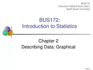
Chapter 2 Describing Data: Graphical
BUS172 Instructor: Nahid Farnaz ( Nhn ) North South University. BUS172: Introduction to Statistics. Chapter 2 Describing Data: Graphical. Data. Categorical. Numerical. Discrete. Continuous. Types of Data. Examples: Marital Status Are you registered to vote? Eye Color

Chapter 2 Describing Data: Graphical
E N D
Presentation Transcript
BUS172 Instructor: Nahid Farnaz (Nhn) North South University BUS172: Introduction to Statistics Chapter 2 Describing Data: Graphical
Data Categorical Numerical Discrete Continuous Types of Data Examples: • Marital Status • Are you registered to vote? • Eye Color (Defined categories or groups) Examples: • Number of Children • Defects per hour • No. of students in a class (Counted items) Examples: • Height/Weight/Time/Distance/Temperature • Voltage (Measured characteristics)
Data Quantitative Qualitative Ordinal Nominal Measurement Levels Qualitative Data: No measurable meaning to the difference in numbers For e.g. a player is assigned the number “20” and another “10” – we cannot conclude that the first player is twice as good as the second player. Difference in numbers is measurable & meaningful Ordered Categories (rankings, order, or scaling) Categories (no ordering or direction)
Graphical Presentation of Data • Techniques reviewed in this chapter: Categorical Variables Numerical Variables • Frequency distribution • Bar chart • Pie chart • Line chart • Frequency distribution • Histogram and ogive • Stem-and-leaf display • Scatter plot
The Frequency Distribution Table • Afrequency distribution table is used to organize data by category • Left column (called classes or groups) includes all possible responses on a variable being studied. • Right column is a list of frequencies, or number of observations, for each class. Example: Hospital Patients by Unit Hospital Unit Number of Patients Cardiac Care 1,052 Emergency 2,245 Intensive Care 340 Maternity 552 Surgery 4,630 (Variables are categorical)
Bar Chart Example *Bar charts and Pie charts are often used for qualitative (categorical) data *Height of bar shows the frequency for each category Hospital Number Unit of Patients Cardiac Care 1,052 Emergency 2,245 Intensive Care 340 Maternity 552 Surgery 4,630
Pie Chart Example Hospital Number % of Unit of Patients Total Cardiac Care 1,052 11.93 Emergency 2,245 25.46 Intensive Care 340 3.86 Maternity 552 6.26 Surgery 4,630 52.50 *The size of pie slice shows the percentage for each category (Percentages are rounded to the nearest percent)
Graphs for Time-Series Data • A line chart (time-series plot) is used to show the values of a variable over time • Time is measured on the horizontal axis • The variable of interest is measured on the vertical axis Line Chart Example
Graphs to Describe Numerical Variables Numerical Data Frequency Distributions and Cumulative Distributions Stem-and-Leaf Display Histogram Ogive
Frequency Distributions What is a Frequency Distribution? • A frequency distribution is a list or a table … • containing class groupings (categories or ranges within which the data fall) ... • and the corresponding frequencies with which data fall within each class or category Why Use Frequency Distributions? • A frequency distribution is a way to summarize data • The distribution condenses the raw data into a more useful form and allows for a quick visual interpretation of the data
Construction of a Frequency Distribution Rule 1: Number of Intervals • Determine k, the number of intervals (classes) • Larger data sets require more intervals; smaller data sets require fewer intervals.. Rule 2: Interval Width • Intervals (classes) should be the same width, w; the width is determined by: Rule 3: Intervals (classes) must be inclusive and non-overlapping. • For e.g.: “age 20 but less than age 30” followed by “age 30 but less than age 40” and so on. Another way: “20-29”,”30-39” and so on.
Quick Guide to Number of Intervals for a Frequency Distribution • Practice and experience provide the best guidelines. • Larger data sets require more intervals; • Smaller data sets require fewer intervals
Frequency Distribution Example Example: A manufacturer of insulation randomly selects 20 winter days and records the daily high temperature 24, 35, 17, 21, 24, 37, 26, 46, 58, 30, 32, 13, 12, 38, 41, 43, 44, 27, 53, 27
Frequency Distribution Example (continued) • Sort raw data in ascending order:12, 13, 17, 21, 24, 24, 26, 27, 27, 30, 32, 35, 37, 38, 41, 43, 44, 46, 53, 58 • Find range: 58 - 12 = 46 • Select number of classes: 5(usually between 5 and 15) • Compute interval width: 10 (46/5 then round up) • Determine interval boundaries: 10 but less than 20, 20 but less than 30, . . . , 60 but less than 70 • Count observations & assign to classes
Frequency Distribution Example (continued) Data in ordered array: 12, 13, 17, 21, 24, 24, 26, 27, 27, 30, 32, 35, 37, 38, 41, 43, 44, 46, 53, 58 Relative Frequency Interval Frequency Percentage 10 but less than 20 3 .15 15 20 but less than 30 6 .30 30 30 but less than 40 5 .25 25 40 but less than 50 4 .20 20 50 but less than 60 2 .10 10 Total 20 1.00 100
Histogram • A graph of the data in a frequency distribution is called a histogram • The interval endpointsare shown on the horizontal axis • the vertical axis is eitherfrequency, relative frequency, or percentage • Bars of the appropriate heights are used to represent the number of observations within each class
Histogram Example Interval Frequency 10 but less than 20 3 20 but less than 30 6 30 but less than 40 5 40 but less than 50 4 50 but less than 60 2 (No gaps between bars) 0 10 20 30 40 50 60 70 Temperature in Degrees
How Many Class Intervals? • Many (Narrow class intervals) • may yield a very jagged distribution with gaps from empty classes • Can give a poor indication of how frequency varies across classes • Few (Wide class intervals) • may compress variation too much and yield a blocky distribution • can obscure important patterns of variation. (X axis labels are upper class endpoints)
Shape of histogram: Symmetry • The shape of the distribution is said to be symmetric if the observations are balanced, or evenly distributed, about the center.
Distribution Shape: Skewness (continued) • The shape of the distribution is said to be skewed or asymmetric if the observations are not symmetrically distributed around the center. A positively skewed distribution (skewed to the right) has a tail that extends to the right in the direction of positive values. A negatively skewed distribution (skewed to the left) has a tail that extends to the left in the direction of negative values.
The Cumulative Frequency Distribution Data in ordered array: 12, 13, 17, 21, 24, 24, 26, 27, 27, 30, 32, 35, 37, 38, 41, 43, 44, 46, 53, 58 Cumulative Frequency Cumulative Percentage Class Frequency Percentage 10 but less than 20 3 15 3 15 20 but less than 30 6 30 9 45 30 but less than 40 5 25 14 70 40 but less than 50 4 20 18 90 50 but less than 60 2 10 20 100 Total 20 100
The OgiveGraphing Cumulative Frequencies Upper interval endpoint Cumulative Percentage Interval Less than 10 10 0 10 but less than 20 20 15 20 but less than 30 30 45 30 but less than 40 40 70 40 but less than 50 50 90 50 but less than 60 60 100 Interval endpoints
Stem-and-Leaf Diagram • A simple way to see distribution details in a data set METHOD: Separate the sorted data series into leading digits (the stem) and the trailing digits (theleaves) • The number of digits in each class indicates the class frequency.
Example • Complete a stem and leaf diagram for the following data: 24, 21, 24, 27, 26, 27, 30, 38, 32, 41.
Example Data in ordered array: 21, 24, 24, 26, 27, 27, 30, 32, 38, 41 • Completed stem-and-leaf diagram:
Using other stem units • Using the 100’s digit as the stem: • Round off the 10’s digit to form the leaves • 613 would become 6 1 • 776 would become 7 8 • . . . • 1224 becomes 12 2 Stem Leaf
Using other stem units (continued) • Using the 100’s digit as the stem: • The completed stem-and-leaf display: • Data: • 613, 632, 658, 717, • 722, 750, 776, 827, • 841, 859, 863, 891, • 894, 906, 928, 933, • 955, 982, 1034, 1047,1056, 1140, 1169, 1224 Stem Leaves 6 1 3 6 7 2 2 5 8 8 3 4 6 6 9 9 9 1 3 3 6 8 10 3 5 6 11 4 7 12 2
Relationships Between Variables • Graphs illustrated so far have involved only a single variable • When two variables exist other techniques are used: Categorical (Qualitative) Variables Numerical (Quantitative) Variables Cross tables Scatter plots
Scatter Diagrams • Scatter Diagrams are used for paired observations taken from two numerical variables • The Scatter Diagram: • one variable is measured on the vertical axis and the other variable is measured on the horizontal axis
Scatter Diagram Example • The diagram shows a scatter plot of the dependent variable, cost per day, and the independent variable, volume per day. • Observations: There is a positive upward trend – cost per day tends to increase directly with increases in volume per day.