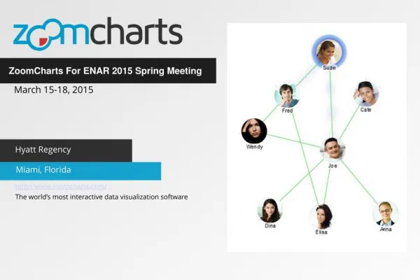
ZoomCharts for ENAR 2015 in Miami, FL
ZoomCharts is offering data visualization tools to support presenters at the ENAR 2015 Spring Meeting, taking place March 15th through 18th, 2015 at the Hyatt Regency Miami, 400 SE Second Avenue, Miami, Florida 33131.
Check out what you can do with ZoomCharts charts and graphs at http://zoomcharts.com
ZoomCharts is the world’s most interactive data visualization software. Create fully interactive, stunning visual representations of big data sets on all modern devices, and at remarkably high speeds. ZoomCharts tools are being discovered by a growing number of clients in a variety of fields as the best way to analyze and present data. Don’t be among the last to discover the exciting potential that ZoomCharts tools can open up for your data.
Run by the Eastern North American Region International Biometric Society, the 2015 ENAR Spring Meeting brings together researchers and practitioners from academia, industry, and government with a common interest in Biometry to explore topics such as data sciences, genomics, clinical trials, neuroimaging, biomarkers, health policy, electronic health records, ecology, and epidemiology.
Learning opportunities are provided by a team of well-known experts that lead a program of courses, tutorials, and roundtables, and networking opportunities include the chance to meet new friends and connect with colleagues. A variety of engaging topics will be covered, including Bayesian methods in drug development, personalized medicine trial designs, analysis of brain imaging data, data sciences and high performance statistical computing, early phase clinical trials, statistical leadership and influence, graphics for clinical trial data, software applications for group sequential and adaptive designs, Bayesian modeling and analysis, and multiplicity problems.
ZoomCharts
http://www.zoomcharts.com
The world’s most interactive data visualization software
★
★
★
★
★
234 views • 5 slides