NCEA Level 3 - Visual Arts 2010
NCEA Level 3 - Visual Arts 2010. Examples of Candidate Work – 90517 Design. Excellence. Excellence.

NCEA Level 3 - Visual Arts 2010
E N D
Presentation Transcript
NCEA Level 3 - Visual Arts 2010 Examples of Candidate Work – 90517 Design
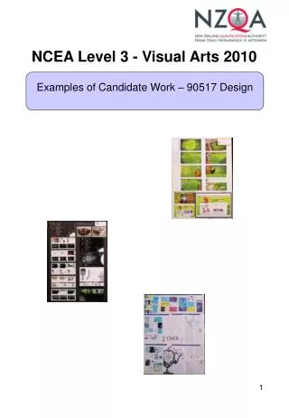
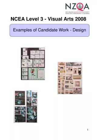
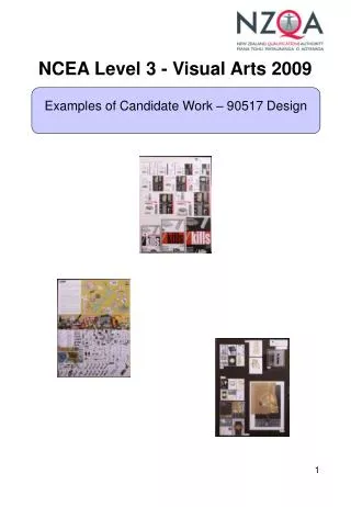
Excellence This submission promotes an organisation called Fowl Aid designed to educate the public about the cruelty to battery-caged hens. The organisation required a logo, a poster, a pamphlet, a thank-you label, and a website. Research consisted of photographs and images of caged hens in a battery hen farm, emaciated hens, broken egg shells, and egg cartons. When designing the logo the candidate explored type and image thoroughly, in a playful way. Text has been placed vertically and horizontally to give a range of possible solutions. The image of a hand-print has been used and the shape of an egg replaces the letter O in the word fowl. The letters F and A have been combined creatively to develop negative space. Colour has been used purposefully; dark red, brown and black represent the cruelty of the battery-caged hens and a lighter green represent the idea of free-range. Image and type have been integrated in a sophisticated manner in the poster; at times quite confrontationally. The communication is effective and the final poster decision has been tested in a bus stop situation. The pamphlet explores two contrasting ideas; the green of grass is in stark contrast to the dark brown in caged areas. The shape of an egg cut-out of the page is an effective device which has been explored in this pamphlet. The candidate has continued to develop new and creative ways of communicating using a label design and website pages. His/her knowledge and understanding of how a website is used is clearly evident. At times the white type reversed out of green becomes difficult to read but the elements have all been well-considered and the final decisions are very successful.
Excellence The brief for this portfolio centres on Spectrum, a new business that specialises in selling designer house-paints. The candidate has responded with a photo-shoot which documents the preparation and painting of a wall in a building. The candidate also submits a dozen photos of paint cans, spray canisters, brushes etc. The logo investigation begins with images of colours, in particular the primary colours seen from different viewpoints. The plugs of pigment appear to represent the shape of paint cans. The three-dimensional circles have a glowing, plastic quality. A range of typefaces have been trialled with the compositions in colour, resulting in a refined combination and a solution exhibited in grey tone, black and white, and colour. In the latter the plugs appear luminous, three-dimensional and very contemporary. The final typeface is sans serif, fine and rounded, and has been combined with the coloured image using paint drips. The candidate’s knowledge and skill with type is very evident. The brief asks for labels for paint cans. The idea of a circle has been developed with the mark of a brush suggested. Pattern has been explored by the repetition of a small paint-brush symbol. Paint cans and test-pots have been repacked with labels that include the logo and information. The final design has been presented on the tins in a beautifully lit photo-shoot. The work is confident, well-edited and very purposeful. When designing a poster for Spectrum the candidate used a dramatic black background from which the colour swatches explode. In the design of the brochure the candidate regenerated ideas from the photo-shoot. An interest in the colour field has resulted in white, grey and black pages. The circle of the paint adds a contemporary and linear component to the work and the elements used are all handled with fluency and skill. There is plenty of evidence of the candidate’s knowledge and understanding of grid layouts and typefaces. The brochure is very inventive; standing as a square around a paint can or on a desk. The pages are read in a continuous fashion and the transition from inside to outside have been well-considered. Overall the portfolio operates at a very sophisticated level of design. The intelligent ideas show that the brief has been well understood.
Merit This portfolio brims with ideas and colour and an overall sense of fun. The candidate has used typography as the major design element. He or she began by gathering a bank of images that set the scene. The candidate had made some drawings in pencil to extend the research. It is at the stage of the logo design that the work appears confident. The candidate has used the logo to generate and analyse a number of typographical solutions. In some examples a lemon shape has been layered over the type or reversed out in white. The poster shows knowledge of contemporary illustration and explores figure/field relationships with type being an integral component. We are reminded of Dr. Seuss. The café’s address is clearly communicated to the audience, as is the description of what this café will offer i.e. jazz music and a relaxing atmosphere. The menu continues to explore hand-drawn images with blocks of bright colour with informal hand-drawn type pouring out of the teapot. The candidate appears to understand grid structures and has chosen simple grids appropriate to the purpose. The results are both cohesive and creative. The billboard that promotes the café is more purposeful and offers a number of options for refinement. The candidate continued to work across board three by designing a business card, a t-shirt and a DPS for a magazine. There is evidence of a thorough investigation of type and image. The candidate has used colour confidently and produced a lively visual brand for the café.
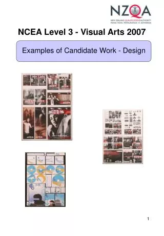
Merit The client in this brief is the Auckland Zoo. They have commissioned the candidate to design a promotional package to celebrate their 50th Anniversary. The requirement is for the promotional package to include a logo, a business card, a CD and CD case, a poster, a billboard and a DPS for a magazine. The candidate presents research as an image bank which using stock photos of animals from the zoo. These show playful exploration of type and colour which contribute to the logo. The candidate decided to use an image of an elephant in grey tone together with a silhouette of the Auckland sky tower to identify the city. The final image together with the sans serif type is clean and friendly. When designing the business card the candidate adds a linear component. This line resembles a transport map and adds a dynamic and very successful framing device for the card. The clarification of ideas towards the CD and CD case demonstrates that the candidate understands the formal characteristics of design. The use of white type reversed out of grey and the central alignment of type ensure the work is legible and contemporary. In addition, the candidate has layered the imagery with circles and lines reminiscent of 1950s graphic design. In the evaluation of its success, the CD has been placed into a CD case and photographed. As with the CD, the poster has also viewed in situ and the graphic sensibility appears better-understood and even more confident than the earlier work. When designing the billboard and magazine DPS on board three the candidate applied images from clip art to extend the options. The communication is clear and successful.
Achieved On this portfolio the brief needed to provide more information. For example, was Dacube a t-shirt, a shop, a clothing range or an exhibition? The candidate designing for Dacube started with a photo-shoot. It was pleasing to see that the candidate’s use of his or her own images although these images were shot in very low light. When designing a logo the candidate generated ideas with greater confidence and it was positive to see that when a decision was made on the selection of typeface to be used, that decision was final. This gave the logo weight with its use throughout the portfolio. The promotional poster uses a number of drawings to investigate type and space within the composition. The candidate used blocks of body type as a grey field in this investigation. There was emphasis on the letter ‘t’, as well as large areas of white and black. A strong horizontal added a playful and more sophisticated element to the composition. In working with type in this way, the candidate showed some knowledge of ideas founded in recent practice. On board two the candidate demonstrates growing confidence in the publicity booklet. Horizontal format and multiple pages have been used. The candidate’s own photos have been included, as well as the logo. The candidate explored the use of a diagonal line through the use of thumbnails, from one page to the next. The website communication continues to demonstrate the development of the established brand. The use of white type reversed out of black provides the clear message. The description of what a t-shirt is somewhat confused by the placement of a shirt with a collar next to it. It does however a show an intended creative strategy to involve viewers and to keep them interested in the promotion.
Achieved The brief for this submission promotes a campaign to educate the public on the serious health risks associated with sunbathing and getting burnt. The brief reveals an intelligent starting point with a full list of the required specifications. The image bank provides a visual explanation of the problem and is accompanied by a page of the candidate’s own drawing. The words ‘ban the tan’ have been explored in a number of typefaces, coupled with drawings of the sun. Colours have been analysed and ideas clarified until the presentation of a final logotype. The strength of board one is the successful photo-shoot that the candidate has presented before drawing ideas for a magazine double-page spread. The layout thumbnails demonstrate knowledge of the characteristics and constraints of designing in grid formats. The decision to work within a grey field punctuated by the hot red and yellow palette was appropriate and apparently deliberate. On board two a glasses case was to be designed. The colour consistent with the colour choices on board two, and the photographs of the case show the front and the top viewpoint. Further exploration of the three dimensions could have taken place but type and image are carefully placed showing some evidence that the candidate had thought in terms of the problem set. The poster utilises a cross as the symbol for “do not sunbathe”. The candidate has applied the cross over the top of his or her own photograph; in transparent colour. Type has been reversed out of the grey image which communicates the message clearly. One idea centres on the damage that the sun’s rays can have; another asked the question “does it hurt?” The poster’s readability was then tested in a bus stop situation. To provide further information to the public the candidate decided to design a website. Finally the promotion asks for a free give-away product – a key ring. Typography has been explored creatively and ideas from board two have been regenerated. The logo has been used to brand the promotion and this has resulted in a cohesive and systematically designed campaign with a limited colour palette and an appropriate aesthetic.
