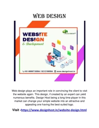
Web Design Best Practices: Choosing Themes and Enhancing User Experience
Discover how to choose a theme that suits your content, optimize readability and design, utilize multimedia effectively, and maximize SEO for a successful website.

Web Design Best Practices: Choosing Themes and Enhancing User Experience
E N D
Presentation Transcript
Choosing a theme • Choose a theme that is clean, simple and appropriate to what you write about. • Think about what you need your site to do for you when choosing a theme. Do you need a lot of pictures? Do you need multiple columns? Do you need video?
Why have an online portfolio • Easy access to your work • Ownership of your work • Shows you’re Web savvy • Let’s you publish unpublished materials.
Readability • Stay away from white text on a black background and other hard to read color schemes. • It might be OK for short blurbs, but after awhile it’s hard on the eyes, especially to an older reader. • EXCEPTION: White on black tends to work well for video and photo.
Busyness • Just because fonts and colors are there doesn’t mean you have to use them. Would you want to read a whole story written like this? • Remember KISS: Keep it simple, stupid.
Fonts • We use Times New Roman in print. This is a serif font. • Online we want to use a san-serif font for our body. Serif fonts are acceptable for headlines.
Uniformity • Make sure all your pages look the same (same color, same style, same navigation, etc.) • It’s confusing when a user finds himself suddenly on a page that looks different. He might wonder if he’s on the same site or not.
Uniformity • Have a style for everything you do. • All cutlines should look the same, all headlines should look the same, all links should look the same, etc.
Links • Always be sure to set your links to open in a new window. • If someone opens a link and from there another and from there another they’ll eventually lose your page. If you set your links to a new window then your page is still up when they finish exploring other sites.
Video • Never set your videos to play automatically. • People surfing the web at work or during class will get annoyed that you’ve let everyone know they’re not paying attention. • If your site has more than one video starting on a page that leads to slow loading times and a lot of confusion.
Photos • Photos that are not part of your portfolio (your picture, pictures to help illustrate stories) should always face into the text, not off the page. • NO! • Photos also • shouldn’t box in words.
Widgets and Add-ons • Choose these carefully • They can add too much busyness to your page. • Be sure that they’re appropriate to what you’re writing about. (Don’t put a sports scores widget on a page about gourmet cooking).
Search Engine Optimization • Make sure you get as many keywords as possible (within reason), into your titles and decks. • This will help google find your work which helps others find your work.
The Finished Product • Show your finished product to lots of different people. Shoot for different ages and professions. • Ask your readers to proofread and to also point out any parts of the website that are difficult to use or confusing.
Web space at CU • Call the help desk at (303) 735-HELP, or look on the IT website • Request a shell account on Rintintin for a student webpage.
Examples of good journalistic websites • 10000 words journalist portfolios • This one looks nice but has some design flaws that could easily be fixed. • This one is a bilingual TV journalist. She has a really cool way of presenting her clips and resume.
Don’t be “that guy” or “that girl” • Web pages that suck 2010 awards


