Scientific Visualization
Scientific Visualization. Why visualization helps? . A seashore is a better place than the street. At first it is better to run than to walk. You may have to try several times. It takes some skill but it ’ s easy to learn. Even young children can have fun.

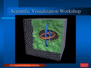
Scientific Visualization
E N D
Presentation Transcript
Why visualization helps? A seashore is a better place than the street. At first it is better to run than to walk. You may have to try several times. It takes some skill but it’s easy to learn. Even young children can have fun. Once successful, complications are minimal. Birds seldom get too close. Too many people doing the same thing, however, can cause problems. One needs lots of room. Beware of rain; it ruins everything. If there are no complications, it can be very peaceful. A rock will serve as an anchor. If things break loose from it, however, you will not get a second chance.
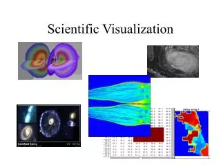
The Purpose and Types • Mapping numbers to pictures • Helps understand algorithms • Helps understand concepts • Cover Art
The Purpose and Types • Mapping numbers to pictures • Help understand algorithms • Help understand concepts • Cover Art
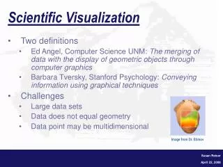
Immediately tells: How good the over-all agreement is Are there serious outliers Is the agreement uniform? Where disagreement is strongest/weakest Example: scatter plot
Elements of a good graph: Clear legends Large enough font, thick lines. Symbols differ in more than one way (color, shape) Graph not cluttered, space well utilized All axes labeled, units shown
An ideal scientific paper… • Can be understood by reading the text ONLY • OR by looking and figures ONLY (with figure captions)
2D contours (“heat map plot”) Always show scale!
The Purpose and Types • Mapping numbers to pictures • Help understand algorithms • Help understand concepts • Cover Art
Scientific Animation (power point) to help understand computational approach: • Simulation type #1. Model photo-detachement of carbon monoxyde (CO) ligand. 20 trajectories , 90 ns each. The ligand starts at the docking site (Fe) and comes out, sometimes. • 2.Simulation type #2. Model diffusion of the ligand from the outside. The ligand starts in the solvent, and sometimes diffuses all the way to the docking site inside. 48 trajectories, each 90 ns long.
The Purpose and Types • Mapping numbers to pictures • Help understand algorithms • Help understand concepts • Cover Art
An animation (defines key degrees of freedom in amino-acids)
The Purpose and Types • Mapping numbers to pictures • Help understand algorithms • Help understand concepts • Cover Art
Cover art: • Stunning graphics to impress the viewer • Helps draw attention • Presumably, helps explain the concept (not always…) • Must be generally correct, but not precise in every detail • High resolution is key.
Cover art example Savin, A. V., Kikot, I. P., Mazo, M. A. and Onufriev, A. V. PNAS (2013) Visualization courtesy of Andrew Woods, Nicholas Polys
Cover art example Savin, A. V., Kikot, I. P., Mazo, M. A. and Onufriev, A. V. PNAS (2013) Visualization courtesy of Andrew Woods, Nicholas Polys
Cover art example (mostly art…) Savin, A. V., Kikot, I. P., Mazo, M. A. and Onufriev, A. V. PNAS (2013) Visualization courtesy of Andrew Woods, Nicholas Polys
Software (General) • Plots: Xmgrace, Mathematica • Image Manipulation: Gimp • Image Generation: InkScape,xfig (vector graphics) • Presentations: power point, beamer (latex friendly).
The undeniable advantage of vector graphics: scales to ANY resolution .eps, .svg .tiff, .jpeg, etc.
Software (special purpose) • Area specific • Example: Structure Visualization. VMD, Rasmol. • Mapping properties onto structures: GEM
A monk climbs a mountain. He starts at 8 am and reaches the summit at noon. He spends the night on the summit. The next morning, he leaves the summit at 8 am and descends by the route he took the day before, reaching the bottom at noon. Prove that there is a time between 8 am and noon at which the monk was at exactly the same spot on the mountain on both days. (Notice that we do not specify anything about the speed at which the monk travels. The monk does not have to walk at constant speed, or the same speed going up and down) The Monk’s climb problem: