Download
1 / 47
490 likes | 1.36k Vues
Discover the essential elements of art - line, shape, form, value, color - that artists use to create captivating compositions. Dive into the world of art and explore how each element contributes to the beauty and meaning of artistic expressions. From the power of lines to the depth of forms, unravel the secrets behind compelling artworks. Learn how value enhances realism and color breathes life into creations. Uncover the magic of geometric and organic shapes, and witness the transformation of 2D shapes into dynamic 3D forms. Enhance your understanding of art with this comprehensive guide to the elements that shape creativity and imagination.

E N D
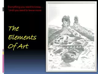
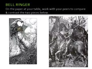
The Elements of Art The Ingredients for a great Composition
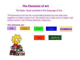
What are the elements of art? The Elements of Art are the “tools” that artists use to make art. There are 7 of them: Line Value Texture Shape Form Space Color
Line A line is a path that a point takes through space. Lines can be thick, thin, dotted or solid. They can make straight movements, zig-zags, waves or curls. They may be horizontal vertical diagonal
Artists use line to lead your eyes around a work of art. This is because the artist wants to lead you through their composition. Line creates movement, and leads your eye into, around, and out of visual images as in this painting by Yvonne Jacquette. Oil, 1988 Notice how the artist uses the line of the highway to pull your eyes into the artwork. Line has width as well as length, but usually the width of the line is smaller than the length. Artists create lines in many different ways. A line can be drawn on a paper with pencil or scratched in clay with a stick.
Horizontal Lines are generally restful, like the horizon, where the sky meets land
Vertical lines seem to be reaching, so they may seem inspirational like tall majestic trees or church steeples
Diagonal lines tend to be disturbing. They suggest decay or chaos like lightening or falling trees
Lines can convey emotion as well. They may show excitement, anger, calmness, tension, happiness and many other feelings.Because of this, some are said to be expressive.
Expressive Lines tend to be found in nature and are very organic
Other lines that are very measured, geometric, directional and angular are called Constructive lines. They tend to appear to be man-made because of their precision.
Some lines that we think we see in nature really do not exist. For instance, when you look at the edges of shapes, you think of lines. In the photo of the dogwood blossom, notice that there are no black lines around the flower, only black against white. However in a sketch of the same blossom, lines are used to define the shape of the flower.
Shape Shape is created when a line becomes connected and encloses space. It is the outline or outward appearance of something. Shapes are 2 Dimensional (2-D) which means there are 2 ways they can be measured. You can measure its HEIGHT and its WIDTH. There are two basic types of shape.
The 2 types of shape Geometric shapes have smooth even edges and are measurable. The include the square, the circle, the triangle and the rectangle.
Organic shapes have more complicated edges and are usually found in nature. Leaves, flowers, ameba, etc.
Form A Form is a shape that has become 3- Dimensional (3-D) Form has HEIGHT, WIDTH and DEPTH--which is the 3rd dimension.Depth shows the thickness of the object. Forms are NOT flat like shapes are!
Turning Shapes into Forms A triangle becomes a cone or a pyramid A square becomes a cube
Turning Shapes into Forms A rectangle can become a box or a cylinder In order to turn a circle into a sphere, you must shade it. You can’t add another side to it!
Value Value is the lightness or darkness of a color. Value makes objects appear more real because it imitates natural light. When showing value in a work of art, you will need a LIGHT SOURCE. A light source is the place where the light is coming from, the darkest areas are always on the opposite side of the light.
Value In order to have a successful drawing, you will need to show a full value range, which means that there are very light areas, middle tones, and very dark areas. This is a way of giving a work of art Contrast. In drawing value can be added several ways:
Ways value can be added: Cross-hatching is when you use irregular lengths of parallel lines that cross over each other diagonally. The closer together the lines are placed, the darker the value.
Ways value can be added Stippling is the use of dots to create shade. This is accomplished by placing dots very close together to create dark values and farther apart to create lighter values.
Ways value can be added Soft shading is when you use your pencil to create soft gradual movements from one value to the next using full value range.
Color Color can add interest and reality to artwork. The use of a 12-step color wheel will help us understand color more effectively. When light is reflected through a prism, colors can be seen These colors are: Red, Yellow, Orange, Green, Indigo, Blue and Violet Remember the anagram: ROY G BIV
Color Wheel A long time ago, artists decided that these colors would be more useful to them if they were placed in a wheel fashion. This became known as the color wheel
Color There are 3 primary colors: Red, Yellow and Blue These colors are primary for 2 reasons: • They can’t be mixed to be made • They make all the other colors on the color wheel
Color When you mix 2 primary colors together, you get a secondary color. For example: Red and Yellow=Orange Red and Blue=Violet Yellow and Blue= Green
Color When you mix a primary and a secondary color together you get an intermediate (or tertiary) color For example: Red and Orange= Red-Orange Yellow and Green=Yellow-Green Blue and Green=Blue-Green Red and Violet=Red-Violet Yellow and Orange=Yellow-Orange Blue and Violet=Blue-Violet
Color Schemes Color is divided into groups based on the way they are placed on the color wheel: 3-4 colors “next-door-neighbors” to each other creates an analogous color scheme
Color schemes 2 colors that are directly opposite each other (going across the center) creates a complimentary color scheme
Color Schemes A Split-Complimentary color scheme is a complimentary color and the two colors on either side of its compliment.
Color Schemes A Triadic color scheme uses 3 colors that are equally spaced apart on the color wheel
Color Schemes When you use only one color plus its tints and shades, you are using a monochromatic color scheme A tint is a color plus white A shade is a color plus black
Colors have temperatures Colors can convey emotion and feelings too. Have your ever felt “blue?” Been “green’ with envy? Called a “yellow” coward? It is important that artists understand the effects of color when they are trying to get the viewers of their art to feel a particular way.
Color Temperatures Warm colors are those that have Reds, Yellows and Oranges. Warm colors seem to advance (or come forward) in an artwork. Cool colors are those that have Blues, Greens and Violets. Cool colors seem to recede (or go back into) an artwork.
Texture Texture is the way the surface of an object actually feels. In the artistic world, we refer to two types of texture---tactile and implied
Tactile (or Real) Texture Tactile (or Real) Texture is the way the surface of an object actually feels. Examples would be sandpaper, cotton balls, tree bark, puppy fur, etc.
Implied Texture Implied Texture is the way the surface of an object looks like it feels. This is the type of texture that artists use when they draw and paint. Textures may look rough, fuzzy, gritty, or scruffy, but can’t actually be felt.
Janet Fish Oranges 1973 Pastel on Sandpaper Janet Fish used pastels to create visual textures in this work. In some areas she has combined different kinds of visual textures, such as shiny-rough, and shiny smooth, and matte smooth.
Space Space is basically divided into 3 parts: Foreground, Middle Ground and Background Generally, the background area is considered to be the upper 1/3 of the picture plane. The middle ground area is considered to be the middle 1/3 of the picture plane. The foreground area is considered to be the lower 1/3 of the picture plane.
Space Space can be shallow or deep depending on what the artist wants to use. Shallow space is used when the artist has objects very close to the viewer.
Space Deep Space may show objects up close but objects are shown far away too.
Space Positive and Negative space is a way that an artwork is divided. When planning a work of art, both areas must be examined so that they balance one another. Drawing items running off the page and zooming in on objects are ways to create visual interest within a work.
Space Positive space is the actual object(s) within the artwork Negative Space is the area in and around the objects. It is the “background” and it contributes to the work of art---you can’t have positive space without negative space
Space Perspective is also a way of showing space in a work of art. Perspective is when the artist uses a vanishing point on the horizon and then creates a sense of deep space by showing objects getting progressively smaller as they get closer to the vanishing point.
Space Objects may overlap as well. When objects are overlapped it is obvious that enough space had to be in the picture to contain all the objects that have been included
Jasper Johns Cups 4 Picasso 1972 Lithograph. Do you see a vase or do you see profiles of Pablo Picasso. Jasper Johns has deliberately organized this work as a visual puzzle to confuse the viewer. One minute the faces are very clear and seem to be the figure, while the space between the profiles is the ground. The next moment the vase becomes figure and the space around the vase becomes the ground.
The Elements of Art in Review The Elements of Art are the “tools” that artists use to make art. They are the basic “foundation” of a good composition Line Value Texture Shape Form Space Color