Download
1 / 16
160 likes | 180 Vues
Learn how to create figures and presentations that are accessible and easy to understand for colorblind individuals. Understand the different types of color blindness and how to make your visuals more inclusive.

E N D
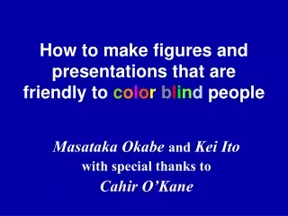
How to make figures and presentations that are friendly to colorblind people Masataka Okabe and Kei Ito with special thanks to Cahir O’Kane
“How common is color blindness? ” One in twelve males (8%) is red-green color blind. Type 1 (protanopes) and type 2 (deuteranopes): functional defects in red and green cone cells, respectively. People with defects in bluecone cells (type 3:tritanopes) are relatively rare (one in tens of thousands.) Red-green color blindness is commoner than AB blood group. There should be more than TEN color blinds in the room with 250 people !
protanope (red cone cells defective) deuteranope (green cone cells defective) tritanope (blue cone cells defective) “Can color blind people see colors? Do they see everything black and white? ” non color blind Color blindnessis not a total loss of color vision. But certain ranges of colors are hard to distinguish.
protanope (red) deuteranope (green) tritanope (blue) “How can you see this color ? ”(common question ;-) A typical confocal picture • Double-staining with • red and green signals. • Not understandable for color blind people ! Let’s simulate how color blind people see this.
“Another problem: recognition of double positive —cannot distinguish yellow from green” protanope (red) deuteranope (green) tritanope (blue) This appears like…
Not good. Then… 1. Present grayscale pictures of each channel. 2. Don’t use red. Use magenta (purple) instead. “How can you make double staining understandable both for color blind and for non-color blind people ? ”
red-green double staining In magenta-green pictures, double positive area becomes white. magenta-green double staining How to convert red channel to magenta? Let’s try with Photoshop.
original red channel �-1 select all �-A copy �-C blue channel �-3 paste �-V all channel �-~ or �-0 How to convert red channel to magenta? REVIEW Just type “� - 1AC3V~”!
protanope deuteranope tritanope “Single labeling should be OK !” not so... Some colors are very difficult to see. (especially red pictures for protanopes.)
when printed • Pure green and red are out of gamut (printable color range). • Subtle gradation will be lost in the published paper. (especially in the area with the strong signal.) Monochrome is the best for tonal reproduction ! “Even if you don’t care about color blinds...” Can you convey more information by making it color ? It should not be just for aesthetic purposes. If you just want to show what kind of label you used (GFP, Cy3, etc.), a sentence in the figure legend might be enough.
1. Present grayscale picture of each channel. 2. Assign dispensable “background staining” to red. “How about triple labeling? ” Good Question… Don’t show the combined picture only. Please:
“Which is better ? Faster to relate colors to channels. (Slides?) green blue red Better tone. Easier to compare staining patterns. (papers and posters?)
3. Difficulty in seeing emphasized parts.Red or green characters in white text over dark blue background.Red characters in black text over bright background.(Red appears similar to black…) “How about characters and drawings? ” Three problems that color blind people suffer: 1. Cannot distinguish different colors.Especially drawings and graphs with red, orange, yellow, yellow green and green symbols and lines. 2. Fail to see some objects.Red or magenta symbols and thin lines over dark blue background.
Mainly use black, blue, white and yellow. Keep the number of colors to a minimum.Use combinations of different symbols with a few, vivid colors rather than a single symbol with various colors.vs. 3. Avoid small red objects.Since protanopes cannot detect long wavelengths, red appears darker. It is hard to recognize red objects above black, blue or green backgrounds. When red is unavoidable, avoid dark red. Use vermilion, put hatching, or add a hem. eg. vermilion hatching hemming pure dark red “How to make slides and figures? ” 2. Over blue or black background, use only yellow and white characters.Emphasize with monochromatic effects like fonts,italics, hatching, shadows or changing brightness. 4. Avoid simultaneous use of red and green.
“Anything else? ” “Cannot see red laser pointer well…” Green laser pointer is good for color blind people. The same also for non-color blinds.
Conclusion There are always color blind people among the audience, readers and referees. Please take this into account when preparing your presentations (papers, slides, web pages etc.) Thank you for your cooperation ! Acknowledgements:Michina Shiraki(double- and triple-staining pictures) Kenji Kitahara and Makiko Ohkido(ophthalmology issue)