
Analyzing Increasing Humidity in Heatwaves: Trends from 1985 to 2050
This presentation continues our examination of heatwaves, illustrating the growing humidity associated with these events over the years. It highlights data from San Diego Lindbergh Airport, showing a rise in minimum temperature dew points from 1985 to 2013, signifying more humid conditions, with an 11% increase observed. Projections for 2050 indicate further increases in specific humidity. The analysis also includes a look at future heatwave trends, with an emphasis on how temperature and humidity changes affect heatwave dynamics.

Analyzing Increasing Humidity in Heatwaves: Trends from 1985 to 2050
E N D
Presentation Transcript
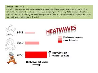
Detailed slides: set 6 This set continues our look at heatwaves; the bar plot below shows where we ended up from slide set 5. Sasha mentioned we should have a more “girlish” looking 2013 image so that has been updated but is merely for illustrative purposes here. So the question is – how can we show that heat waves will get more humid? Heatwaves 1985 Heatwaves become more frequent 2013 Heatwaves get warmer at night 2050 Heatwaves get longer
In a basic sense we know the heat waves are getting more humid because the temperature is warmer at night. At night we see the temperature falling towards the dewpoint temperature. The dewpoint temperature tells us how far we have to cool the air for dew to form. Thus a higher dewpoint temperature means the air is more humid. And if we are warmer at night that means the dewpoint temperature is higher. When we looked at the changes between 1985 and 2013 we looked at the San Diego Lindbergh record. Since this is an airport site we have hourly data and this data includes dewpoint temperature. So for the days that we outlined (slide set #5) we can look at the dewpoint temperature from those events. For this look I’ve selected the dewpoint temperature at the time of the minimum temperature. The dewpoint temperatures are in oC. If we average the values we get 17.0oC for 1985/86 and 18.8oC for 2012/13. So we see an 11% increase in the minimum temperature dewpoint value from 1985 to 2013.
From the global climate model we don’t have hourly dewpoint temperature but we do have near surface (approximately 2meter) specific humidity. Specific humidity is the mass of water vapor in a unit mass of moist air. It is usually expressed as g/kg (grams of water vapor in a kg of moist air). We can look at this to gauge how the night time heat waves are becoming more humid. When we looked at the changes for 2050 (slide set 5) we looked at the CNRM CM5 global climate model simulations. Again we focus on the inland San Diego grid cell which is representative of an area that is partly inland San Diego to mostly desert. The specific humidity values are in g/kg. If we average the values we get 9.9 for 1989/90 and 10.7 for 2049/50. So we see an 8% increase in the specific humidity value from 1989/90 to 2049/50.
The little clouds demonstrate the increase in humidity. The 2013 cloud is 11% larger than the 1985 cloud. The 2050 cloud is 8 percent larger. The cloud may not be the most appropriate symbol to use as we would not want the reader to infer more cloudiness. Heatwaves 1985 Heatwaves become 2013 more humid more frequent Heatwaves get warmer at night 2050 Heatwaves get longer
These are the 6 “bubble” plots that Kristen made for us to show heat wave activity. Sasha thought it would be interesting to look at one plot which shows activity for the 6 regions combined. I’m in touch with Kristen about making this plot and hopefully we’ll have more on this next week (Oct 28 – Nov 1).
Like the bubble plot we’ll take the same 6 sites (8 are shown here) and average the tmax and tmin. Then we’ll plot the tmax and tmin on the same plot – combining this into one plot. We’ll have more on this next week (Oct 28 – Nov 1).
From the average of the 6 sites (tmax and tmin) we’ll make an average “region” temperature. This will replace the black line on the temperature projections plot. We’ll have more on this next week (Oct 28 – Nov 1).
Dan had me make some changes to the water-energy graphics and thought I would share those for your consideration.
Dan had me make some changes to the water-energy graphics and thought I would share those for your consideration.
Staying with the more “primary color” version of this I’ve changed the y-axis units from percent to thousands of acre feet. One acre foot is the amount of water that it would take to cover an acre one foot deep.
Sasha and I talked about making bar graphs from the line graphs below (from Suraj). He felt it was important to emphasize little change in the annual total precipitation but more variability from year to year. I’ll get the data from Suraj so we can make bar graphs (and you can consider binning the data). However we are still thinking about how to emphasize the year-to-year variability. More on this next week (Oct 28-Nov 1).
I’m working on changing the 2013 data shown here (just Lindbergh) to reflect the same six sites – as those we’re going to use for the temperature looks. We’re also working on a version showing the change in year to year variability. Right now I have a bucket with water at the same level but different numbers of holes and different size holes. More on this next week (Oct 28-Nov 1). 2050 2013