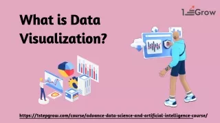
What is Data Visualization: A Comprehensive Guide
What is Data Visualization: A Comprehensive Guide" offers a concise exploration of the fundamental concepts and techniques behind visualizing data. From charts and graphs to interactive dashboards, this guide illuminates how data visualization enhances understanding and decision-making across various domains. Dive into the art and science of transforming raw data into insightful visuals.

What is Data Visualization: A Comprehensive Guide
E N D
Presentation Transcript
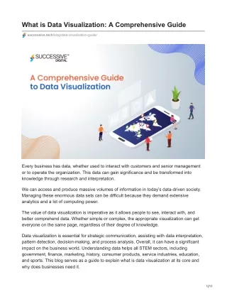
What is Data Visualization: A Comprehensive Guide successive.tech/blog/data-visualization-guide/ Every business has data, whether used to interact with customers and senior management or to operate the organization. This data can gain significance and be transformed into knowledge through research and interpretation. We can access and produce massive volumes of information in today’s data-driven society. Managing these enormous data sets can be difficult because they demand extensive analytics and a lot of computing power. The value of data visualization is imperative as it allows people to see, interact with, and better comprehend data. Whether simple or complex, the appropriate visualization can get everyone on the same page, regardless of their degree of knowledge. Data visualization is essential for strategic communication, assisting with data interpretation, pattern detection, decision-making, and process analysis. Overall, it can have a significant impact on the business world. Understanding data helps all STEM sectors, including government, finance, marketing, history, consumer products, service industries, education, and sports. This blog serves as a guide to explain what is data visualization at its core and why does businesses need it. 1/11
What is Data Visualization? Data visualization depicts information and data in a pictorial or graphical style. It is simply the visual representation of data. Data visualization tools make it easier to detect and analyze trends, patterns, and outliers. The idea behind using visuals is to interpret data used for centuries. The most common data visualization methods are charts, tables, graphs, maps, and dashboards. The term is often interchangeably used with information graphics, visualization, and statistical graphics. Data visualization, an essential phase in the data science process, occurs after data has been collected, analyzed, and represented. It’s part of the broader data presentation architecture discipline, which aims to discover, retrieve, modify, format, and communicate data most efficiently. To read more about data engineering, please refer to this blog- Data Engineering: A Guide Explaining Every Aspect of IT Why is Data Visualization Important for Businesses? Data visualization is a huge benefit to aggressive enterprises and evolving organizations. It can also identify mistakes in the company’s data, policies, or processes, improving performance and brand perception. Data patterns outline how specialists collect data and design visual representations of data. The primary use is to specify which fields are required for extraction, examination, or display. These patterned data sets can be semi-structured, structured, researchable, or database- indexed. They contribute to making complex data available for many use-case such as future study or predictions and can be integrated with multiple applications to develop new concepts. Dashboards, graphs, infographics, maps, charts, videos, slides, and other mediums can all be used to visualize and comprehend data. In the era of modern technologies like AI, ML, IoT, etc., data visualization has emerged as an essential tool for deriving meaningful insights from the massive amounts of data produced by these technologies. As AI and ML algorithms process and analyze huge datasets to identify patterns and trends, data visualization is critical for presenting these insights in a human- readable fashion. By visualizing the outputs of AI and ML models, organizations can better understand complicated events, allowing them to make confident data-driven decisions. Furthermore, as IoT devices that collect real-time data from diverse sources grow, data visualization becomes increasingly essential in monitoring, analyzing, and understanding this data. 2/11
Every industry benefits from knowing its data, so data visualization expands into all fields where data exists. Through visualization, one can effectively explain their points and use that knowledge. Advantages of Data Visualization Let’s further understand in detail how data visualization are used in businesses and how these benefit modern businesses: Data Simplification The most significant advantage of data visualization is that it simplifies complex data into simple visual representations, enabling business leaders to make informed decisions. It facilitates data sharing by ensuring everyone is on the same page while viewing your graphic. Instead of risking people’s inability to understand or interpret numbers or raw data strings, a visualization aligns business leaders’ thoughts collectively. Actionable Insights Data visualization can assist your organization in identifying areas for improvement or areas of high performance. By identifying successes and areas for improvement, actionable items can be created. For example, if your sales staff understands that every X number of calls results in Y number of sales, creating a visual report based on calls per salesperson and progress toward the call objective serves as a visual motivator to fulfill the call quota. Similarly, a pipeline report that illustrates each opportunity in the sales funnel helps sales teams make the right decisions. Increased Interaction Data visualization improves engagement by translating complex data into understandable visual representations. Data visualization, which presents information in visually attractive formats such as charts, graphs, and maps, allows consumers to immediately comprehend insights, patterns, and trends that would otherwise be buried in raw data. This visual clarity not only improves comprehension but also promotes engagement since users are more likely to investigate and interact with data that is presented in a captivating manner. Furthermore, interactive features such as zooming, filtering, and drill-down capabilities allow users to go further into the data, revealing significant insights. Overall, data visualization is an effective method for increasing interaction by making data more accessible. Discovers Relations Between Events Data visualization techniques are effective for identifying links between occurrences. As it visually represents complex data in understandable formats. Data visualization uses interactive charts, graphs, and diagrams to help users uncover connections, patterns, and 3/11
trends that may not be immediately obvious in raw data. Numerous factors influence a business. Finding links between these aspects or events allows leaders to understand their company’s difficulties. For example, today’s online business market is different from before. Diagrams of internet groups appear during holidays such as Christmas and Thanksgiving. For example, if an internet firm does a $1 million business in a given quarter and the business proliferates, it may quickly identify the comparable events. Increases Productivity & Sales Data visualization helps to increase productivity and sales by speeding up data analysis processes and allowing for more informed decision-making. Data visualization, which presents complicated datasets in visually intuitive formats such as charts, graphs, and dashboards, will enable teams to quickly detect trends, patterns, and correlations, saving significant time that would otherwise be spent on manual data interpretation. This efficiency increases production because teams can focus on strategic tasks rather than manual data analysis. Furthermore, data visualization gives sales teams real-time insights into consumer behavior, market trends, and sales performance. This allows them to recognize opportunities, modify their tactics, and prioritize their efforts more effectively, resulting in better sales results. What are the Key Elements of Data Visualization? Every approach or technology in the market has its guidelines, essential elements, pillars, and segments. Let’s understand how you can create an appealing data dashboard and make your data visualization effective: Clean Heading & Keys The more appealing the heading, the more the reader will focus on the facts in the chart or graph. You must first identify your target audience to build the most intriguing heading. For example, avoid using technical phrases or jargon when communicating with the general audience. Using the term “your” makes the information immediately relatable to the reader. When it comes to keys, keep them as simple and easy as possible. Short labels and significant color variation make them simple to use at a glance, and positioning them in the right area – where they are visible but keep the data clear – helps to minimize confusion. Relevant Comparisons Comparisons are potent data visualization techniques, whether you’re trying to emphasize a point or persuade readers to adopt a specific habit. Comparisons assist in putting your data in context. This method works best when you have multiple data sets that are directly comparable. Displaying current data alongside averages and norms, for example, 4/11
demonstrates to the reader how things are and how they could and should be. And the more detail you can include in the comparison, the better. This allows the reader to comprehend the “why” and “how” of the information you’re attempting to convey; it makes facts actionable. Evidence to Support The more elements – essentially evidence – you include in data visualization, the more persuasive the overall picture will become. Trends appear more entrenched, while outliers appear more unique. That being stated, make sure to convey the data. Don’t forgo a simple message to display a large amount of data. Clear Summaries Sometimes, there are better approaches to presenting information than traditional data visualization (with colorful visuals). It would help if you had something shorter than lengthy reports, yet charts and graphs would be excessive– the solution: a simple table. You do not need to study, calculate, or point out a trend; deliver the most significant points as effectively as possible. Thanks to clear headings and minimum rows and columns, your reader can see all the information they need at a glance. Design Elements Adding design features to data visualization can improve your message in subtle but significant ways. It can draw readers’ attention, pique their interest, and enhance the presentation’s professional appearance and feel. Design can also provide visual clues that are relevant to the reader. Consolidated Information Another critical element of data visualization is the consolidated presentation of information. It can convey multiple ideas in a readily accessible format. Individual data points can be visually represented to provide particular information and a larger picture. Types of Visualization 5/11
Let’s further understand the different types of data visualizations: Bar Charts Bar charts are one of the most common data visualization methods because they provide a data set in an easily understandable manner, allowing users to identify highs and lows at a look. They are incredibly adaptable and are commonly used to compare discrete categories, examine changes over time, or compare subsets of a whole. Line Graphs These graphs have sections that each represent a portion of the entire. They offer a simple method for compiling data and comparing component sizes. Pie Charts Pie charts show a circle divided into sectors, each representing a fraction of the total. They can be grouped into up to five data groups. They help compare both discrete and continuous data. There are two variations on the pie chart: Standard: Used to show the link between parts. Donut: A style variation with a total value or design feature in the center. Scatter Plots 6/11
Scatter plots utilize points on a Cartesian coordinate plane to depict the relationship between two variables. Additionally, they help in determining the correlation between data sets. Heatmaps Heat maps use color or intensity fluctuations to depict individual data points on a matrix. Color is commonly used to distinguish between data groups visually. Color coding can help visualize webpages, with “hot” colors representing places with the most interaction and “cold” colors representing pages with the fewest clicks. Histograms Histograms use bars to represent variables, with the surface area proportional to the frequency of the depicted values. They provide an overview of a population or sample distribution based on a specific trait. Tables This comprises rows and columns for comparing variables. Tables can display a large amount of information in a structured style, but they can also overwhelm consumers only by searching for high-level patterns. Bubble Charts These visuals highlight three-dimensional data in dispersion diagrams and maps. They aim to illustrate nominal comparisons and categorization links. Combined with data, the size and color of bubbles can highlight specific values. Radar Charts These representations use a regular polygon within a circle, with the radii guiding the vertices serving as axes to express values. They are comparable to graphics using parallel coordinates on polar coordinates. Typically, they reflect a metric’s behavior across a specific time, such as hours, months, or days of the week. Tree Maps Treemaps portray hierarchical data as nested rectangles with surface areas proportional to variable values. Each tree branch is given a rectangle and then arranged in a mosaic with smaller rectangles representing subsidiary branches. The completed product is a dynamic visual of a plane separated into sections based on hierarchical data, sorted by size, and color-coded. Data Visualization & Big Data: Correlation Between Them 7/11
Data visualization and big data analytics are often linked. Data visualization can help communicate big data analytics results to a larger audience. It can also detect trends and patterns in data that are difficult to spot with the naked eye. Data visualization transforms data into visual representations. This allows people to analyze and interpret vast amounts of data better. Big data analytics collects, stores, and analyzes enormous amounts of data to gain significant insights. Data Visualization Tools To effectively utilize data visualization, you must need data visualization tools. Below is the list of some data visualization tools that are widely utilized: Tableau Tableau stands out in the data visualization market for its unique combination of simplicity and power. It’s an easy-to-use tool that’s incredibly robust. With the ability to import data from a wide range of sources and create a variety of visualizations, including charts and maps, Tableau is a versatile solution. Owned by Salesforce, Tableau has a large user base and a thriving community, making it a popular choice in the business world. Tableau provides numerous products, including desktop, server, and web-hosted versions of its analytics platform and customer relationship management (CRM) software. A free solution, Tableau Public, is also available. Infogram 8/11
Infogram is another popular alternative for creating charts, reports, and maps. What distinguishes Infogram from the other tools is its ability to produce infographics, making it particularly popular among creative workers. The application also contains a drag-and-drop editor, which is helpful for beginners. Visualizations can be saved as picture files and GIFs to be integrated into reports and documents or as HTML for internet use. Infogram, like most of the other products on this list, includes tier-based pricing, with options ranging from free to business. Zoho Analytics Zoho Analytics is a data visualization application created primarily for professionals seeking to display business analytics. As a result, it is most typically used to visually represent sales, marketing, profit, revenues, costs, and pipelines through user-friendly dashboards. More than 500,000 organizations and two million users are presently using the software. Zoho Analytics offers a variety of packages that are priced based on your needs. A free version also allows you to create a limited number of reports, which might be helpful when deciding which tool is ideal for your needs. Grafana Grafana open source is a free data visualization and analytics tool. It allows you to query, display, alert, and investigate metrics, logs, and traces from anywhere. It offers tools for converting time-series database (TSDB) data into valuable graphs and visualizations. It also has a Grafana cloud component. It is an OpenSaaS logging and analytics platform that is highly accessible, fast, and completely customizable. The application has all of the features you enjoy about Grafana, but Grafana Labs hosts and administers it for you. Grafana Enterprise is Grafana’s commercial edition, which includes features unavailable in the open-source version. Grafana Corporate offers enterprise data sources, complex authentication options, enhanced permission limits, 24x7x365 support, and core team training. Microsoft Excel & BI Microsoft Excel is a spreadsheet solution, not a data visualization tool. Nonetheless, it offers valuable data visualization capabilities. Given that Microsoft products are frequently utilized in the industry, you may already have access to them. According to Microsoft’s documentation, Excel can create at least 20 different types of charts from spreadsheet data. Standard options include bar charts, pie charts, and more complicated ones such as radar charts, histograms, and tree maps. 9/11
If your company needs an advanced data visualization tool but wants to stay within the Microsoft environment, Power BI is a good option. Designed primarily as a data analytics and visualization tool, Power BI can input data from various sources and generate visuals for a wider audience. How can we help you with Data Visualization? Successive Digital specializes in business intelligence and data visualization consulting and implementation services and provides world-class data transformation, visualization, reporting, and analytics solutions. Our data engineers and BI consultants specialize in creating data models to meet the organization’s intelligent and innovative data demands, such as KPI reporting, visualization, and insight discovery. Our intuitive visual representations of data solutions have helped businesses tap into performance measures and uncover significant trends for better decision-making. We have assisted companies in healthcare, advertising, branding, maritime, retail, and others in efficiently utilizing complicated information and gaining a competitive advantage in their respective fields. Trends in Data Visualization: What Future Holds? Data visualization makes our business operations easier and efficient. It helps us to take informed decisions. With the advancement of technology and the increase in the data volume, it’s imperative to understand what is data visualization. Below are the jotted-down trends for data visualization that you must read: Scrollytelling “Scrollytelling” is a technique we’ve all encountered while perusing infographics or websites. As the name suggests, it attempts to convey a story as users scroll over a graphic. Many libraries, such as Waypoints, ScrollStory, ScrollMagic, and Graph-Scroll.js, can help create this type of visualization. These tools let users interact with content while scrolling over a webpage or zooming in on specific content, which alters and tells a story. Users can interact with the data visualization to see more details, a timeline, or new elements such as text, icons, or pictures. Social First Data Visualization The world of data visualization is continually changing, as we have witnessed during the years of digital transformation. Social networks now play an essential role since the constant flow of information allows us to create more narrative storylines using data collected by Instagram, Snapchat, and YouTube. In his book “Info We Trust,” RJ Andrews writes, “It’s almost like content stumbles onto social right now.” He says that “it is something that has yet to be convincingly figured out, but the community is gradually becoming aware. “Social can mean many things” in terms of marketing and research. 10/11
Virtual Reality Visualizations Virtual reality can potentially transform data visualization, especially for massive data. Even in a two-dimensional image, the human eye has too much information to process. Consider a three-dimensional data visualization that allows users to engage with data in a 360-degree field of view completely. Virtual reality data visualizations are three-dimensional computer- generated projections that are highly interactive. Although the concept of virtual reality is not new, the idea of immersive data exploration is, and the fascinating possibilities that it promises are boundless. To read about immersive experiences- refer to this blog- Immersive Experiences: A Comprehensive Guide to Virtual World Conclusion Information is critical for staying informed and making decisions in this data driven environment. Effective data visualization is a vital stage in the data processing workflow. Data visualization is gaining popularity in the current era. With the advent of next-generation technologies and the creation of apparent frameworks, it is transitioning from art to science, creating new potential. Using the guidelines above, you can utilize data visualizations to process your business data or seek assistance from data visualization consulting services. 11/11