Expressive
Expressive. Typography Using type for the secondary meaning. Typography. Letters are not just abstract notions, carriers of meaning; they are also real, physical shapes.

Expressive
E N D
Presentation Transcript
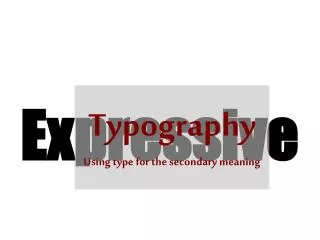
Expressive Typography Using type for the secondary meaning
Typography • Letters are not just abstract notions, carriers of meaning; they are also real, physical shapes. • Paying attention to those shapes, and using them as a visual element in graphic design, is an essential part of the art of typography. • This is sometimes called "expressive typography”. • It's a matter of seeing the graphic elements on the page or screen, including the letterforms, and arranging them in a way that seems natural, in fact inevitable. • Shape of letters are expressive far beyond the basic use as sound symbols
Typography • Use individual and groups of letters as expressive imagery • Scale • Position • Texture • Study the individual letters of the alphabet in order to heighten sensitivity to shape • Study groups of letters, lines of type, inter-letter and inter-line spacing • Consider legibility, readability, spirit, style, classic, trendy, and appropriateness • Unity, hierarchy, balance, alignment, and rhythm
Typography • Positive and negative relationship • Mixing letter sizes • Stacking lines • Outside edge texture • Shape - form • Ligatures
Sometimes the size and shape of the letters have a direct bearing on the meaning of the words, as Dair shows what he was talking about in the very letterforms that he chose, and in how he arranged them together. Figure 2:The letterforms that describe themselves, from one of Carl Dair's "Typographic Quest" booklets.
Not visual puns, which can get out of hand unless they're used with extreme restraint • But the perfect congruence between the meaning and the type itself. • Jost Hochuli used a simple fi ligature, and the Italian forms of the names of France and Italy ("Francia" and "Italia"), to create this meaningful image of unity and integration between two countries. Figure 3: Linking the names of France and Italy, and the first letters of their names, in a ligature and a word play; from Jost Hochuli's "Alphabugs."
Sometimes letters get used as visual elements with only allusions to their meaning; becoming more a matter of collage than of typography: perhaps only peripherally typographical. Figure 4: An ad from "The New York Times": type as almost pure texture.
Of course, you can separate typography almost entirely and use letters as the building blocks of art. Figure 5:Pure art, not typography, using wood type: a letterpress print by Jack Stauffacher.
Typography • You can use striking contrasts of size and style and position of type to grab someone's attention in order to impart a message. • By making the image visually rewarding, you invite a potential reader in and present your message in an entertaining way. • You can entice that person to read the fine print by making something large and dramatic -- as long as the drama doesn't come at the expense of the meaning.
Figure 6:This one-color 3-x-5-inch card was a handout meant to be distributed to people at a large convention -- something to stick in the pocket and take home. • Contrast and strong letter shapes are used to do this in a simple hand-out card for the online science-fiction magazine.
Dramatic display typography is often used today in newspapers -- especially in features pages which mixes type in visually arresting ways. • Highly unusual and effective use of type draws the reader into the story. Figure 7:Detail from an arts page of the French-language Québec newspaper "Le Devoir," designed by Lucie Lacava.
Typography • These images are just suggestions, reminders of what's possible and keys to opening up our visual vocabulary. • Typography doesn't have to be staid. • It has to be functional • Don’t play with the type without regard for the meaning of the words, or the purpose of the message that needs to be communicated • Typography -- whether it's the most straightforward text or the wildest display -- is a seamless melding of the verbal and the visual. It needs to be practiced mindfully, creatively, and respectfully.