Download
1 / 2
20 likes | 140 Vues
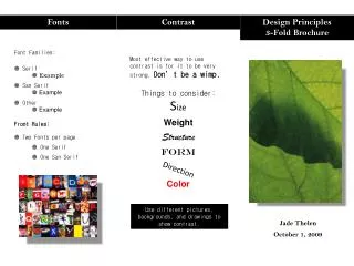
Discover essential design principles for creating impactful brochures. Learn how to effectively use fonts, including serif and sans serif families, ensuring a balanced and visually appealing layout. This guide emphasizes the importance of strong contrast, encouraging bold choices in size, weight, and color. Understand the principles of repetition for cohesiveness and alignment for clarity, while mastering the art of proximity to enhance visual relationships. Perfect for designers seeking to unify their work and captivate their audience.

E N D
Fonts Contrast Design Principles 3-Fold Brochure • Font Families: • Serif • Example • San Serif • Example • Other • Example • Front Rules: • Two Fonts per page • One Serif • One San Serif Most effective way to use contrast is for it to be very strong. Don’t be a wimp. Things to consider: Size Weight Structure FORM Color Direction Use different pictures, backgrounds, and drawings to show contrast. Jade Thelen October 1, 2009
Repetition Alignment Proximity • Robin William’s design principle for repetition is to repeat an aspect of the design throughout the entire piece. • Keep it consistent • Fronts • Type face • Colors • Alignment • Pictures • Bullets and Numbering • Purpose is to unify and add visual interest Left Justified • Proximity is about: • Grouping related items together • It shows a relationship to the items • Unrelated items need to be separated • For Example: Within alignment the four important elements are visual connection, unity, try not to over use center and justify My Flowers Marigold Pansy Carnation Violets My Flowers Marigold Pansy Carnation Violets Right Justified