Download
1 / 20
200 likes | 353 Vues
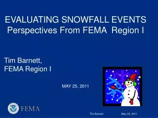
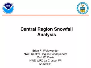
Central Region Snowfall Analysis. Brian P. Walawender NWS Central Region Headquarters Matt W. Davis NWS WFO La Crosse, WI 5/26/2011. History. In the early 2000’s, NWS offices began creating precipitation analysis graphics for display on their web pages.

E N D
Central Region Snowfall Analysis Brian P. Walawender NWS Central Region Headquarters Matt W. Davis NWS WFO La Crosse, WI 5/26/2011
History • In the early 2000’s, NWS offices began creating precipitation analysis graphics for display on their web pages. • Two primary software packages were utilized for the creation of the graphics • ArcMap • GFE • Both software packages interpolated the random points into a graphical analysis
Weaknesses of Previous Methods • Manually created, via a multistep process, on a non routine basis • Typically restricted to the local forecast area, requiring the user to view several graphics to see the big picture • Color and contour intervals typically varied from office to office, leading to confusion when viewing graphics from multiple offices. • No ability to zoom the graphics or add/remove layers
Central Region Prototype • Collaborative effort between NWS Central Region Headquarters and WFO La Crosse, WI. • Key Requirements • Use commonly available to Open Source GIS tools • Automated • Output can be zoomed and panned • Consistent colors and contour intervals
Open Source Tools Utilized • Postgresql/PostGIS database – allows for the storing of a geometry object (latitude and longitude in our case) with any database entry • GDAL - Geospatial Data Abstraction Library • Used perform the interpolation of the raw data into the output analysis graphic • Used perform the contour analysis from the output image • Used to create the multiday analysis products
Open Source Tools Utilized • Mapserver – web mapping server used to serve out the raster and shapefile output products • OpenLayers – web mapping API • Similar to Google Maps • Allows for adding interactive maps to web pages
Dataflow • Input data of consists of: • NWS Cooperative Observer Reports • Community Collaborative Rain, Hail and Snow Network (CoCoRaHS) reports • Typical Analysis will consist of about 7500 observations • NWS Local Storm Reports (LSR) were purposely left out because of time range concerns • LSR reports currently contain no start, stop or duration information (yet)
Dataflow • Reports are received via LDM from MADIS and NOAAport • Reports are decoded and databased in realtime • Database can hold several months of data
Data Analysis • The scattered point to grid analysis is done via an inverse distance weighted interpolation scheme. • Grid box is a moving1.8 degs, requiring three observations. Inverse power is 6, and output is smooth very slightly at 0.2. • Output is a georeferenced tagged image file format (GeoTIFF) • 2000 x 2000 GeoTIFF covering CONUS.
Data Analysis • To increase the display performance, the large GeoTIFF is converted into polygon shapefile via GDAL • The conversion into the polygon shapefile bins the analysis into the standard contour intervals • The analysis is run every 30 minutes from 12 UTC until 20 UTC to continuously update the analysis
Multiday Products • Multiday products pose a challenge since there is dilemma on whether or not to include stations that do not report each day of the reporting period • Example – a station reports three days over a four day period – do you use it in a four day analysis • To avoid this concern, the multiday products are created by summing the output analysis for each day in the period, instead of the raw data.
Quality Control • An internal web interface allows offices to quality control the analysis • The interface allows the forecaster to flag stations with questionable data, causing them to be removed from the analysis • The analysis is automatically run twice per hour, including new observations, and removing those which were quality controlled.
Web Display • The final analysis products are displayed on the web page via an interactive map • The interactive map can be panned and zoomed • The interactive map has multiple layers that can be toggled on and off • The map includes output for the last 24, 48 and 72 hours
Web Display • The snowfall analysis can be viewed at: • http://www.srh.noaa.gov/ridge2/snow/index.php • Note this URL may change for the 2011/2012 snow season • Future enhancements will included increased resolution, and more observations (Snotel, etc.)
Customer Response • Customer Survey ran from Jan 10th until April 30th, 2011 • 300 responses • 180 users rated the technical quality of the product as a nine or higher (out of ten) • 207 users rated the ease of use as a nine or higher
Authors • Matt W. Davis • La Crosse, WI Weather Forecast Office • N2788 County Road FA • LaCrosse, WI 54601 • Matt.W.Davis@noaa.gov • Brian P. Walawender • Central Region Headquarters Regional Office • 7220 NW 101st Terrace • Kansas City, MO 64153 • Brian.Walawender@noaa.gov