Download
1 / 42
440 likes | 800 Vues
Explore the influential figures and key designs of the postmodern design movement from the 1980s, including Memphis in Europe and San Francisco schools. Learn about visionaries like Michael Vanderbyl, Michael Graves, Michael Manwaring, and Michael Cronin. Discover how they pushed the boundaries of graphic possibilities with symbolic and intuitive forms. This era embraced a mix of graphic, product, and interior design, emphasizing harmony and composition. Dive into the vibrant world of postmodern design today!

E N D
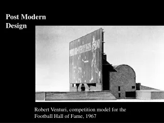
Post Modern Design Robert Venturi, competition model for the Football Hall of Fame, 1967
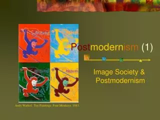
A new movement in postmodern design appeared in the Europe and America at the early 1980s. The Italia design group Memphis became a predominant design style during the 1980s.In their architects and products designs They embraced the fantastic form and bright color palette. The function became less important. The Memphis and San Francisco schools
In the early 1980s, The design community and art schools in San Francisco emerged rapidly. With important contributions of graphic designers Michael Vanderbyl, Michael Manwaring, and Michael Cronin the city gained a reputation as a center of creative design. Those designers explored the harmony and composition of graphic possibilities. They conveyed a sunny and optimistic attitude in their work. The symbolic and intuitive form became a part of the arrangements.
“When it comes to design, I like to do it all,” says Michael Vanderbyl, whose life-long goal has been to merge traditionally segregated design forms like graphic design, product design and interior architecture. As evidenced by the work that has emerged from his San Francisco–based studio over the course of his 27-year career, Vanderbyl has attained this goal—and more. A century ago, Otto Wagner, Vienna’s pioneering modernist architect/designer, coined the famous term Gesamtkunstwerk—the total work of art—to describe what he believed was the ultimate creative attainment in the modern age. One hundred years later, Vanderbyl’s talent and achievements seem to fulfill the Viennese master’s criteria with startling accuracy.
Michael Vanderbyl 22-01
Michael Vanderbyl 22-01
22-01 Michael Vanderbyl
22-01 Michael Vanderbyl, postermodern architecture poster, 1984
22-01 Michael Graves From tea kettles to typefaces to libraries— the wide-ranging designs of Michael Graves.
Poster for a Michael Graves exhibition, designed by William Longhauser, 1983
Michael Graves The Portland Building opened in 1982. It is home to the municipal offices of Portland, Oregon, and in 2011 became part of the National Register of Historic Places.
Michael Graves The Portland Building opened in 1982. It is home to the municipal offices of Portland, Oregon, and in 2011 became part of the National Register of Historic Places. Sketch of the award-winning Denver Central Library's main facade designed by Michael Graves included the preservation and renovation of the 1956 modernist library by Burnham Hoyt, and a 390,000-square-foot expansion. It opened in 1995.
Completed in 1985, the Humana Building in Louisville, Kentucky, received a National AIA Honor Award.
Walking Sticks for Kimberly-Clark designed by Michael Graves in 2014.
Michael Manwaring brochure cover for Barr Exhibits, 1984
Michael Manwaring The Embarcadero Waterfront Transportation Project Historic and Interpretive Signage Program This interpretive signage program was created in 1996 and covers 2.5 miles of the Embarcadero. The project commemorates the waterfront’s historical significance.
Michael Cronin, experimental text design, 1971
22-05 Wolfgang Weingart (b.1941), exhibition poster, 1982.
Dan Friedman (1945-1999): Typografische Monatsblatter magazine cover, 1971. Letterforms become kinetic objects moving in time and urban space. An American who studied at the Ulm Institute of Design in 1967 and 1968 and at the Basel School of Design from 1968 to 1970, he rethought the nature of typographic forms and how they could operate in space 22-05
22-05 April Greiman Art Direction, 1978
22-05 Paula Scher (1995) Pentagram Design for The Public Theatre
22-05 Paula Scher (1995) Pentagram Design for The Public Theatre
22-05 Paula Scher (1995) Pentagram Design Touhill Performing Arts Center
22-05 Paula Scher (1995) Paula Scher - 1995 - Part of 'Bring in Da Noise Bring in Da Funk' Series
22-01 Alan Fletcher, Colin Forbes, and Bob Gill, cover for Graphis, 1965. The record of a parcel’s international journey carrying Pentagram work to the magazine also became the package carrying Graphis to its readers.
22-05 Ryuichi Yamashiro, poster for a tree-planting campaign, 1961. The Japanese characters for tree, grove, and forest are repeated to form a forest.
22-06 Japanese traditional crests & much postwar Japanese graphic design share direct frontal presentation of simplified images, symmetrical composition, and a refined use of line and space.
22-30 Wim Crouwel, postage stamps for the PTT, 1976. Absolute simplicity gains expression through color gradation.
22-34 Pieter Brattinga, exhibition poster, De Man Achter due Vormgeving van de PTT (The Man Behind the Design for the Dutch Post Service), 1960. A vibrant translucency, achieved by overprinting gray and blue on a halftone photograph, expresses the subject.
22-35 Studio Dumbar, PTT corporate identity system, 1989. Architectural identification, vehicles, and signage were produced from guidelines in the identity manual, shown at right.
22-36 R.E.D. Oxenaar with J. J. Kruit, designs for Netherlands currency: 50 guilder, 1982, and 250 guilder, 1986. A rare aesthetic attainment and functional practicality enabled currency to contribute to a sense of national identity.
22-37 Anthon Beeke (designer and photographer), theater poster for Leonce and Lena, 1979. The image becomes a covert allusion to something not directly stated, disconcerting in its ambiguity.
22-45 Hard Werken Design, covers for Hard Werken magazine no. 1, 1979, and no. 10, 1982. Experimentation with images, printing techniques, and materials characterized early Hard Werken designs.
22-46 Hard Werken Design, souvenir stamp sheet for the PTT, 1988. The self-referential attributes of modern painting and literature are applied to postage stamps.