Download
1 / 2
20 likes | 28 Vues
If you plan to upgrade your existing logo & create a new one from scratch, keep all such proven design principles in mind or you can simply take professional services from TechPlek Technologies specialized in Brand Strategy, Website development, web app development and more<br>

E N D
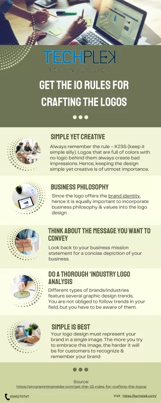
Get the 10 Rules for Crafting the Logos Simple yet creative Always remember the rule – KISS (keep it simple silly). Logos that are full of colors with no logic behind them always create bad impressions. Hence, keeping the design simple yet creative is of utmost importance. Business Philosophy Since the logo offers the brand identity, hence it is equally important to incorporate business philosophy & values into the logo design Think about the message you want to convey Look back to your business mission statement for a concise depiction of your business. Do a thorough ‘industry logo analysis Different types of brands/industries feature several graphic design trends. You are not obliged to follow trends in your field, but you have to be aware of them. Simple is best Your logo design must represent your brand in a single image. The more you try to embrace this image, the harder it will be for customers to recognize & remember your brand Source: https://programminginsider.com/get-the-15-rules-for-crafting-the-logos/ 8595270747 Visit : https://techplek.com/
Go easy on colors Yet again, less is more brilliant. Think about what types of colors best symbolize your brand/business.Choose no more than 2-4 colors at most for your final design Establish (adhere to) specific brand guidelines Preferably, your business/brand already has a ‘brand style guide’ that outlines what’s permissible & what’s not about your logo & related marketing resources. Utility A logo should also be compact enough to be resized without cooperating its artistic value. Keep it readable Always prefer to use regular fonts. However, the fancy logo fonts look well, but it is not specialized for commercial reproduction & reprint of your logo. Work with vectors Work with vectors because vector illustrations can be resized without any loss of clarity & image quality. A well- drawn and vector-based logo with clean and crisp lines & limited colors is always more effective than others. Source: https://programminginsider.com/get-the-15-rules-for-crafting-the-logos/ 8595270747 Visit : https://techplek.com/