Download
1 / 6
60 likes | 165 Vues
Learn how to display information using pictographs, bar graphs, line graphs, and pie charts. Explore examples like ferry usage and shoe size surveys to improve your data visualization skills.

E N D
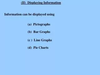
(II) Displaying Information Information can be displayed using (a) Pictographs (b) Bar Graphs (c ) Line Graphs (d) Pie Charts
Pictographs - made up from small pictures Ferry Use = 10 cars MON TUE WED THU FRI
Busiest day is Friday 40 No. cars on Monday is No. cars on Thursday is 25 No. more cars on Monday than on Thursday 15 Total for week 190
Pictographs - made up from small pictures Ferry Use = 4 cars MON TUE WED THU FRI
Pictographs - made up from small pictures Ferry Use = 6 cars MON TUE WED THU FRI
Bar Charts The results of a shoe size survey were Size 2 3 4 5 6 7 8 Frequency 1 3 2 1 5 3 1 These can be made into the following bar chart Class Shoe Size 4 frequency 2 2 3 4 5 6 7 8 size