Download

1 / 15
320 likes | 926 Vues
How to Make an Effective Presentation. By: Sanjeev Acharya. Presentation. A presentation is a means of communication i.e. used during various speaking situations, such as: giving a lecture talking to a group addressing a meeting briefing a team. Effective Presentation.

E N D
How to Make an EffectivePresentation By: Sanjeev Acharya
Presentation A presentation is a means of communication i.e. used during various speaking situations, such as: giving a lecture talking to a group addressing a meeting briefing a team.
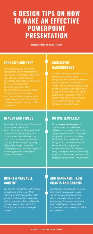
Use a Template Use a set font and color scheme. Different styles divert the concentration of audience. We want the audience to focus on what we present, not the way we present.
Fonts Choose a clean font that is easy to read. Roman and Gothic typefaces are easier to read than Script or Comic. Stick with one or two types of fonts. The appropriate font size is between 24 to 28 for content and between 28 to 32 for Headings.
Bullets • Keep each bullet to one line, two at the most. • Limit the number of bullets in a screen to six
Bullets & Cueing • Bullets allow you to “cue” the audience in on what you are going to say. • Cues can be thought of as a brief “preview.” • This gives the audience a “framework” to build upon.
Caps and Italics • Do not use all capital letters • Makes text hard to read • Denies their use for EMPHASIS • Italics • Used for “quotes” • Used to highlight thoughts or ideas • Used for book, journal, or magazine titles
Colors Reds and oranges are high-energy but can be difficult to stay focused on. Greens, blues, and browns are smoother, but not as attention grabbing.
Backgrounds • Having a darker background on a computer screen reduces glow. • White on dark background should not be used if the audience is more than 20 feet away.
The Color Wheel • Colors separated by another color are contrasting colors (also known as complementary) • Adjacent colors (next to each other) harmonize with one another. e.g. Green and Yellow
Attention Grabber To make a slide stand out, change the font and/or background
Illustrations Use only when needed, otherwise they become distracters instead of communicators. They should relate to the message and help make a point. Simple diagrams are great communicators.
YOU Do not use the media to hide you, The audience came to see you not the media. The media should enhance the presentation, not BE the presentation If all you are going to do is read from the slides or overheads, then just send them the slides