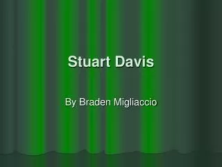
Stuart Davis in his Studio
Stuart Davis in his Studio. Int'l Surface No. 1, 1960. Sans-serif font Serif font Serif font (red serifs). Typography
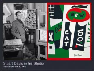

Stuart Davis in his Studio
E N D
Presentation Transcript
Stuart Davis in his Studio • Int'l Surface No. 1, 1960
Sans-serif font Serif font Serif font (red serifs) Typography Typography is the study of letters and its use for graphic design. Letters come in many styles and shapes. Some have flat, even spacing called Gothic. Some have thick and thin letters called Roman. Using serifs, flourishes, and scripts lettering can be utilized for design as well as the function of communication. 2
Abstract Art Now generally understood to mean art that does not depict objects in the natural world, but instead uses color and form in a non-representational way. In the very early 20th century, the term was more often used to describe art, such as Cubist and Futurist art, that depicts real forms in a simplified or rather reduced way—keeping only an allusion of the original natural subject.
Cubist Art An early 20th century school of painting and sculpture in which the subject matter is portrayed by geometric forms without realistic detail, stressing abstract form. Highly influential visual arts style of the 20th century Created principally in Paris between 1907 & 1914. Emphasized the flat, 2D surface of the picture plane, rejecting the traditional techniques of perspective, foreshortening and modeling. Often presented objects in new ways- showing several sides at once and often fragmented.
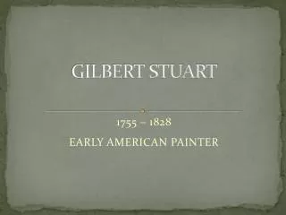
Stuart Davis 1894-1964 American Painter He used natural forms, rearranged them into flat, poster-like patterns with precise outlines and sharply contrasting colors. Later in his career he moved to pure abstract paintings, often introducing lettering into the paintings. Davis is said to have created a distinctive American style.
SKETCH FINISHED PRODUCT
BLIPS AND IFS 1963-1964
THE MELLOW PAD 1945-1951
Untitled • 1964 Screenprint
Your Stuart Davis Drawing • Step One:Start with the first letter of your name and place it on the bottom of the page in a block letter format. This letter becomes the "foundation" of the pile. • Then, begin adding the other letters, not necessarily in spelling order, around, behind, in front and on top of the first letter. To help with flow, you can turn your papers around.
Step Two: After the letters are piled high (repeating letters is encouraged!), fill in the spaces with patterns.
Step Three: Once the patterns are filled in, bring out the crayons and color in the letters. No color rules here: whatever color you choose is fantastic!