Responsive Web Design for Enhanced User Experience
70 likes | 179 Vues
The Open Repository UI Redesign features context-aware layout that automatically adjusts to screen size and orientation using Responsive Web Design techniques. Navigation is hidden by default and CSS & Javascript are utilized for a seamless user experience. Supports both portrait and landscape orientations. Toolbar and Files navigation are accessible. Browse by Title or Authors easily on both large and small screens.

Responsive Web Design for Enhanced User Experience
E N D
Presentation Transcript
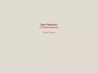
Open Repository UI Redevelopment Design features
Context-aware The layout automatically reflows depending on the size or orientation of the screen, using ‘Responsive Web Design’ techniques. It can be demonstrated by making a regular browser window small or large. Large screen Small screen
Navigation Using a mix of CSS and Javascript, the navigation is hidden automatically, and displayed when needed. Default view Navigation open Scrolled down
Orientation The small screen version works well in portrait or landscape orientations. Viewed sideways Default view Toolbar and Files navigation open
Item page Large screen Small screen
Browse: A-Z by Title Large screen Small screen
Browse: Authors Large screen Small screen