Download
1 / 14
140 likes | 251 Vues
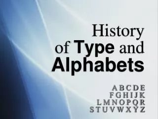
Explore the history and usage of blackletter, Helvetica, Garamond, Futura, Trajan, Bondini, and Century Gothic fonts, from their creation to contemporary applications. Learn about the characteristics, purposes, and classifications of each font style.

E N D
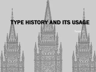
Type History and its usage Team 2
Black Letters • Release Year: 1150 • Country of Origin: Europe; Johann Gutenberg • Classification: Script/Blackletter • Can be referred to as: Old English, Mediaeval/Gothic, Celtic (Textura, Schwabacher, Cursiva and Fraktur) • Characteristics: • Strongly maintained its roots in the calligraphic scripts and organic shapes of its ancestors-in-influence for the following 500 years as it remained in strong use. • Strong space between words was required. • Dramatic thin and thick strokes, with elaborated curves
Black Letters • Purpose: It was used for the religious texts of monasteries which later on evolved. • What is it used for today? It brings to mind the medieval times and is often used in headlines, logos, signs, fantasy games, movies.
Helvetica When ? : • Created in year 1957 by Max Miedinger. Characteristics ? : • two-storied a (with curves of bowl and of stem) • narrow t and f • square-looking s • bracketed top serif of 1 • rounded off square tail of R Purpose ? : Professional look of the font that it look simply and accessible What is it used in today ? : Commercial logos (3M, BMW) , federal income tax forms(from the US government),subway signs(MTA:MetropolitanTransportation Authority) Classification ? : Sans Serif Family (type that does not have serif)
Garamond • Created: Between 1530 and 1545.(Garamond by Claude Garamond and most of the Garamond faces are most closely related to the work of a later punch-cutter, Jean Jannon.) • Characteristics: The font is easy to read and consistent. Garamond conveys a sense of solid tradition, yet still soft and attractive. Top serifs have a downwards slope • Purpose: It was during this early part of the 16th century that Garamond and his peers found that the typography industry required unique multi-talented people. This way they could produce fine books. • Used for: It is used on pamphlets typeset, novels, poems and advertisement. • Classification: Old Style ( under the category of serifs )
Futura • Year: 1927 by Paul Renner • Characteristic: Complex curves • Classification: Sans Serif • Purpose: He believe that a modern typeface should express modern models rather than be a rival of a previous design • Used today: Corporate logos, commercial products, films and advertisements
TRAJAN • Year: Designed in 1989 by Carol Twombly for Adobe. • Type of classification: Display font • Characteristics: All caps alphabet, with elegant, sweeping curves • Purpose: Conveys a feeling of importance, elegance and is very easy to read at a distance. Seen frequently in advertising and in book titles
Bondini • Year: Designed by the Italian engraver Giambattista Bodoni in 1798 • Type of classifications: Modern/Didonefont. • Characteristics of the font: Contrast between thick and thin strokes to the vertical axis combining with thin 'hairlines' resulted in an attractive, delicate font but one which could prove difficult to print. • Purpose:Often used by glossy fashion magazines. Bodoni poster-style fonts made popular in artwork produced in the Swinging Sixties are now enjoying a revival. An up-to-date example which has received world-wide exposure is the title adopted for the film production of Abba's hit musical Mamma Mia!
Century Gothic • Release Year: 1991 • Country of Origin: United States, • Classification: Sans Serif, Lineales, Geometric Sans. • Characteristics: They do not have decorative serifs. Clean and simple. Suggests new and attention awakening appeal. It has a larger height than monotype font script. The stroke in this font is also wider and more even.
Century Gothic • Purpose: • Century Gothic maintains the basic design of 20th Century but has an enlarged x-height and has been modified to ensure satisfactory output from modern digital systems. • What is it used for today? • Printing children’s story books. • Writing school books and printing materials. • Useful for headlines and general display work and for small quantities of text, particularly in advertising.
Credits • http://typophile.com/node/14496 • http://www.weagree.com/book/149-Characteristics%3A+Helvetica,+Times+New+Roman+and+Garamond.html • http://www.linotype.com/414/claudegaramond.html • http://www.pointlessart.com/education/loyalist/typeTalk/garamond/biography.html