Download
1 / 27
330 likes | 1.55k Vues
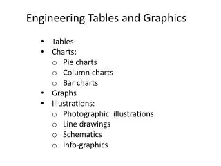
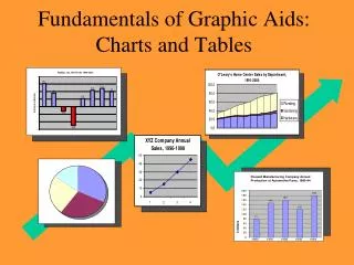
Fundamentals of Graphic Aids: Charts and Tables. Objectives. Explain the value of graphs in reports Describe the criteria for quality graphs Describe the potential for misleading data Choose the correct graph for different data sets Construct bar graphs, pie charts, and line graphs .

E N D
Objectives • Explain the value of graphs in reports • Describe the criteria for quality graphs • Describe the potential for misleading data • Choose the correct graph for different data sets • Construct bar graphs, pie charts, and line graphs
Why use charts? • To help clarify complex data • To supplement text (not substitute text) • To help the reader focus on the data • To simplify the reader’s comprehension
To clarify, supplement, focus, simplify Better ? 1991 1992 1993 1994 1995 1996 1997 1998 1999 2000
To clarify, supplement, focus, simplify BEST ! 1991 1992 1993 1994 1995 1996 1997 1998 1999 2000
Criteria for Quality Graphs 1.Shows the data 2. Helps the reader focus on the data rather than on the graph itself 3. Avoids misleading the reader or distorting the data 4. Simplifies the reader’s comprehension of the data 5. Is consistent with the verbal or numeric description of the data.
You be the judge. Potential for misleading the reader
Two Different Graphs Presenting the Same Information XYZ Company Safety Violations, 1986-1989 XYZ Company Safety Violations, 1986-1989 500 450 400 350 300 250 200 150 100 50 0 50 45 40 35 30 25 20 15 10 5 0 1986 1987 1988 1989 1986 1987 1988 1989
$515 $510 almost unnoticeable scale break $505 $500 0 Oct Nov Dec Two Different Graphs Presenting the Same Information XYZ Company Sales $600 XYZ Company Sales $500 $400 $300 $200 $100 0 Oct Nov Dec
XYZ Company Cost of Operations, 1999-2000 You be the judge. Other Training & Development 5% Material & Capital Development 50% 10% 35% Salaries
Simple Vertical Column Chart Used to show changes in quantities over time.
Simple Horizontal Bar Chart Used to changes in quantities by category. Western Cable TV Radio Station WROZ-FM Radio Station WKDM-AM 0 2 4 6 8 10 Net Income (millions of dollars)
Expenditures for Real Estate Advertising in Selected Colorado Counties, 1998 Arapahoe County SCALE BREAK $55 Denver County $3.2 million El Paso County $75 0 20 40 60 80 100 Thousands of dollars
Multiple Column Chart Used to show changes in several different quantities over time. 1999 2000 2001
Stacked (segmented or subdivided) Chart Used to compare subdivisions of quantities (horizontal or vertical).
1993 1994 1995 1996 1997 1998 1999 2000 Used to show positive and negative values over time. Bilateral Column Chart
Choose the Correct Column or Bar Chart Situation 1: Radkur, Inc. net profit for 8 years 1993 +15.2 million 1994 + 9.0 million 1995 - 3.1 million 1996 - 12.5 million 1997 + 5.3 million 1998 +10.8 million 1999 +12.1 million 2000 + 9.9 million
Choose the Correct Column or Bar Chart Situation 2: Provide the correct graph to depict projected annual sales for XYZ Company for the next 5 years: Year Projected Sales Revenue 1 10.2 million 2 11.1 million 3 11.9 million 4 12.5million 5 13.5 million
Choose the Correct Column or Bar Chart Situation 3: Provide the correct graph to depict projected income of three divisions for XYZ Company for the next 3 years as follows (in millions): Year Division A Division B Division C 1 15.2 5.1 12.7 2 22.4 8.6 14.5 3 26.7 9.5 15.8
Pie Charts Used to show subdivisions of a whole.
Line Charts Used to show changes in information over time.
The label and title are typed flush with the left margin on the same line below the figure. 1993 1994 1995 1996 1997 1998 1999 2000 Place the source data directly below the title. Format for presenting figures in the report Figure 1. Radkur, Inc. Net Profit, 1994-2001 Source: Primary
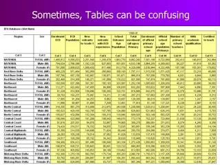
Tables The formal table presentation includes the following parts: • General introduction in the text (including a phrase such as “…as shown in Table 1”) • Label (“Table”) and number • Title • Table containing data • Source information • Specific discussion in the text that points out important points in the table
The label and title are typed flush with the left margin on separate lines above the table. Use borders and line divisions. Center numbers in columns but align right. Place the source data below the table.