Understanding Data Interpretation: Charts, Tables, and Graphs
This guide explains different types of visual data representation, including tables, pie charts, bar graphs, and line graphs. Tables organize and display exact amounts of data without visual comparisons, while pie charts effectively illustrate parts of a whole, ideal for 6 or fewer items. Bar graphs serve to compare quantities across categories, making relationships easy to grasp. Line graphs, on the other hand, depict data that changes over time, revealing trends. Each type has its unique strengths, helping in the clear interpretation of data.

Understanding Data Interpretation: Charts, Tables, and Graphs
E N D
Presentation Transcript
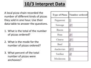
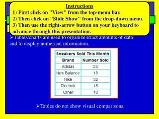
Instructions 1) First click on "View" from the top-menu bar. 2) Then click on "Slide Show" from the drop-down menu. 3) Then use the right-arrow button on your keyboard to advance through this presentation. SPI 0807.Inq.3: (Interpret Data) Notes Science Different types of charts, tables, and graphs Tables • Tables/charts are used to organize exact amounts of data and to display numerical information. • Tables do not show visual comparisons.
SPI 0807.Inq.3: (Interpret Data) Notes Science Different types of charts, tables, and graphs Pie Charts • A pie chart is a circular chart divided into sectors • Best used for comparing parts to a whole • The total amount should equal 100% • Works well for comparing 6 or fewer items, but more than • six items becomes difficult to view and interpret
SPI 0807.Inq.3: (Interpret Data) Notes Science Pie Charts: Examples
SPI 0807.Inq.3: (Interpret Data) Notes Science Different types of charts, tables, and graphs Bar Graph • Bar graphsare used to compare facts. The bars provide a visual display for comparing quantities in different categories • Bar graphs help us to see relationships quickly.
SPI 0807.Inq.3: (Interpret Data) Bar Graph: Example Notes Science • Example: A survey of student's favorite after-school activities was conducted at school The table shows the results • Note: Since the data is not changing over time, a line graph would not be best for displaying this data. A bar graph is better.
SPI 0807.Inq.3: (Interpret Data) Notes Science Different types of charts, tables, and graphs Line Graph • Line graphs are used to display data or information that changes continuously over time. • Line graphs allow us to see overall trends such as an increase or decrease in data over time.
SPI 0807.Inq.3: (Interpret Data) Line Graph: Example Notes Science