Download
1 / 13
130 likes | 254 Vues
This project aims to visualize the distribution of the AIG bailout money recently discussed in the news. By creating a world map highlighting the recipient countries and major cities, I will enhance the understanding of the fund's allocation. I will gather data from AIG, likely requiring formatting, and employ GIS techniques such as data importation from Excel, data matching by name, and visual flow arrows to illustrate the financial flow. This project will culminate in a refined storyboard and presentation, demonstrating the bailout's global impact.

E N D
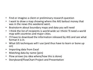
Find or imagine a client or preliminary research question • I want to draw a map showing where the AIG bailout money that was in the news this weekend went. • Brainstorm about boundary maps and data you will need • I think the list of recipients is world-wide so I think I'll need a world map with countries and major cities. • I'll have to download the information released by AIG and see what format it is in. • What GIS techniques will I use (and thus have to learn or bone up on) • Importing data from Excel • Matching data by name (join) • Flow arrows (no idea where/how this is done) • Storyboard/FlowChart Project and Presentation
http://www.draytonhall.org/images/journal/26191027510851781.jpghttp://www.draytonhall.org/images/journal/26191027510851781.jpg
http://www.draytonhall.org/images/journal/49181027510851781.jpghttp://www.draytonhall.org/images/journal/49181027510851781.jpg
Twitter Map (superbowl) http://blog.gisuser.com/wp-content/uploads/2009/02/supertwittermap.jpg