Download
1 / 7
70 likes | 213 Vues
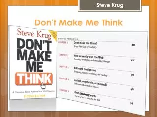
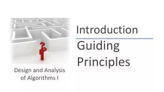
By: David Fischer. THE FIVE GUIDING PRINCIPLES OF DON’T MAKE ME THINK. 1) Don’t Make Me Think. Ease of use is key Users should be able to look at anything, and know: What it does If that’s what they want. How We Really Use the Web. Users don’t read, they scan

E N D
By: David Fischer THE FIVE GUIDING PRINCIPLES OF DON’T MAKE ME THINK
1) Don’t Make Me Think • Ease of use is key • Users should be able to look at anything, and know: • What it does • If that’s what they want
How We ReallyUse the Web • Users don’t read, they scan • Users click the first thing that is close to what they want • Users shouldn’t have to muddle through sites, they should just be able to “get it”
Billboard Design 101 • Create an obvious hierarchy showing the user where they are, and where they can go • Nesting is great for this • Big things important • Smaller things less important • Smallest things least important • Conventions and boundaries are your friends • Make it obvious what they can click
Animal, Vegetable, or Mineral? • Choices should be mindless • The less time thinking about how to navigate a site properly, the better • Don’t make users click on too many things to get them to where they want to be
Omit Needless Words • “Get rid of half the words on each page, then get rid of half of what’s left” • The less words for a user to read, the better • A wall of text can intimidate a user, and make them ignore that entire portion of the site
Contact Info David Fischer djf29@buffalo.edu