1 / 12
120 likes | 127 Vues
Lets admit the fact that Photography is one of those few industries that are mostly discussed in Logo designing field...

E N D
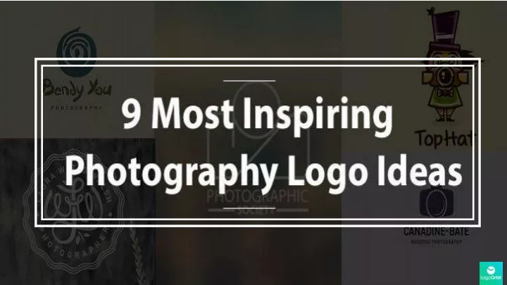
Importance Lets admit the fact that Photography is one of those few industries that are mostly discussed in Logo designing field. As a logo designer from five years, I have designed dozens of Logos in this industry and I love to do it. BUT I’ve seen many designers struggling to achieve that KISS factor in it. That’s the reason today I came up with an idea to pick 9 most inspiring Logo ideas from the Photography industry and explain the factors behind their success. So watch out over my shoulder as I’ll define all the things clearly. Remember it’s not that typical photography logo examples post filled up with dozens of Logos. I have picked 9 Logos according to my opinion. And since it is opinion, so I don’t make any guarantee that you’ll also like these Logos. Just pick up the points that you may found different. PS: If you’re looking for some solid Photography Logo inspiration then must see our 60 top notch Photography Logos industry inspiration.
– David Davidson Landscape Photography It’s a Logo for a landscape photography business. The graphic mark is detailed yet simple to remember. The initials D from David, D from Davidson and L from Landscape are visible, if you focus on it. The holo type circle is created around the mark while light weight font is used to mention the business name. Key Takeaway: Never go after the traditional ways of conceptualizing and if you’re looking to merge the specific sub industry with initial or word mark type Logos then use the linking technique to make it visible.
– Laura Watts Walsh Photographer It’s a Logo of a photographer in nature and wedding photography category. The concept of the niche is represented with a leaf and a knot/celebrated ribbon. It’s monogram and stamp type Logo. Key Takeaway: If you want to create a stamp or monogram type Logo, then place the text relatively. Any slight mistake here will break the flow. Always use custom fonts for drawing initials inside the stamp or monogram.
– Canadine Bate Wedding Photography As you can see, it’s a Logo of wedding photography. Interestingly the designer behind this Logo haven’t done any extra thing. He has just stick with basics like the camera icon and ring. I’ve seen many concepts of wedding rings and camera merged together but they aren’t perfected like this one. Key Takeaway: Some times simplistic approach can get better results in your Logo. Never go after shocking colors if you’re designing a simple graphic symbol.
– Photographic Society The Logo is of photographic society that is a board or a platform for photographers. It’s one of my all time favorite Logo because of it’s bespeaking simplicity. The perfect execution of KISS formula can described with this Logo. The initials P and S are superbly creating the camera symbol. Key Takeaway: Instead of using the camera icons or photographic items, try to make them with combinations of initials. This will bring a distinct and unique touch to your Logo.
– Slug Shot Photography Slug Shot Photography is a nature based photography that specifically focus on the insects and other small animals/birds photography. As you can see that the concept of the nature niche is shown with the caterpillar on the shutter element. Except this, there’s no other elements used in this Logo. Key Takeaway: Instead of using whole clip art, try to use the identical parts of the thing you’re embedding in the main icon. Use lighter shades of the colors combinations. You May Also Like: Why Logos Should be Simple?
– Bendy You Photography This Logo is designed by Sean Heisler for a photography that focuses on yoga. It’s a great example of mixing the name meaning with business theme. The bends of you are swirled to create a camera eye concept. It have only swirls as design element which makes it a simple Logo with minimal details. Key Takeaway: Never fill up your Logo with too much details if you’re combining a different type of business name and theme.
– Schonfeld Photography It’s a Logo of nature and outdoor photography business. It describes the concept of nature and photography with birds distorting from the camera. The illustration is outstanding and simple. Key Takeaway: The distorted effect can also be used in simple Logos by usage of light visible colors with the simple finishing.
– Writegrapher It’s a Logo designed for a travelogue writer that does photography also. The illustrative draw of keyboard and camera with a paper popping out are used in this Logo as design elements. The writing and photography concept is brilliantly conceptualize in this Logo. It merges two types of retro-styled mediums in it. The typographic font is used to mention the name. Key Takeaway: The main point that you should pick from this Logo is that mixing the elements works only if you do it according to the industry. The correct industry wise color usage is also a important point in achieving a decent Logo design.
– Top Hat Photography It is a Logo of outdoor photography. It’s an illustrative Logo that uses beautiful illustration of girl as a main element. While the hat, bird and camera is used to support the main element. The outdoor concept is shown with waiving hair. Key Takeaway: The presentation of the concept is core part of making a successful Logo. Illustrations helped in conceptualizing the business theme with attraction. Read Also: Importance of Logos in branding of businesses
Conclusion So that was 9 Logo ideas for Photographers that Ifound inspirational and different from same old school designs. Some of them are pretty new concepts while some are modified. I hope that you’ve liked these designs too. BUT as I said earlier opinions can be different so feel free to comment your preferred design opinions. If you find this post helpful, please share it on social media. It costs only a click. Thank you.