Download
1 / 13
130 likes | 152 Vues
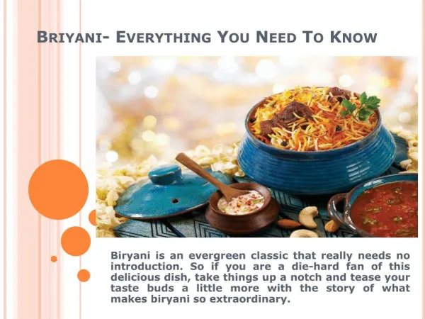
Simple logos are everywhere but cool logos are rare to find. Ever wondered what makes a brand recognizable in the world of extreme competition? It is the art of crafting a cool logo for your business...

E N D
CoolLogos2020EverythingYouNeedToKnow LOGO ORBIT
Why Cool Logos? • Simple logos are everywhere but cool logos are rare to find. Ever wondered what makes a brand recognizable in the world of extreme competition? It is the art of crafting a cool logo for your business. • As it distinguishes one brand from the others. You will find a logo on every brand but you will not find every other logo visually appealing to your sight. Therefore, you need to design a logo for your company that is not unique only but also gives your brand a sense of invigoration. • The good part is you can design your own logo by taking ideas and inspiration from other top-tier brands. Besides, you can hire an expert graphic designer to get custom logo design services.
Cool Logos For Your Business • You may not realize but the imperativeness of cool logos cannot be questioned. It is the reason why some companies are able to successfully position their brand in the audience mind. • Whereas, other brands are still competing to make their brand recognition strong. A logo could be animated, abstract, mascot or a wordmark but if it does not make people intrigue it is of no worth. With cool logo design, you can increase your brand recognition.
Get Inspiration From Cool Logos • The below-listed coolest logos are some of the exceptional ones having a hidden meaning that makes them powerful. You need to take inspiration from these logos and ensure you create a brand new logo for your business. When you are crafting a logo make sure your hidden message resonates with your brand core values. • Thereby, keeping it aligned with your business strategic objective. There are other logos too but I have just jotted down the ones I find the most captivating. Have a look and think beyond how you too can come up with artistic ideas.
Baskin – Robbins • The logo of Baskin-Robbins is one example of how a cool logo looks like. Their logo comprises of two capital letters that are capital B and capital R respectively. If you closely recognize their logo, you will see that the parts of the letter B and R that are in pink color displays a number 31. What does the number 31 stands for? It shows the brand offers a variety of ice-cream flavors that will make you scream for having more ice-cream. • The number 31 is used in their logo to let the audience know they hold 31 unique delectable flavors of ice-creams. With Baskin Robbins, you can have one unique flavor for every day of the month. Their logo represents fun, energy, and happiness that you feel exactly when you have an ice-cream.
Tostitos • Tostitos is another example of the coolest logo with a hidden meaning behind it. The two T’s are placed in the mid of their logo. It gives the concept of two people who could be friends or family enjoying tortilla chips together. And, they are making it even more savory by dipping the chips into the bowl of salsa which is in red. • It displays that the dot on the letter “i” serves as the salsa bowl. The company is well-recognized for its tortilla chips. Along with the most scrumptious dips that make people crave for their chips. Their logo gives the message that people can have a good time together while having their chips along with dips.
Amazon • Undoubtedly, the logo of amazon holds behind a simple yet impressive message for the people. If you notice, there is an arrow from A to Z. It reflects that amazon has a vast variety of goods and services that you can buy and avail just from the comfort of your home. • The products and services are ranging from alphabets A to Z. On their website, you can find almost every stuff that you are probably looking for. You only need to think about the product and service and you will find it in the Amazon store. The arrow also represents a smile that means if you shop from amazon you will be satisfied and happy while you get an amazing shopping experience. • You may also like to read: Vintage Logo Design: Viable Tips, Inspiration, And Trends
Beats • Most people when looking at the Beats logo they think of a circle that holds the letter “b” in it. Whereas, in actual the letter small “b” reflects the headphones. And the circle which is in red represents a human head carrying a headphone. The uniqueness of their logo makes it appealing for the people who are music lovers and wants to have a sound that is matchless. • The letter “b” represents the brand name in which it makes people experience a personal touch while enables a person to see them wearing headphones. The core idea behind their logo is a man who is wearing headphones.
FedEx • The FedEx logo is more likely to represent a typographic logo that is way too simple with its name used as the logo. If you look closely between the letters E and X you will be noticing an arrow. The logo of FedEx reflects that the delivery professionals from FedEx will deliver your package quickly and efficiently. • They have used the font in such a way that it represents a directional arrow that makes you look forward. And it aligns with the company commitment that it delivers the products and services quite fast and serves as a reliable option.
Toblerone • The logo of Toblerone is quite complex but holds a deep meaning rooted in it. If you look at its logo you will see a mountain and in that, you can spot a bear too. The core reason behind why their logo has that bear is that the Swiss chocolate company emerged from the city of Bern in Switzerland. • And that city is commonly known as the city of bears. The company highlighted the bear just because people remember the origin of their brand. Also, their logo represents the widely famous mountain named Matterhorn that is in Switzerland. And, it reflects the origin of the chocolate bars. • Read more: 05 PRO Tips To Design a Circular Logo That Harmonizes Your Brand
Subway • Ever wondered what does the subway logo represents? If you look clearly you will notice the left arrow on the first letter of subway logo “S” and the arrow on the right letter of the subway in “Y”. It represents the entrance and exit of the restaurant. • Moreover, it gives the sense of having a fast option to enjoy your food that will not take much time to prepare. Also, it is the healthiest food you can have to satisfy your instant hunger crave. The core meaning behind the subway logo is you can have this meal on the go easily.
Key Takeaway from Cool Logos • The above mentioned cool logos are for you to derive inspiration for your startup logo. You can even take ideas from these logos and craft one for your brand with the unique meaning behind it. Remember, you need to choose a logo that makes your brand aesthetic and gives it an edge over the rivals. • Even if you are an established brand you may still revamp your logo if it lacks the basic aura that makes people compel. A logo is more than a personality and you have to embed that in your brand to make it look awe-inspiring.