Download

1 / 17
170 likes | 174 Vues
User experience is a primary factor that determines whether your target audience will convert and keep buying from you. Make bad design choices and feeble decisions about your Magento store optimisation and you will lose your potential customers and sales to your competitors.

E N D
User experience is a primary factor that determines whether your target audience will convert and keep buying from you. Make bad design choices and feeble decisions about your Magento store optimisation and you will lose your potential customers and sales to your competitors.
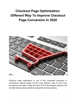
The checkout is a crucial stage in a sales funnel that leaves a significant impact on customer behaviour. Luckily, Magento 2 is equipped with features and enhancements that make the checkout process faster and smoother for customers. However, there are still some usability issues faced by customers and always room for improvement.
Here are some practices you can implement on your Magento 2 store to address and improve the usability of your Magento store, and help visitors convert faster.
Get Rid of Discreet Sign In By default, Magento 2 stores allow customers to check out as guest users if they do not wish to create an account. This ensures a seamless and speedy checkout process for new and recurring customers.
Registered customers who already have an account, on the other hand, will actively look for the link to sign into their account which is discreetly placed at the top right corner of the page. Since visitors on the checkout page are focused on the comprehensive form, the sign-in option easily go unnoticed.
Though Magento displays a password field after a registered user enters their email address, users may not be familiar that it is going to happen, which means poor usability of the website. So, it is advisable for merchants to place the sign-in CTA right above the email field so that users can easily locate it and skip the long process.
Improve the Visibility of Order Summary on Mobile Devices Order summary can be considered a mini shopping cart that displays product images, the total and certain details of the products like name, size, colour and quantity.
With a quick preview of the order, customers can also ensure what they are buying because sometimes people mistakenly add an extra item to their cart without realising it or simply forget to add an item they intended to buy.
While the order summary is clearly visible in the right sidebar on desktop versions, most mobile users are not aware that same is hidden under the cart icon on mobile devices which may lead to unwanted surprises for customers once the transaction is complete.
A simple and easy solution to this usability issue is adding a label “order summary” right next or below the cart icon to tell users where they can double check their order details and shipping information before they place the order.
Clear the Confusion around Address Fields Magento stores have a well-structured checkout form with clear-cut fields to enter shipping details. Still, many users feel confused with the three input fields that are displayed by default in the “street address” section. Some users, especially first-time buyers, may not be sure what to enter in the second or third fields or whether to leave them empty.
Those fields are optional, but it is nowhere mentioned by Magento which leaves users confused and add extra minutes to the checkout process. So, it is a good idea to clearly mention that those fields can be left empty.
Removing the third field and keeping it to two fields is a possibility, but the existing customers who have already saved their addresses in three lines will face “Shipping address can’t contain more than two lines” error during the checkout stage.
The best solution is to add placeholders – Address Line 2 (optional) and Address Line 3 (optional) in the 2nd and 3rd address fields respectively. Users will instantly know they have the option to leave additional fields empty if they do not have too much information to specify address details.
THE TAKEAWAY Even the smallest of changes on the checkout page can make a big positive impact on your conversion and revenue. That is why it is important to always keep tabs on your customer behaviour, shopping habits and the way they interact with your Magento store.
CONTECT US Web Circle Suite 610/12 Century Circuit, Baulkham Hills NSW 2153 1300 760 363 www.webcircle.com.au